


This library provides status/stories features like Instagram/WhatsApp or other social media, It is simple to use and fully customizable. It works on both android and iOS platforms.
Installation | StoryView | Usage | Props | Example | License
$ npm install react-native-story-view
# --- or ---
$ yarn add react-native-story-view$ npm install react-native-video react-native-reanimated react-native-gesture-handler react-native-video-cache-control @shopify/flash-list lodash
# --- or ---
$ yarn add react-native-video react-native-reanimated react-native-gesture-handler react-native-video-cache-control @shopify/flash-list lodashNote: If you already have these libraries installed and at the latest version, you are done here!
cd ios && pod installNote: Make sure to add Reanimated's babel plugin to your
babel.config.js
module.exports = {
      ...
      plugins: [
          ...
          'react-native-reanimated/plugin',
      ],
  };
In your project's
android/app/build.gradle
dependencies {
    implementation 'com.danikula:videocache:2.7.1'
    // Your rest of the code
}
In your project's
android/build.gradle
buildscript {
    // Your rest of the code
}
allprojects {
    repositories {
        google()
        mavenCentral()
        maven { url 'https://jitpack.io' }
        jcenter()
    }
}
Android:
If you're facing issue related to 'android-scalablevideoview' or 'videocache' module not found.
Add this code in android's build.gradle
jcenter() {
    content {
        includeModule("com.yqritc", "android-scalablevideoview")
        includeModule("com.danikula", "videocache")
    }
}
Know more about react-native-video, react-native-reanimated, react-native-gesture-handler, react-native-video-cache-control, @shopify/flash-list and lodash
 |
|
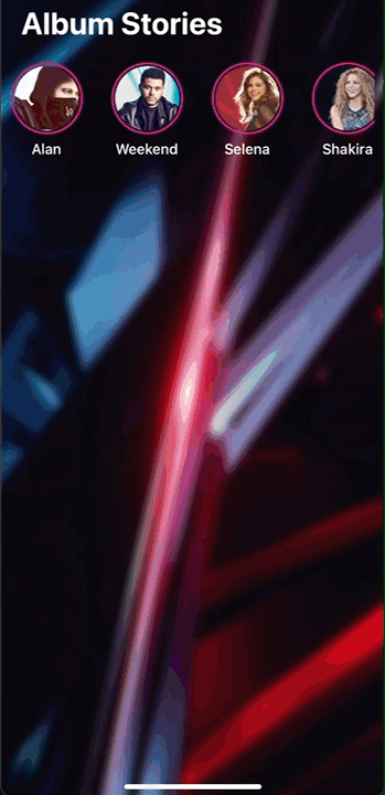
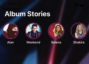
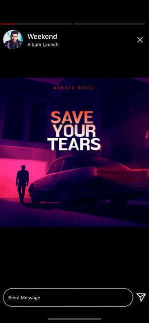
StoryView is divided into several components, MultiStory is the root component. ProfileHeader and Footer are individual components for header and footer. StoryContainer internally used for rendering Story. We'll look usage and customization of all these.
Checkout Multi Story Example here
Checkout Stories Data Format here
Checkout Single Story Example here
Define the users' stories array in the below format. There will be multiple users and multiple stories inside.
const userStories = [
    {
      id: 1, //unique id (required)
      username: 'Alan', //user name on header
      title: 'Albums', //title below username
      profile: 'https://sosugary.com/wp-content/uploads/2022/01/TheWeeknd_001.jpg', //user profile picture
      stories: [
        {
          id: 0, //unique id (required)
          url: 'https://i1.sndcdn.com/artworks-IrhmhgPltsdrwMu8-thZohQ-t500x500.jpg', // story url
          type: 'image', //image or video type of story
          duration: 5, //default duration
          storyId: 1,
          isSeen: false,
          showOverlay: true, // to show overlay component
          link: 'https:google.com', // to handle navigation in overlay component
        },
        {
          id: 1,
          url: 'https://storage.googleapis.com/gtv-videos-bucket/sample/BigBuckBunny.mp4',
          type: 'video',
          duration: 15,
          storyId: 1,
          isSeen: false,
        },
      ],
    },
    {
      id:2,
      username: 'Weekend',
      ...
    }
] |

|
This is the root component of StoryView package. It displays horizontal list of users with pre-defined ui from StoryAvatar component and uses animated flatlist under the hood to display stories. StoryContainer is used under the hood for story so all customization can be done from storyContainerProps.
const multiStoryRef = useRef<MultiStoryRef>(null);

<MultiStory
  stories={stories}
  ref={multiStoryRef}
  avatarProps={{
    userNameStyle: { fontSize: 16 },
  }}
  // all StoryContainer props applies here
  storyContainerProps={{
    renderHeaderComponent: ({ userStories, progressIndex, userStoryIndex }) => (
      <Header {...{ userStories, progressIndex, multiStoryRef }} />
    ),
    renderFooterComponent: ({ userStories, progressIndex, userStoryIndex }) => (
      <Footer {...{ userStories }} />
    ),
    barStyle: {
      barActiveColor: Colors.red,
    },
  }}
/>;
Checkout Multi Story Example here
 |
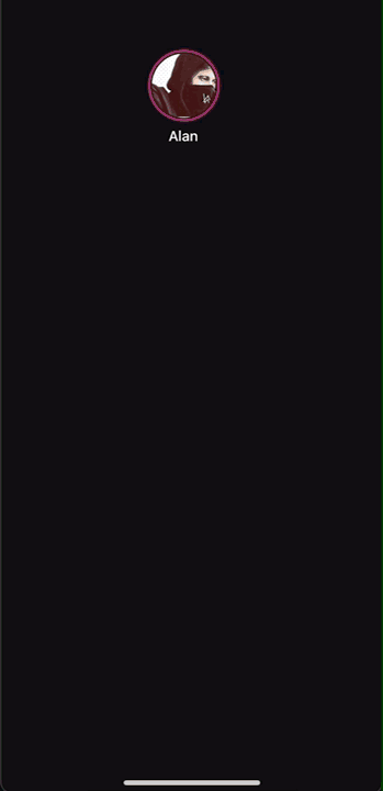
This is an individual component, To display user details on header like instagram/whatsapp. In renderHeaderComponent of StoryContainer, Custom component can be assigned.
For MultiStory, renderHeaderComponent receives progressIndex, userStories, story and userStoryIndex for getting current user data.
const multiStoryRef = useRef(null);

<MultiStory
  ref={multiStoryRef}
  storyContainerProps={{
    renderHeaderComponent: ({
      userStories,
      story,
      progressIndex,
      userStoryIndex,
    }) => (
      <ProfileHeader
        userImage={{ uri: userStories?.profile ?? '' }}
        userName={userStories?.username}
        userMessage={userStories?.title}
        onClosePress={() => {
          multiStoryRef?.current?.close?.();
        }}
      />
    ),
  }}
/>; |

|
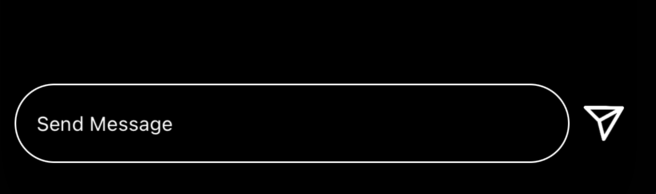
This is an individual component, To display footer like instagram. Any TextInput props can be directly passed to Footer. In renderFooterComponent of StoryContainer, Custom component can be assigned.
<MultiStory
  storyContainerProps={{
    renderFooterComponent: ({
      userStories,
      story,
      progressIndex,
      userStoryIndex,
    }) => (
      <Footer
        onIconPress={() => {
          console.log('Share icon clicked');
        }}
        onSendTextPress={() => {
          console.log('Message sent');
        }}
        shouldShowSendImage={true}
        shouldShowTextInputSend={true}
        placeholder="Enter Message"
      />
    ),
  }}
/>This is the core component of StoryView, which provides all functionality of story view and customization. It is used to render all stories in MultiStory. This component is just for reference how storyContainerProps in MultiStory being passed in this component internally.
const [isStoryViewVisible, setIsStoryViewShow] = useState(false);

<StoryContainer
  visible={isStoryViewVisible}
  extended={true}
  // extended enables play & pause feature on single story view default is "true"
  maxVideoDuration={10}
  stories={userStories[0].stories}
  renderFooterComponent={({ story, progressIndex }) => (
    <Footer
      onSendTextPress={() => {
        Alert.alert(`Current Story id ${story?.[progressIndex].id} `);
        Keyboard.dismiss();
      }}
      onIconPress={() => {
        Alert.alert('Current Story progress index' + progressIndex);
      }}
    />
  )}
  renderHeaderComponent={({ story, progressIndex }) => (
    <ProfileHeader
      userImage={{ uri: userStories[0]?.profile ?? '' }}
      userName={userStories[0]?.username}
      userMessage={userStories[0]?.title}
      onImageClick={() => {}}
      onClosePress={() => setIsStoryViewShow(false)}
    />
  )}
  //Callback when all stories completes
  onComplete={() => setIsStoryViewShow(false)}
/>;MultiStory is wrapper on this component with extra horizontal user list UI of StoryAvatar. If MultiStory's horizontal list customisation is not sufficient for any use-case, use this base component and add your own customised horizontal user list UI.
|
const [isStoryViewVisible, setIsStoryViewShow] = useState(false);
const [pressedIndex, setPressedIndex] = useState<number>(0);

const openStories = (index: number) => {
  setIsStoryViewShow(true);
  setPressedIndex(index);
};

  <View style={styles.container}>
    <FlatList
      horizontal
      data={userStories}
      keyExtractor={item => item?.id?.toString()}
      renderItem={({ item, index }) => (
        <Pressable onPress={() => openStories(index)}>
          <CustomStoryAvatar {...{ item, index }} />
        </Pressable>
      )}
    />
    {isStoryViewVisible && (
      // add other StoryContainer Props
      <MultiStoryContainer
        visible={isStoryViewVisible}
        onComplete={() => setIsStoryViewShow(false)}
        stories={userStories}
        renderHeaderComponent={...}
        renderFooterComponent={...}
        userStoryIndex={pressedIndex}
      />
    )}
</View>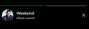 |
ProgressBar customisation can be controlled through StoryContainer itself. enableProgress to make visible the progressbar.progressIndex to start story from any index. barStyle to customize look feel of progressbar.onChangePosition trigger when progressbar index will change returns current index.
<MultiStory
  storyContainerProps={{
    enableProgress: true,
    //Callback when progressbar index changes
    onChangePosition: position => {},
    barStyle: {
      barHeight: 2,
      barInActiveColor: 'green',
      barActiveColor: 'grey',
    },
    maxVideoDuration: 25,
    progressIndex: 0,
  }}
/>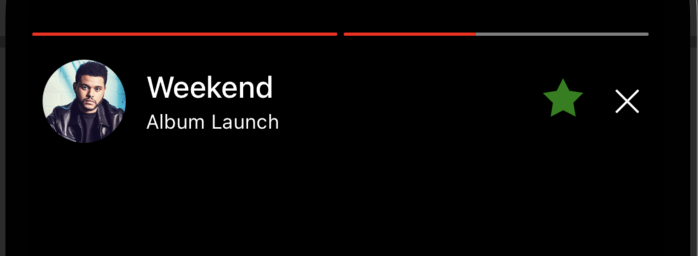 |
Pass any custom view in story view. It will be rendered on top of story view as it has an absolute position. In renderCustomView of StoryContainer, Any custom component can be assigned.
<MultiStory
  storyContainerProps={{
    renderCustomView: () => (
      <View
        style={{
          position: 'absolute',
          top: 40,
          right: 50,
        }}>
        <Image
          source={Images.star}
          style={{
            height: 25,
            width: 25,
            tintColor: 'green',
          }}
        />
      </View>
    ),
  }}
/>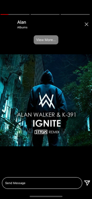 |
Pass any custom overlay view in the story view, which will be visible when the story contains showOverlay as true. It will be rendered on top of the image/video. In renderOverlayView, pass a callback function that takes the currently visible item and returns any custom component. In overlayViewPosition, assign one of the following positions: top, middle, or bottom.
<MultiStory
  overlayViewPostion={'top'}
  renderOverlayView={(item: StoryType) => (
    <TouchableOpacity
      style={{
        padding: 10,
        backgroundColor: 'gray',
        borderRadius: 10
      }}
      onPress={() => {
        if (item.link) {
          Linking.openURL(item.link);
        }
      }}>
      <Text style={{ color: 'white' }}>View More...</Text>
    </TouchableOpacity>
  )}
/>[{
id: number;
username: string;
title: string;
profile: string;
stories:Array<Story>[
{
id: number;
url: string;
type: 'image' | 'video';
duration: number
isReadMore: boolean
storyId: number,
isSeen?: boolean,
showOverlay?: boolean,
link?: string,
}
]
}]| Cube | Scale | Default |
|---|---|---|
 |
 |
 |
Name Default Type stories* undefined StoriesType[] Array of multiple user stories ref null MultiStoryRef To access closestory methodstoryContainerProps {} StoryContainerProps Customize all story props, detailed props in below StoryContainersectionavatarProps {} StoryAvatarStyleProps Customize avatar component styles onChangePosition null (progressIndex, storyIndex) => {} Callback when progress index changes transitionMode TransitionMode.Cube TransitionMode: {Default, Cube, Scale} To customize user story transition, (TransitionMode.default : no transition, Transition.scale : zoomIn/zoomOut transition, Transition.Cube: 3D cube transition) cube onComplete null (viewedStories?: Array<boolean[]>) => void Callback when stories closed or completes. viewedStoriescontains multi array of boolean whether story is seen or notrenderOverlayView null (item?: StoryType) => JSX.Element The callback for the overlay view is triggered only when the story item has showOverlay property set to true overlayViewPostion bottom string Position of overlay view (top, middle, bottom) props- FlatListProps Pass any FlatListprops to customize horizontal user list
Name Default Type userNameStyle - TextStyle To change style of user name userImageStyle - ImageStyle To change style of user avatar containerStyle - ViewStyle To change style of image container userImageProps - ImageProps To customize image props userNameProps - ViewStyle To customize text props rootProps - PressableProps To customize root view props viewedStoryContainerStyle - ViewStyle To customize story avatar when all stories of it are seen
Name Default Type stories* undefined StoriesType[] Array of multiple user stories visible* false boolean Hide / show story view userStoryIndex 0 number Pass clicked index of horizontal user list. storyContainerProps {} StoryContainerProps Customize all story props, detailed props in below StoryContainersectiononChangePosition null (progressIndex, userIndex) => {} Callback when progress index changes transitionMode TransitionMode.Cube TransitionMode: {Default, Cube, Scale} To customize user story transition, (TransitionMode.default : no transition, Transition.scale : zoomIn/zoomOut transition, Transition.Cube: 3D cube transition) cube onComplete null () => {} Callback when stories closed or complete renderOverlayView null (item?: StoryType) => JSX.Element The callback for the overlay view is triggered only when the story item has showOverlay property set to true overlayViewPostion bottom string Position of overlay view (top, middle, bottom) props- StoryContainerProps Pass any StoryContainerPropsprops to customize storypointers { pageX: 0,
pageY: 0 }PointerType Pointers will be used internally for modal opening and closing positions, You can pass profile avatar's position offsets here.
Name Default Type visible* false boolean Hide / show story view stories* undefined StoryType[] Array of stories extended* true boolean Enables pause / play feature on single story view backgroundColor #000000 string Background color of story view maxVideoDuration null number Override video progress duration (default is actual duration of video) style {} ViewStyle Style of story view showSourceIndicator true boolean Display indicator while video loading sourceIndicatorProps {} ActivityIndicatorProps To override indicator props onComplete null () => {} Callback when all stories completes renderHeaderComponent null (callback: CallbackProps) => JSX.Element Render Header component ( ProfileHeader) or custom componentrenderFooterComponent null (callback: CallbackProps) => JSX.Element Render Footer component ( Footer) or custom componentrenderCustomView null (callback: CallbackProps) => JSX.Element Render any custom view on Story renderIndicatorComponent {} () => JSX.Element Render loader when we press on Story, which represent loading state of story storyContainerViewProps {} ViewProps Root story view props headerViewProps {} ViewProps Header view wrapper props footerViewProps {} ViewProps Footer view wrapper props customViewProps {} ViewProps Custom view wrapper props videoProps {} VideoProperties To override video properties ref {} StoryRef To access 'pause' story method and 'viewedStories' stories object (Single Story) customViewStyle {} ViewStyle Style of custom view container headerStyle {} ViewStyle Style of header container footerStyle {} ViewStyle Style of footer container
Name Default Type progressIndex 0 number Current progress index of story story undefined StoryType[] Current story array userStories undefined StoriesType Current user story array ( Only for Multi Story)userStoryIndex undefined number Current user story index ( Only for Multi Story)
Name Default Type progressIndex 0 number To start story with any index barStyle { barActiveColor: #ffffff'
barInActiveColor: #FFFFFF7F
barHeight: 2
}BarStyleProps Progressbar Style: ( barActiveColor,barInActiveColor,barHeight)enableProgress true boolean To display progressbar progressViewProps {} ViewProps ProgressBar view wrapper props onChangePosition null (position) => {} Callback when progress index changes
Name Default Type userImage {} ImageSourcePropType Circular view image userName '' string To display username userMessage '' string Display text below username customCloseButton null any To render custom close button closeIconProps {} ViewProps ProgressBar view wrapper props onImageClick null () => {} Callback on user image click rootStyle {} ViewStyle root view style changes containerStyle {} ViewStyle container view style changes userImageStyle {} ImageStyle To change profile Image view style userNameStyle {} TextStyle To change profile name style userMessageStyle {} TextStyle To change profile message/subtext style closeIconStyle {} ImageStyle To change close icon style userImageProps {} ImageProps User Image props userMessageProps {} TextProps User Message Props userNameProps {} TextProps User Name Props
Name Default Type customInput null TextInput Render any custom text input shouldShowSendImage true bool Show/hide send icon image onIconPress null () => {} Callback on send icon press sendIconProps {} ImageProps Additional props to customize 'send' image view sendText 'Send' string To change text 'send' with any other string shouldShowTextInputSend true bool Show/hide send text inside text input (like instagram) onSendTextPress null () => {} Callback on send text press sendTextProps {} TextProps Additional props to customize 'send' text view sendTextStyle {} TextStyle To change style of send text sendIconStyle {} ImageStyle To change style of send icon inputStyle {} StyleProp To change style of input containerStyle {} ViewStyle To change style of root view containerViewProps {} ViewProps Root view props props- TextInputProps Pass any TextInputprops onFootercomponent
A full working example project is here Example
yarn
yarn example ios   // For ios
yarn example android // For Android- [ ] Customize StoryAvatar in reference of Instagram
- [ ] Customized Story example
- [ ] Refactor Cube transition (make perfect cube in reference of Instagram)
- [ ] Landscape support
- [ ] Optimize video loading on android
Support it by joining stargazers for this repository.⭐
For bugs, feature requests, and discussion please use GitHub Issues, GitHub New Feature, GitHub Feedback
We'd love to have you improve this library or fix a problem 💪 Check out our Contributing Guide for ideas on contributing.
- Check out our other available awesome mobile libraries