
React IDE Component is lighweight IDE component for react that has been included with typewritting effect for animation.
This components use:
- GSAP for animation that have impressive performance
- highlight.js for rich syntax highlighter and detect the language
- html-react-parser for parsing HTML into React elements
If you're using npm, in the command prompt run:
npm install react-ide-component --saveIf you're using yarn, run:
yarn add react-ide-componentImport the module
import IdeComponent from 'react-ide-component'Prepare datas to send it as props, this example use React Icons as icon. you can use your own svg / image icon here
const ideData = [
{
id: 'tab1',
icon: <ReactSvg size='100%' />
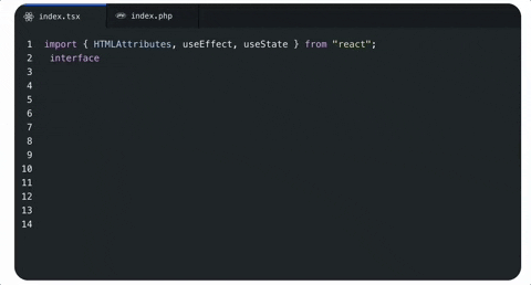
filename: 'index.tsx',
content: 'console.log("test")',
lang: 'typescript'
},
]type for datas object
| Property | Type | Required | Default | Description |
|---|---|---|---|---|
id |
string |
true | null |
tab's ids that you can use for your own needs |
icon |
JSX.Element |
true | null |
you can use your own svg, png as icon logo that representation tile extention / code language |
filename |
string |
true | null |
filename and extention file that will shown as tab's label example: 'index.js'
|
content |
string |
true | null |
it will be use as code text, enter/break line inside string didnt not work here. if you want to break line code content use <br> instead. |
lang |
string |
true | null |
language name. example javascript, php, java, python, etc you can serach list language available from highlight.js languages list
|
Then insert component and datas like this
<IdeComponent datas={ideData} />Might be your full code look like this
import React from "react";
import IdeComponent from 'react-ide-component'
import { ReactSvg, JsSvg } from '../svg/ReactSvg'

const ideData = [
  {
    id: 'tab1',
    icon: <ReactSvg size='100%' />
    filename: 'index.tsx',
    content: 'console.log("test")',
    lang: 'typescript'
  },
  {
    id: 'tab2',
    icon: <JsSvg size='100%' />
    filename: 'index.jsx',
    content: 'console.log("test")',
    lang: 'javascript'
  },
]


function App() {
  return (
    <div>
      <IdeComponent datas={ideData} />
    </div>
  )
}| Property | Type | Required | Default | Description |
|---|---|---|---|---|
datas |
TabDataType[] |
true | null |
Array of object that representating tab ide, icon, filename, code, and language |
mode |
dark or light
|
false | dark |
Mode for IDE color between dark and light, default is `dark |