
react-dirty-form
A form input component library

Install
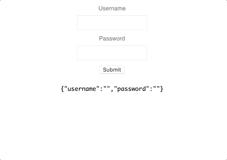
npm install --save react-dirty-formDemonstration
Usage
import React, { useEffect } from 'react'import { useForm, TextInput } from 'react-dirty-form'; const App = () => { const { form, setForm, isDirty, handleInputChange, handleSubmit } = useForm(postFormToServer); useEffect(() => { setForm({ username: 'user1', password: 'password1' }); }, []); function customPasswordValidation(value: string): boolean { return !(value.toLowerCase() === value || value.toUpperCase() === value); } function postFormToServer() { console.log("Sending form: ", form); } return ( <div style={{ display: 'flex', flexDirection: 'column', alignItems: 'center' }}> <TextInput name="username" isDirty={isDirty} value={form.username} onChange={handleInputChange} minLength={3} maxLength={12} containerStyle={containerStyle} containerErrorStyle={containerErrorStyle} labelStyle={labelStyle} labelErrorStyle={labelErrorStyle} inputStyle={inputStyle} inputErrorStyle={inputErrorStyle} errorMessageStyle={errorMessageStyle} label="Username" /> <TextInput name="password" isDirty={isDirty} value={form.password} onChange={handleInputChange} minLength={3} containerStyle={containerStyle} containerErrorStyle={containerErrorStyle} customValidation={{ validator: customPasswordValidation, errorMessage: "Passwords must contain at least one upper and one lower case letter" }} labelStyle={labelStyle} labelErrorStyle={labelErrorStyle} inputStyle={inputStyle} inputErrorStyle={inputErrorStyle} errorMessageStyle={errorMessageStyle} isRequired isPassword label="Password" /> <button style={{ marginBlockEnd: '10px' }} onClick={handleSubmit}>Submit</button> </div> );} export default App; const containerStyle = ` display: flex; user-select: none; flex-direction: column; align-items: center; font-family: 'Helvetica'; margin-block-end: 10px;`; const containerErrorStyle = ` color: red;`; const labelStyle = ` font-size: 12px; color: gray; margin-block-end: 7px; transition: color 0.15s ease-in-out;`; const labelErrorStyle = ` color: darkred;`; const inputStyle = ` outline: none; border: 1px solid #E8E8E8; height: 30px; font-size: 12px; padding: 7px 7px; box-sizing: border-box; max-width: 150px; width: 100%; transition: border 0.15s ease-in-out; &:hover { border-color: lightgray; } &:focus { border-color: lightgray; }`; const inputErrorStyle = ` border: 1px solid red; &:hover { border-color: red; } &:focus { border-color: red; }`; const errorMessageStyle = ` margin-block-start: 7px; color: red; font-size: 12px;`;JSX Structure - Text Input
<Container> <LabelText>{props.label}</LabelText> <Input value={props.value}/> <ErrorMessage>{errorMessage}</ErrorMessage></Container>License
MIT © omerbresinski