Installation
Add the dependency:
npm i react-native-subscribe-cardPeer Dependencies
Zero Dependency
Usage
Import
import SubscribeCard from "react-native-subscribe-card";Fundamental Usage
<SubscribeCard
  title="1 year plan"
  descriptionPrice="$224"
  description=" billed every year"
  currency="$"
  price={12}
  timePostfix="/mo"
  onPress={() => {}}
/>
Selected Customization Usage
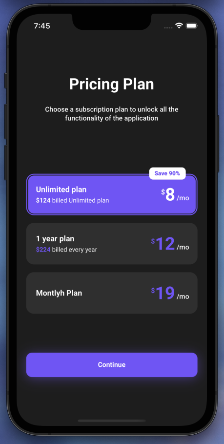
isSelected prop makes the whole subscribe card changes to a new selected one.
<SubscribeCard
  isSelected
  title="Unlimited plan"
  descriptionPrice="$124"
  description=" billed Unlimited plan"
  currency="$"
  price={8}
  timePostfix="/mo"
  onPress={() => {}}
/>
Discount / Save Optional Usage
discountText prop makes the available for the discount/save optional component.
<SubscribeCard
  discountText="Save 90%"
  title="Unlimited plan"
  descriptionPrice="$124"
  description=" billed Unlimited plan"
  currency="$"
  price={8}
  timePostfix="/mo"
  isSelected
  onPress={() => {}}
/>
Example Project 😍
You can checkout the example project
Simply run
npm ireact-native run-ios/android
should work of the example project.
Configuration - Props
Fundamentals
| Property | Type | Required | Default | Description |
|---|---|---|---|---|
| title | string | |
undefined | change the title |
| description | string | undefined | change the descrition | |
| descriptionPrice | string / number | undefined | change the descrition price | |
| price | string / number | undefined | change the price | |
| currency | string | undefined | change the currency icon such as $
|
|
| timePostfix | string | undefined | change the time postfix | |
| isSelected | boolean | false | enable the selected styling | |
| discountText | string | undefined | change the discount text | |
| onPress | function | undefined | set your own logic for the button functionality when it is pressed |
Customization (Optionals)
| Property | Type | Default | Description |
|---|---|---|---|
| style | ViewStyle | default | set or override the style object for the styling |
| containerStyle | ViewStyle | default | set or override the style object for the container style |
| selectedContainerStyle | ViewStyle | default | set or override the style object for the selected container style (when the isSelected prop is enable) |
| discountContainerStyle | ViewStyle | default | set or override the style object for the discount container style |
| outerContainerStyle | ViewStyle | default | set or override the style object for the outer container style |
| selectedOuterContainerStyle | ViewStyle | default | set or override the style object for the selected outer container style (when the isSelected prop is enable) |
| titleTextStyle | TextStyle | default | set or override the style object for the title text style |
| descriptionTextStyle | TextStyle | default | set or override the style object for the description text style |
| descriptionPriceTextStyle | TextStyle | default | set or override the style object for the description price text style |
| selectedDescriptionPriceTextStyle | TextStyle | default | set or override the style object for the selected description price text style (when the isSelected prop is enable) |
| currencyTextStyle | TextStyle | default | set or override the style object for the currency text style |
| selectedCurrencyTextStyle | TextStyle | default | set or override the style object for the selected currency text style (when the isSelected prop is enable) |
| priceTextStyle | TextStyle | default | set or override the style object for the price text style |
| selectedPriceTextStyle | TextStyle | default | set or override the style object for the selected price text style (when the isSelected prop is enable) |
| timeTextStyle | TextStyle | default | set or override the style object for the time text style |
| discountTextStyle | TextStyle | default | set or override the style object for the discount text style |
| TextComponent | Text | default | set your own component instead of default React Native's Text component |
| TouchableComponent | TouchableOpacity | default | set your own component instead of default React Native's TouchableOpacity component |
Future Plans
- [x]
LICENSE - [ ] Write an article about the lib on Medium
Credits
Big thanks to Maxim Sirotyuk. Heavily inspired by Maxim Sirotyuk's Amazing Design
Author
FreakyCoder, kurayogun@gmail.com
License
React Native Subsribe Card is available under the MIT license. See the LICENSE file for more info.


