React Native Badge Avatar
A user avatar display with support:
- default place holder
- name as Avatar
- url as Avatar
- onPress event callback
- Avatar border
- Avatar border color
- Avatar radius
- Badge Number
- Badge Icon
- Auto Badge Size & Position
Based on: https://github.com/Samoy/react-native-badge-view, https://github.com/avishayil/react-native-user-avatar
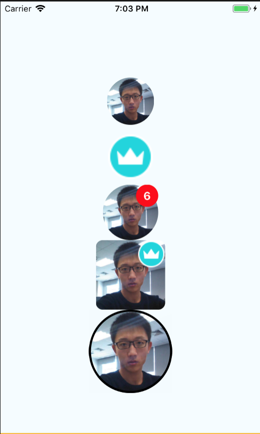
ScreenShot
Installation
npm install --save react-native-badge-avatar or yarn add react-native-badge-avatar
Usage
<Avatar size=68 name="Dean Guo" style= margin: 6 onPress= /> <Avatar size=68 style= margin: 6 placeholder= onPress= /> <Avatar size=80 name="Dean Guo" source="https://avatars3.githubusercontent.com/u/8385255?s=460&v=4" badge=6 /> <Avatar size=100 name="Dean Guo" radius=02 source="https://avatars3.githubusercontent.com/u/8385255?s=460&v=4" badge=6 badgeIcon= /> <Avatar size=120 borderColor="black" borderWidth=3 name="Dean Guo" source="https://avatars3.githubusercontent.com/u/8385255?s=460&v=4" />Avatar render priority:
- source > name > placeholder > default placeholder
Prop
| Prop | Type | Required | Default | Comment |
|---|---|---|---|---|
| name | string | optional | null | name of Avatar |
| source | string | optional | null | net image url of Avatar |
| placeholder | number | optional | png format default icon | local source of Avatar |
| onPress() | function | optional | null | Press event callback |
| size | number | optional | 48 | Size of Avatar, badge will be 1/4 of Avatar size |
| radius | number | optional | 1 | range of 0-1, 0 is rect, 1 is full circular |
| borderColor | string | optional | "" | avatar border color |
| borderWidth | number | optional | 0 | avatar border width |
| badge | string | optional | "" | badge number |
| badgeIcon | number | optional | "" | local source of badge icon |
| badgeTextColor | string | optional | white | badge text color |
| badgeBackgroundColor | string | optional | red | badge backgroud color |
| style | object | optional | null | compontent style same like default use |
  static propTypes = {
    badgeIcon: PropTypes.number,
    badgeTextColor: PropTypes.string,
    badgeBackgroundColor: PropTypes.string,
    badge: PropTypes.number,
    name: PropTypes.string,
    source: PropTypes.string,
    placeholder: PropTypes.number,
    size: PropTypes.number,
    radius: PropTypes.number,
    borderColor: PropTypes.string,
    borderWidth: PropTypes.number,
    onPress: PropTypes.func,
    ...View.propTypes
  };