React Friendly Input

This is a set of React form field components which don't change their value programmatically when focused. It helps to build controlled inputs that don't annoy users.
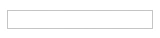
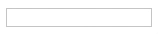
Here is a simple example. It is a React application where a user can change his/her name. A name must not start or end
with a space and must be not more than 10 characters long. The user is typing I am typing a text and pressing Tab.
| Plain input | Friendly input |
|---|---|
|
|
|
|
|
Status


Installation
There are several ways to install the components:
Simple
Download the plugin script and import it using a <script> tag after the React
import.
<!-- React --> <!-- React Friendly Input -->AMD/RequireJS
The script requires the following AMD modules to be available:
react— React.
Installation:
require; ;Node.js/NPM/Yarn/Webpack/Rollup/Browserify
Install the package:
npm install react-friendly-input --saveRequire it:
const reactFriendlyInput = ;Usage
The components are rendered like the plain React form fields. All the props are passed to the underlying DOM elements.
const Input TextArea Select = reactFriendlyInput; ReactDOM;If a field is focused, the field value doesn't change when a new value is given through the props. The new value is applied as soon as the field loses the focus.
A component can be uncontrolled:
const Input = reactFriendlyInput; return <Input ="initial value" />;You can change a field value using the value property. If the field is focused the value doesn't change.
const Input = reactFriendlyInput; let input;ReactDOM;inputvalue = 'value2';You can set a new value despite the focus using the forceValue method:
input;Making a custom friendly input
If you have a component that acts like a form field:
- Its element has a writable
valueattribute - Has the
defaultValue,onFocusandonBlurprops that acts the same as in the<input>component - Uncontrolled when doesn't receive the
valueprop
You can use the higher-order component function to make it friendly:
const palInput = reactFriendlyInput; Component // ... const FriendlyCustomField = ;Getting a reference to the DOM element
If you need to get a reference to the underlying element (e.g. to focus it), you have several options.
First is to use the friendly input input property:
const Input = reactFriendlyInput; return <Input = />;Second is to use the inputRef prop:
const Input = reactFriendlyInput; return <Input = />; // String refs are not supported hereBuilding and testing
The source code is located in the src directory. When you first download the code, install
node.js version 8 or greater, open a console, go to the project root directory and run:
npm installRun to compile the source code:
npm run buildRun to test:
npm testCompile the code before testing because the test uses the compiled code. An Internet connection is required to test because multiple React versions are downloaded while testing.
Versions compatibility
The project follows the Semantic Versioning.
License
MIT. See the LICENSE file for details.