react-expansion
Fully customizable and reusable expand/collapse component

What is this
react-expansion sees the expand/collapse system as the composition of multiple bricks. the picture bellow resumes it all.
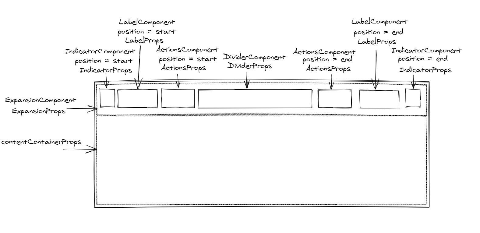
Picture generated with excalidraw.
Install
npm install --save react-expansionor
yarn add react-expansionDemo
This ongoing codeSandbox will contain reusable examples

Props and Usage hints
To use react-expansion, you need to define a few components on your own because we prefer to stay agnostic to the UI.
These components will receive the following props:
| Prop | value |
|---|---|
expanded |
a boolean that indicates whether the component is expanded/collapsed |
toggleExpansion |
if controlled, will toggle the expansion state |
position |
will be spread to IndicatorComponent, LabelComponent and ActionsComponent, and indicates respectively the position of the nested component |
The ExpandCollapse component props are:
| Prop | PropType | Default value | Usage |
|---|---|---|---|
expanded |
bool |
undefined |
If present, the expand collapse becomes controlled by this prop |
initialValue |
bool |
false |
If not controlled, this is the initial expansion state when the component is mounted |
labelPosition |
oneOf(['start', 'end']) |
start |
Indicates the position of the label component and/or label children |
actionsPosition |
oneOf(['start', 'end']) |
end |
Indicates the position of the action component and/or the actions children |
indicatorPosition |
oneOf(['start', 'end']) |
end |
Indicates the position of the indicator component |
Component |
String or func |
React.Fragment |
Is the component in which the Expansion header and content will be wrapped into |
ComponentProps |
object |
{} |
The props of the top level wrapper component |
ExpansionComponent |
String or func |
undefined |
The component to be mounted to wrap the Expansion Header (that contains the indicator, label, actions, divider) |
ExpansionProps |
object |
{} |
The props to be passed to the ExpansionComponent plus the automatic props described the in the previous table |
IndicatorComponent |
String or func |
undefined |
The component that is supposed to indicate the expansion state and toggles it |
IndicatorProps |
object |
{} |
The props to be passed to the IndicatorComponent plus the automatic props described the in the previous table |
LabelComponent |
String or func |
undefined |
The component in which the label prop is wrapped |
LabelProps |
object |
{} |
The props to be passed to the LabelComponent plus the automatic props described the in the previous table |
ActionsComponent |
String or func |
undefined |
The component in which the actions prop is wrapped |
ActionsProps |
object |
{} |
The props to be passed to the ActionComponent plus the automatic props described the in the previous table |
DividerComponent |
String or func |
undefined |
The component that will be mounted as a divider (may be an hr or any custom object (even a form)) |
DividerProps |
object |
{} |
The props to be passed to the DividerComponent plus the automatic props described the in the previous table |
contentContainerProps |
object |
{} |
The props to be passed to the div containing the content, these props are only passed if the component is expaned |
actions |
any |
undefined |
The actions children to be mounted in the actions area |
children |
any |
undefined |
What will be hidden/visible depending on the expansion state |
label |
any |
undefined |
The label to display in its position |
keepMounted |
bool |
undefined |
If true, the content will stay into the dom, but the div containing it will have a display: none style |
onExpandChange |
func |
undefined |
will be called with the next expansion state whenever the expand collapse changed |
contentDisplay |
string |
undefined |
The display style property's value that will be given the content container when visible |
You can also imperatively handle the expansion state if not controlled.
The useImperativeHandle hook exposes the following functions:
- expand
- collapse
- toggleExpansion
and can be used like this:
const myRef = React { myRefcurrent} { myRefcurrent} { myRefcurrent}// later<SomeButton =>Toggle</SomeButton><SomeButton =>Expand</SomeButton><SomeButton =>Collapse</SomeButton><ExpandCollapse = >Some tags and children</ExpandCollapse>Limitations and roadmap
- The
ExpandCollapsecomponent wraps the children in adivso itsdisplaystyle is managed and thus we can offer thekeepMountedability - There is no support for animations, but we hope it will be released in the
v2(instead, you can pass the needed css using className or style via thecontentContainerProps)
Usage examples
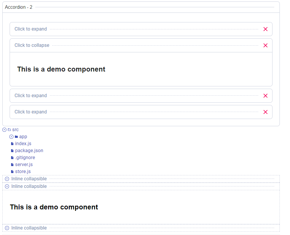
There is a lot of examples that can be made with this ExpandCollapse.
Let's create a navigation file system that will display a files tree (folders & files).
I will be using Material-ui to illustrate my examples for faster dev.
First: the IndicatorComponent
const useIndicatorStyles = ; { const classes = if variant === 'file' return null; // no indicator when it's a file return <IconButton ="primary" = = ="small"> <SvgIcon => expanded ? <ArrowDown /> : <ArrowRight /> </SvgIcon> </IconButton> }Then: the LabelComponent
import File from '@material-ui/icons/InsertDriveFile'import FolderOpen from '@material-ui/icons/FolderOpen'import FolderClosed from '@material-ui/icons/Folder' const useStyles = { const classes = { if fileUrl else } return <Typography = ="primary" ="div" => <SvgIcon => variant === 'folder' && expanded && <FolderOpen/> variant === 'folder' && !expanded && <FolderClosed/> variant === 'file' && <File/> </SvgIcon> <Typography ="primary" ="span"> filename </Typography> </Typography> }Then: the DividerComponent which will be nothing:
{ return null;}And then, the FileUnit that returns our ExpandCollapse:
{ return <ExpandCollapse ="div" ='start' ='div' = = = = = = = > children </ExpandCollapse> }The resulting ExpandCollapse with a minimal example will give this output
We can also create a large variant of expand collapse and combine them. Here is a picture, I am still looking to create multiple other examples in a demo package.
License
MIT © incepter