react-autocomplete-select


React Autocomplete for input field, all styles are fully customizable. In which you could modify or customize the options JSX or add any kind of input field's JSX and any of the css to any element according to your need.
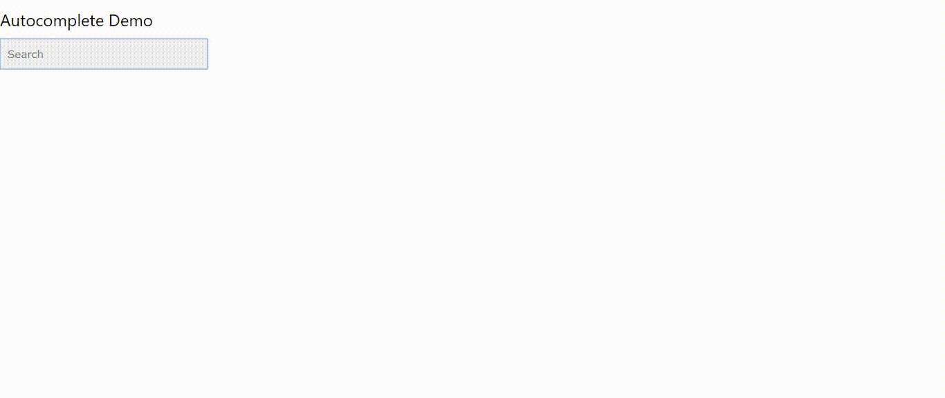
Example
Instalation & Configuration
npm install --save react-autocomplete-select
and after installation , Import this package where you want to use the calendar...
import Autocomplete from "react-autocomplete-select";
Use it in this way...
; inputRef = React; state = changedValue : '' { thisinputRefcurrent; } { // get input field value // console.log(this.inputRef.current.value); } { return <div> <h3>Autocomplete Demo</h3> <Autocomplete inputRef=thisinputRef // being passed as input field's ref prop // so you can handle it on your own // if you want to add animation or any other js stuff to it defaultInputValue = 'any string your choice' searchPattern='containsString' // possible values are // ['containsString','containsLetter','startsWith','endsWith'] selectOnBlur = false // whether active dropdown option should // select or not when input field is blured placeholder = "Type to Search" // input field's placeholder maxOptionsLimit = 10 // max options to show in dropdown searchEnabled = true /** if axiosConfig prop is passed //then itemsData prop is ignored. // And shows the data as returned by the axios request // and does not make the search on the response data of axios request. // If you want to enable search on the axios response data // then set searchEnabled = **/ getItemValue={ return itemcountry } /** get the value from // every element of array passed object // e.g if data to make search on is this // [{country: 'USA'},{country: 'UK'}] // then you will set this prop just like this // getItemValue={(item)=>{ return item.country }} **/ optionsJSX = <span>value</span> // custom option JSX ... // you can enclose the passed value in any valid jsx tags... onChange = { this; } // called every time the input values get changes onSelect = { console } // called when an option is selected axiosConfig = url : 'http://local.cuddlynest.com/autocomplete.php? query=${inputFieldValue}' method : 'get' // default, responseType : 'JSON' // enable this option otherwise will not // work properly and response from the // server should return the data // in json format // you could pass any of the axios config ... // check axios config docs on this url // https://github.com/axios/axios#request-config itemsData = "country": "United State" "country": "United Kingdom" "country": "Canada" "country": "Australia" "country": "New Zealand" inputJSX = <div className="mainSearchInputContainer"><i className="material-icons">search</i><input ...props className="inputClass" /></div> // must pass the {...props} to the input field // and don't style any jsx element with style={{}} way, instead // assign className to any of the JSX element , // because some of the stylings // does not get overridden like background color of input // is not overridden by using // style={{}} props or importing your style.css file and better // you can use it by giving className='exampleClass' // then style them in "globalStyle" props... globalStyle = " .mainSearchInputContainer { background: #FFFFFF; border: 1px solid #DCDADC; box-sizing: border-box; box-shadow: 0px 2px 4px rgba(0, 0, 0, 0.1); border-radius: 2px; height:45px; } .material-icons { position: absolute; left: 1.94%; right: 86.94%; top: 29.41%; bottom: 26.47%; vertical-align:middle; } .inputClass { position: absolute; left: 9.81%; right: 70.97%; top: 17.65%; bottom: 17.65%; font-family: Fira Sans; font-style: normal; font-weight: normal; font-size: 18px; line-height: 22px; background: #FFFFFF; outline : none; width: 265px; } " /> </div> } Functional Guide
| Property Name | Default | Description | Type | Short Example |
|---|---|---|---|---|
| onSelect : Optional | N/A | this method is called, when user selects the option from the dropdown | function | <Autocomplete onSelect= (selectedValue) => { // do whatever you want to do } |
| onChange : Optional | N/A | called whenever input value changes | Array | <Autocomplete onChange= (changedValue) => { // do whatever you want to do } |
| itemsData : Required | [] | data from which we will make search when user will type something in the input field | Array<Object,Object> | <Autocomplete itemsData= [ {country:'USA',country:'UK'} ] /> |
| axiosConfig : Optional | false | If you provide axiosConfig data then itemsData will be ignored | function:Object | <Autocomplete axiosConfig= {inputValue => ({ url:http://locahost/yourfile.php?query=${inputValue}// you can provide here any of axios config parameters }) } |
| getItemValue : Required | N/A | getItemValue method returns the value that we will use to search and show in the dropdown options | function:Any | <Autocomplete getItemValue={(item)=>{ return item.name }} |
| selectOnBlur : Optional | false | selectOnBlur decides whether to select the active option or not when input is blured | boolean | <Autocomplete selectOnBlur = {false} /> |
| searchPattern : Optional | containsString | searchPattern decides the method of search | string< startsWith, endsWith, containsString, containsLetter> | <Autocomplete |searchPattern={'containsString'} /> |
| placeholder : Optional | Search | placeholder for input field | string | <Autocomplete placeholder = "Type to Search" /> |
| inputRef : Optional | N/A | this property value should be of React.createRef() type and will be passed to input field as a ref prop so you can handle any js stuff like focus or get or set input field value | Object<React.createRef> | <Autocomplete inputRef={this.inputRef} /> |
| optionsJSX : Optional | N/A | you can make the option customized as you want by writing any valid JSX | function | <Autocomplete optionsJSX = { (value)=><span>value</span>} /> |
| inputJSX : Optional | (props)=><input {...props} /> | you can make the input field fully customized as you want by writing any valid JSX, but try styling it by giving it className and then style it in globalStyle props | function | <Autocomplete inputJSX = { (props)=><input {...props} />} /> |
| maxOptionsLimit : Optional | 10 | if we got thousands of records in our response or we have passed it in itemsData prop then we could limitize the data to be shown up to an extent e.g 10 | number | <Autocomplete maxOptionsLimit = { 10 } /> |
| searchEnabled : Optional | false | enable search on axios responded data | boolean | <Autocomplete searchEnabled = {true} /> |
| defaultInputValue : Optional | N/A | this default value shows up in the input field on page load and on input field blur | string | <Autocomplete defaultInputValue = {'any string of your choice'} /> |
Style Guide
| globalStyle : String (Optional) |
|---|
Default Value :
/*the container must be positioned relative:*//*Dropdown options container css*//*Dropdown options each div css*//*Dropdown options each div on hover css*//*when navigating through the items using the arrow keys:*/
Description :
you could modify or override any of the above default provided css....
Server Side Axios Search Data Example
you client side Autocomplete code goes here
; { return <Autocomplete getItemValue=itemcountry itemsData = url: 'http://localhost/autocomplete.php?query='+inputValue method : 'get' responseType : 'JSON' // necessary to parse the response... // and you could pass any of the axios config parameters here... /> } Server side guide
here you need to generate a PHP file if you are using php otherwise use other file like Asp or nodeJs file accordingly...
and put your file on the specified path and make request to search data according to request.
PHP file name autocomplete.php
Version Upgradation guide
In version 0.1.9
prop ref={} was replaced by inputRef
In version 0.1.10
A new prop was added to show the default value if there is no value in the input field. it shows up in the input field on page load and on input field blur defaultInputValue = {'any default value'}