customizable-discordjs-pagination


This package features a fully customizable embed pagination for DiscordJS V13 and V14. The User can modify the buttons to their liking and enable/disable Select Menu.
Install package
npm install customizable-discordjs-pagination
Discord.js v13 Example
const Pagination = require('customizable-discordjs-pagination');

// Make Embeds using DiscordJS package
const pages = [embed1, embed2, embed3];

const buttons = [
   { label: 'Previous', emoji: '⬅', style: 'DANGER' },
   { label: 'Next', emoji: '➡', style: 'SUCCESS' }
];

new Pagination()
   .setCommand(message)
   .setPages(pages)
   .setButtons(buttons)
   .setPaginationCollector({ timeout: 120000 })
   .setSelectMenu({ enable: true })
   .setFooter({ enable: true })
   .send();
Discord.js v14 Example
const Pagination = require('customizable-discordjs-pagination');
const { ButtonStyle } = require('discord.js'); // Discord.js v14+

// Make Embeds using DiscordJS package
const pages = [embed1, embed2, embed3];

const buttons = [
   { label: 'Previous', emoji: '⬅', style: ButtonStyle.Danger },
   { label: 'Next', emoji: '➡', style: ButtonStyle.Success },
]

new Pagination()
   .setCommand(message)
   .setPages(pages)
   .setButtons(buttons)
   .setPaginationCollector({ timeout: 120000 })
   .setSelectMenu({ enable: true })
   .setFooter({ enable: true })
   .send();
Screenshots
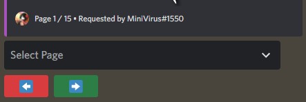
2 Buttons - Previous and Next

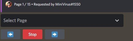
3 Buttons - Previous, Stop and Next

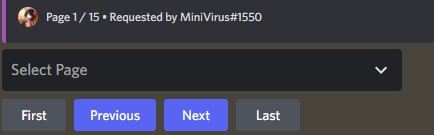
4 Buttons - First, Previous, Next, Last

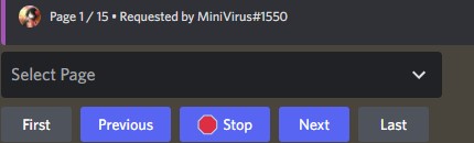
5 Buttons - First, Previous, Stop, Next, Last

Documentation
new Pagination()
   .setCommand(message)
   .setPages(pages)
   .setButtons(buttons)
   .setPaginationCollector({ timeout: 120000 })
   .setSelectMenu({ enable: true })
   .setFooter({ enable: true })
   .setCustomComponents([])
   .setCustomComponentsFunction(fn)
   .send();
Methods
| Name |
Optional |
Details |
| setCommand(message / interaction) |
❌ |
Message or Slash Interaction Accepted |
| setPages(pages) |
❌ |
Array of MessageEmbeds(DiscordJS V13) or EmbedBuilder(DiscordJS V14) |
| send() |
❌ |
Executes the pagination |
| setButtons([{ parameters }, { parameters }, ...]) |
✔️ |
Array of objects containing styles, labels and/or emojis for the buttons |
| setPaginationCollector({ parameters }) |
✔️ |
Optional Method to set Select Menu Options |
| setSelectMenu({ parameters }) |
✔️ |
Optional Method to set Collector Options |
| setFooter({ parameters }) |
✔️ |
Optional Method to set Footer Options |
| setCustomComponents({ parameters }) |
✔️ |
Optional Method to set Custom Component Options |
| setCustomComponentsFunction(fn) |
✔️ |
Optional Method to set Custom Component Function |
Optional Methods
setButtons([{ parameters }, { parameters }, ...])
Default: An Empty Array ( [] )
| Parameter |
Type |
Details |
| label |
String |
The text to be displayed on this button |
| emoji |
Emoji |
The emoji to be displayed on this button |
setFooter({ parameters })
Defaults:
- {User Tag} - message.member.user.tag || interaction.member.user.tag
- {User Avatar} - message.author.displayAvatarURL({ dynamic: true }) || interaction.user.displayAvatarURL({ dynamic: true })
| Parameter |
Type |
Default |
Details |
| option |
String |
'default' |
'user' - Uses the User's Embed Footer; 'none' - Remove Embed Footer; 'default': The Package Default Footer with parameters modifications(Below) |
| pagePosition |
String |
'left' |
Adjust the pagePosition to the left, right or none. |
| extraText |
String |
'Requested by {User Tag}' |
The user can customize this text to be displayed on the footer |
| enableIconURL |
Boolean |
true |
Set tp false to disable Footer Icon(Image) |
| iconURL |
String |
{User Avatar} |
The icon URL of the footer |
setSelectMenu({ parameters })
| Parameter |
Type |
Default |
Details |
| enable |
Boolean |
false |
Set to true to enable Select Menu |
| placeholder |
String |
'Select Page' |
The text to be displayed as placeholder for the Select Menu |
| pageOnly |
Boolean |
false |
True: Forced Select Menu Options is page numbers; False: Select Menu Options is the Embed Title(if different), otherwise page numbers |
setPaginationCollector({ parameters })
| Parameter |
Type |
Default |
Details |
| components |
String |
'disable' |
Options: 'disable' - Disables the components at the end ; 'disappear' - Remove the components at the end |
| ephemeral |
Boolean |
false |
Set to true to make the Pagination Collector ephemeral |
| resetTimer |
Boolean |
true |
Set to true to reset the Pagination Collector timer |
| startingPage |
Number |
1 |
Set Default Page Number |
| secondaryUserInteraction |
Boolean |
false |
Set to true to allow secondary user interaction |
| secondaryUserText |
String |
'This isn't your interaction.' |
The text to be displayed for the secondary user |
| timeout |
Number |
120000 |
The time in milliseconds before the Pagination Collector times out |
setCustomComponents([component, ...])
Default: An Empty Array ( [] )
| Parameter |
Type |
Details |
| component |
ActionRow |
Represents an action row component |
setCustomComponentsFunction(fn)
| Parameter |
Type |
Details |
| fn |
Function |
Function to handle the custom component |
Example:
const customFn = function fn({ message, msg, pages, collector, setPage, setPages }, interaction) {
   switch(interaction.customId) {
      case 'test':
         setPage(2);
         break;
   }
}

return new Pagination()
   .setCustomComponentsFunction(customFn)
   . ...
Bots that use this package