

Bootstrap Switch Button
Bootstrap Switch Button converts plain checkboxes into awesome switch buttons.
Library Distributions
| Project | Description |
|---|---|
| bootstrap4-toggle | Supports bootstrap4 (requires jQuery) |
| bootstrap-switch-button | Supports bootstrap4+ (ES6 class, no dependencies) |
| bootstrap-switch-button-react | Supports bootstrap4+ (React component, no dependencies) |
Demos
Demos and API Docs: https://gitbrent.github.io/bootstrap-switch-button/
Installation
CDN
Download
NPM
npm i bootstrap-switch-button -- saveYarn
yarn add bootstrap-switch-buttonUsage
Initialize With HTML
Simply add data-toggle="switchbutton" to automatically convert a plain checkbox into a bootstrap 4 switch button.
Initialize With Code
Switch buttons can also be initialized via JavaScript code.
EX: Initialize id chkSwitch with a single line of JavaScript.
API
Options
- Options can be passed via data attributes or JavaScript
- For data attributes, append the option name to
data-(ex:data-onlabel="Enabled")
| Name | Type | Default | Description |
|---|---|---|---|
onlabel |
string/html | "On" | Text of the on switch button |
offlabel |
string/html | "Off" | Text of the off switch button |
onstyle |
string | "primary" | Style of the on switch button. Possible values are: primary,secondary,success,danger,warning,info,light,dark |
offstyle |
string | "light" | Style of the off switch button. Possible values are: primary,secondary,success,danger,warning,info,light,dark |
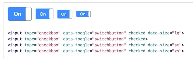
size |
string | "normal" | Size of the switch button. Possible values are: large, normal, small, mini. |
style |
string | Appends the value to the class attribute of the switch button. This can be used to apply custom styles. Refer to Custom Styles for reference. | |
width |
integer | null | Sets the width of the switch button. if set to null, width will be auto-calculated. |
height |
integer | null | Sets the height of the switch button. if set to null, height will be auto-calculated. |
Methods
Methods can be used to control switch buttons directly.
| Method | Example | Description |
|---|---|---|
| initialize | $('#switch-demo').switchButton() |
Initializes the switch button plugin with options |
| destroy | $('#switch-demo').switchButton('destroy') |
Destroys the switch button |
| on | $('#switch-demo').switchButton('on') |
Sets the switch button to 'On' state |
| off | $('#switch-demo').switchButton('off') |
Sets the switch button to 'Off' state |
| toggle | $('#switch-demo').switchButton('toggle') |
Toggles the state of the switch button on/off |
| enable | $('#switch-demo').switchButton('enable') |
Enables the switch button |
| disable | $('#switch-demo').switchButton('disable') |
Disables the switch button |
Events
Event Propagation
Note All events are propagated to and from input element to the switch button.
You should listen to events from the <input type="checkbox"> directly rather than look for custom events.
API vs Input
This also means that using the API or Input to trigger events will work both ways.
On by APIOff by APIOn by InputOff by Input