
Radial Color Picker - React


Introduction
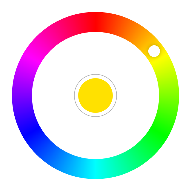
Great UX starts with two basic principles - ease of use and simplicity. Selecting a color should be as easy as moving a slider, clicking a checkbox or pressing a key just like other basic form elements behave.
This is a flexible and minimalistic color picker. Developed with mobile devices and keyboard usage in mind. Key features:
- Small size - 2.9 KB gzipped (JS and CSS combined)
- Supports touch devices
- Optimized animations
- Ease of use
- Screen reader support.
- Tab to focus the picker.
- ↑ or → arrow key to increase hue. PgUp to go quicker.
- ↓ or ← arrow key to decrease hue. PgDown to go quicker.
- Enter to select a color and close the picker or to open it.
- Mouse ScrollUp to increase and ScrollDown to decrease hue (Opt-in).
Ecosystem
The right color picker, but not the framework you're looking for?
Demos
- Basic Example - Codepen
Usage
With Module Build System
Color Picker on npm
npm install @radial-color-picker/react-color-pickerAnd in your app:
import ColorPicker from '@radial-color-picker/react-color-picker';
import '@radial-color-picker/react-color-picker/dist/style.css';

function App() {
    const [color, setColor] = useState({
        hue: 90,
        saturation: 100,
        luminosity: 50,
        alpha: 1,
    });

    const onInput = (hue) => {
        setColor((prev) => ({ ...prev, hue }));
    };

    return <ColorPicker {...color} onInput={onInput} />;
}
Depending on your build tool of choice (vite, webpack, etc.) you may have to setup the appropriate plugins or loaders. If you're using vite you don't have to do anything else - it comes preconfigured and supports CSS import out of the box.
Options
ColorPicker can be used either as a controlled component or as uncontrolled component.
// Controlled component. Its current state is defined and updated by the props you pass to it.
<ColorPicker hue={value} onInput={(hue) => setValue(hue)} />

// Uncontrolled component. You can use onChange to react to knob rotation stop for example.
<ColorPicker onChange={(hue) => console.log('Current color:', hue)} />| Name | Type | Default | Description |
|---|---|---|---|
| hue | Number | 0 |
A number between 0-359. |
| saturation | Number | 100 |
A number between 0-100
|
| luminosity | Number | 50 |
A number between 0-100
|
| alpha | Number | 1 |
A number between 0-1
|
| disabled | Boolean | false |
A boolean to disable UI interactions |
| step | Number | 2 |
Amount of degrees to rotate the picker with keyboard and/or wheel. |
| variant | String | collapsible |
Use persistent to prevent collapsing/closing |
| initiallyCollapsed | Boolean | false |
Hides the palette initially |
| mouseScroll | Boolean | false |
Use wheel (scroll) event to rotate. |
| ariaLabelColorWell | String | color well |
Labels the color well |
| onInput | Function | noop | Called every time the color updates. Use this to update the hue prop. |
| onChange | Function | noop | Called every time the color changes, but unlike onInput this is not called while rotating the knob. |
| onSelect | Function | noop | Called when the user dismisses the color picker (i.e. interacting with the middle color well). |
First Asked Questions
What's the browser support?
The last two versions of major browsers (Chrome, Safari, Firefox, Edge) are supported though it will probably work in other browsers, webviews and runtimes as well.
How to select other shades of the solid colors?
We suggest to add a custom slider for saturation and luminosity or use <input type="range">.
Why exactly onInput/onChange events?
Event names are based on the HTML <input type="color">. MDN: As is the case with other <input> types, there are two events that can be used to detect changes to the color value: input and change. input is fired on the <input> element every time the color changes. The change event is fired when the user dismisses the color picker.
Why is the scroll-to-rotate functionality not turned on by default?
It's another non-passive event that could potentially introduce jank on scroll. To rotate the color knob, but stay on the same scrolling position the wheel event is blocked with preventDefault(). Thus, if you really want this feature for your users you'll have to explicitly add mouseScroll={true}.
Change log
Please see Releases for more information on what has changed recently.
Migration
Migration from v3 to v4
- In an effort of project modernization, CJS build is no longer provided. The UMD build is deprecated and will be removed in a future version.
- Non-minified builds are no longer provided. Use the minified build artifacts instead.
- The StyleSheet in the
distdirectory has been renamed fromreact-color-picker.min.csstostyle.css.
Migration from v2 to v3
-
Double-click to move the knob to the current position of the pointer is gone since this is now the default behavior as soon as the clicks on the palette. If you had a tooltip or a help section in your app that described the shortcut you should remove it.
-
With v3 the keyboard shortcuts are better aligned with the suggested keys for any sliders. This means that the Shift/Ctrl + ↑/→/Shift/Ctrl + ↓/← non-standard key combos are replaced by the simpler PageDown and PageUp. If you had a tooltip or a help section in your app that described the shortcut keys you should update it.
-
The
onChangeevent is now emitted when the user changes the color (knob drop, click on the palette, keyboard interaction, scroll) and aonSelectevent is emitted when interacting with the color well (middle selector).
  <ColorPicker
      hue={hue}
      onInput={updateHue}
-     onChange={onColorSelect}
  />

  <ColorPicker
      hue={hue}
      onInput={updateHue}
+     onChange={onColorChange}
+     onSelect={onColorSelect}
  />
Migration from v1 to v2
v2 comes with lots of performance improvements like native CSS conic-gradient support and lots of bugfixes, but some things were changed as well.
- The UMD prefix in the CSS file name is now gone:
- import '@radial-color-picker/react-color-picker/dist/react-color-picker.umd.min.css';
+ import '@radial-color-picker/react-color-picker/dist/react-color-picker.min.css';- The
onChangeprop is calledonInputandonSelectprop is calledonChangenow. The reason for that is to align with the event names on the HTML<input type="color">.
- <ColorPicker {...color} onChange={onHueChange} onSelect={onMiddleSelectorClick} />
+ <ColorPicker {...color} onInput={onHueChange} onChange={onMiddleSelectorClick} />- The
onInputandonChangeprops were streamlined and will no longer pass thesaturation,luminosityandalphaprops back. Insteadhuewill be the only param. This reduces unneeded object creation and in certain edge-cases skips unneeded re-renders (comparing two numbers vs. two objects).
- const onHueChange = (color) => {
-     setHue(color.hue);
- };

+ const onHueChange = (hue) => {
+     setHue(hue);
+ };- The internal CSS class names also changed. You should avoid relying on the inner DOM structure and CSS class names, but if you did here's a handy list of what was renamed:
-
.color-picker->.rcp -
.palette->.rcp__palette -
.knob->.rcp__knob -
.rotator->.rcp__rotator -
.selector->.rcp__well -
.ripple->.rcp__ripple -
.is-in->.in -
.is-out->.out -
.is-pressed->.pressed -
.is-rippling->.rippling -
@keyframes color-picker-ripple->@keyframes rcp-ripple -
@keyframes color-picker-beat->@keyframes rcp-beat
-
Contributing
If you're interested in the project you can help out with feature requests, bugfixes, documentation improvements or any other helpful contributions. You can use the issue list of this repo for bug reports and feature requests and as well as for questions and support.
Please see CONTRIBUTING and CODE_OF_CONDUCT for details.
Credits
This component is based on the great work that was done for the AngularJs color picker angular-radial-color-picker.
License
The MIT License (MIT). Please see License File for more information.