Vuex-table
Vuex-table is a Vue component created in order to easily fit in any Vue (even Vuex or Typescript) project. It consists on a table representation of informations whose data can be provided both from frontend or backend.
NEW ! Vuex-table is now coded on Vue.js and Typescript (see Documentation)
Features ⚙
-
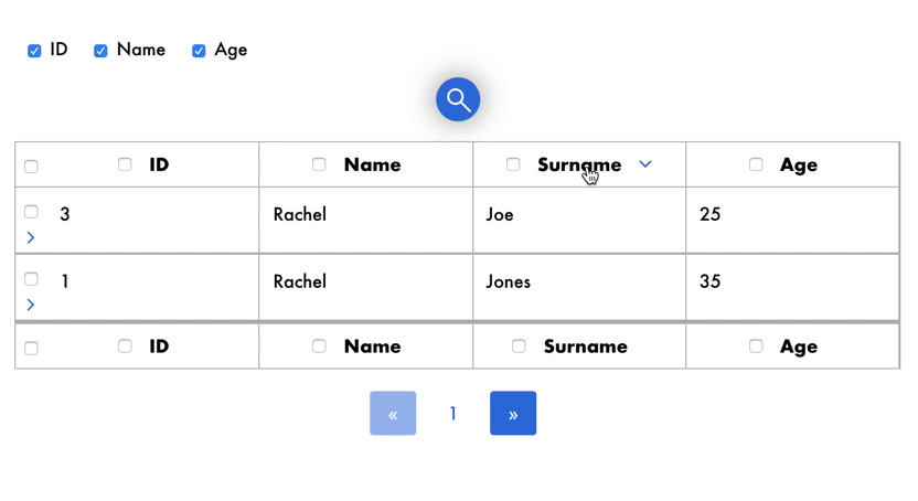
Sorting
Rows can be sorted according to column field (ex. sorting names alphabetically )
-
Selection
Rows can checked one by one or all at once by clicking on checkbox.
-
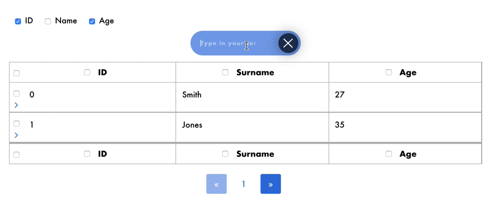
Search
Rows which match with user input in searchbar will be displayed, so that user can easily find the information he/she is looking for.
-
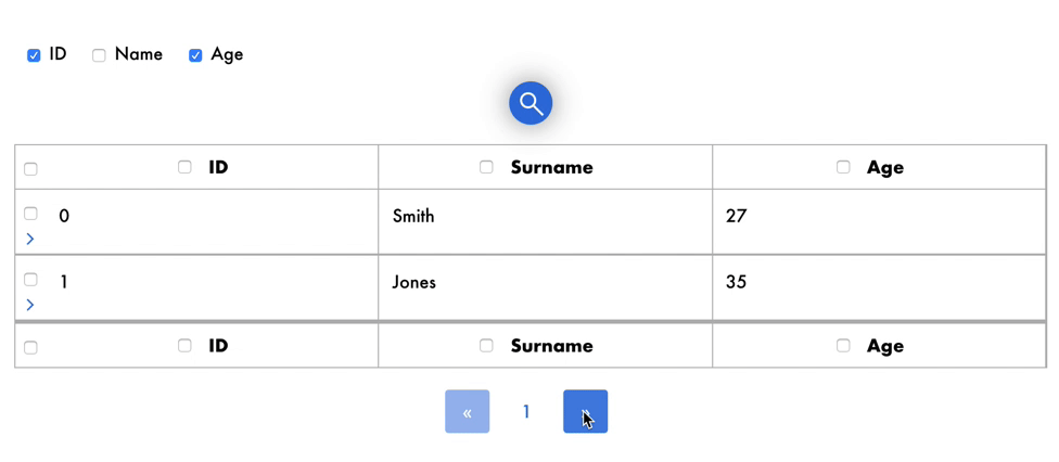
Pagination
For better browsing on data, a maximum number of rows is displayed and others can be shown just by changing page.
-
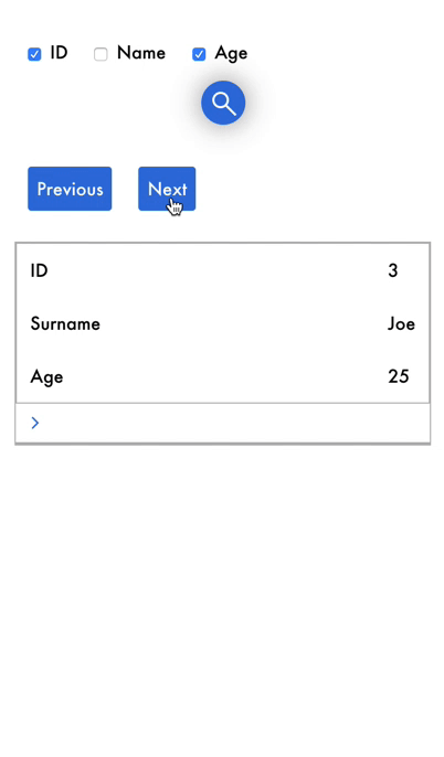
Show/Hide details
Each row may contain details that users can show and hide by clicking on the icon.
-
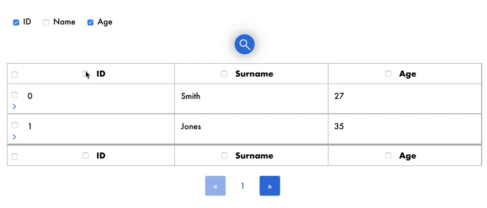
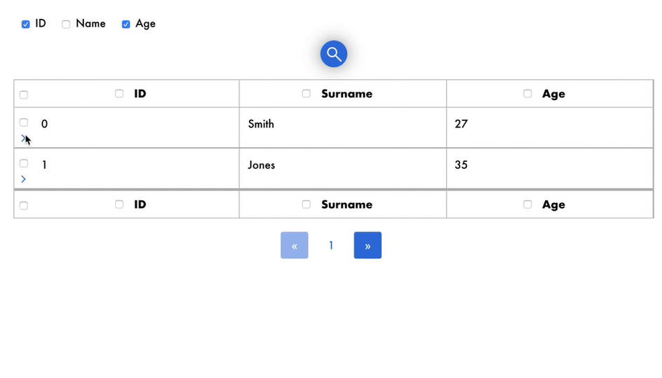
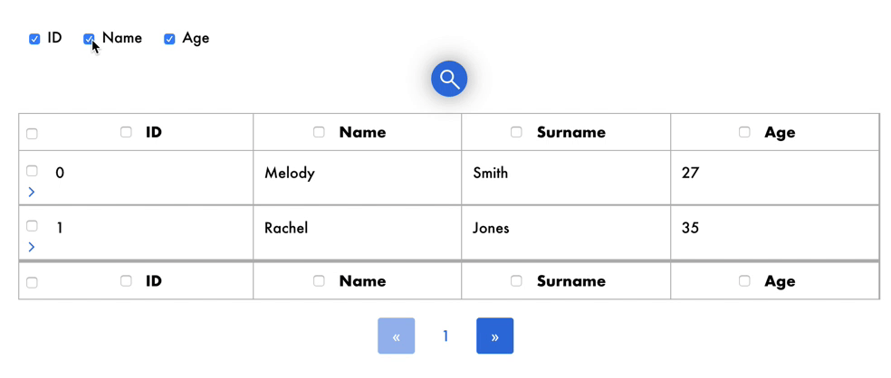
Show/Hide columns
Each column can be hidden or shown by clicking on the appropriate checkbox.
-
Responsive
Vuex-table is responsive, with simple and intuitive mobile User Experience.
Language Support (i18n)
Vuex-table is conceived to be translated in all languages. In order to properly set your default language you need the following elements:
- ISO 639-1 code in lowercase of the language (i.e.
enfor English,frfor French, etc) - A script or JSON containing all translations for each language you'd like to add
Example (for setting German):
// externalLangs.js

export default {
    "de":
        {
            "search": "Geben Sie Ihren Suchbegriff ein",
            "previous": "Vorheriges Item",
            "next": "Nächstes Item"
        }
    }
Then you can change your default language like this
import ExternalVuexTableLangs from '../langs/externalLangs.js;

<vuex-table current-lang="de" :langs='ExternalVuexTableLangs' />
Documentation 📔
Documentation is in the docs directory.
You can find here online documentation.
Quick start 🚀
Pss...it's easy! 😎
Install
npm install --save vuex-table
or
yarn add vuex-table
To install dependencies
npm install
Import
import Vue from 'vue';
import VuexTable from 'vuex-table';

Vue.use(VuexTable);
### Example
<template>
    <vuex-table
        :headers="state.headers"
        :data="state.data"
        :selectable-columns="true"
        :selected-columns.sync="state.selectedColumns"
        :selected-rows.sync="state.selectedRows"
        :enable-details="true"
        :items-per-page="state.itemsPerPage"
        :current-page.sync ="state.currentPage"
    >
        <template slot-scope="props">
             {{props.data}}
        </template>
        <template slot="details" slot-scope="props">
            <span>Lorem ipsum dolor sit amet, consectetur adipisicing elit. Aut consequatur cupiditate deserunt eligendi eveniet iste iure, labore minus natus nostrum numquam pariatur placeat porro quia repellat veniam vero voluptatem voluptates.</span>
        </template>
    </vuex-table>
</template>
API
Properties
| Name | Description | Type | Values | Default |
|---|---|---|---|---|
backend-pagination |
Use asynchronous data fetching from any API or backend | boolean | - | false |
backend-sorting |
Use asynchronous data sorting from any API or backend | boolean | - | false |
current-lang |
Current lang of the table | string | ISO 639-1 | en |
current-page |
Current page showed when initializing the table | number | - | 1 |
data |
Data passed to the table | Object[] | required | - |
default-sort-direction |
Sort direction by default | string | asc OR desc | asc |
details |
All opened detail slots by default | number[] | - | [] |
enable-details |
Enable detail slots for each row | boolean | - | false |
headers |
Headers of the table | Object[] | required | - |
is-sortable |
Allow columns to be sorted | boolean | - | true |
langs |
Extra langs added by the user (see related section) | Object | - | {} |
paginated |
Enable pagination | boolean | - | true |
selectable-columns |
Allow columns to be selected | boolean | - | false |
selectable-rows |
Allow rows to be selected | boolean | - | false |
selected-columns |
Selected columns when initializing the table | number[] | - | [] |
selected-rows |
Selected rows when initializing the table | number[] | - | [] |
total |
Total number of items (for pagination) | number | required | - |
Slots
| Slot name | Description | Props (if scoped) |
|---|---|---|
default |
Default slot rendered for each cell | field: string, row: number, column: number, header: Object, data: any |
details |
Row detail (collapsible) | row: number |
Events
| Event name | Description | Parameters |
|---|---|---|
sort |
Triggered when a sort is requested | header: Object, currentSortDirection: asc OR desc |
next-card |
Triggered in mobile mode when the next item is requested | oldCard: number, newCard: number |
previous-card |
Triggered in mobile mode when the previous item is requested | oldCard: number, newCard: number |
details-open |
Triggered when a detail slot is opened | index: number |
details-close |
Triggered when a detail slot is closed | index: number |
selected-row |
Triggered when a row is selected or de-selected | selection: number[], newlySelectedRow: number (-1 if all is selected), isDeselected: boolean |
selected-column |
Triggered when a column is selected or de-selected | selection: number[], newlySelectedRow: number (-1 if all is selected), isDeselected: boolean |
page-change |
Triggered the current page change | oldPage: number, newPage: number |
Collaborators 👩🏻💻👨🏼💻
License
Code released under MIT license.
Copyright (c) 2019, Superpitch.