vue-jLunar-datePicker
@JinWen
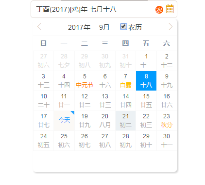
Lunar-Date-Picker component, lightWeight, powerful, easy to use, with festival and solar terms.
Online demo
Getting Start
New for 2.0
1、add a new Property : type : DATE/DATERANGE (you can pick a period of time by use DATERANGE option)
2、fixed bugs
Install
npm install vue-jlunar-datepicker --save
Usage
main.js
import Vue from 'vue'; import JDatePicker from 'vue-jlunar-datepicker'; Vue.component("j-date-picker",JDatePicker); test.vue
<template> <j-date-picker v-model="value1" :width="width1" :placeholder="placeholder" :picker-options="pickerOptions" :rangeSeparator="rangeSeparator" @change="onDateChange" :disabled="disabled" :showLunarClass="showLunarClass" :showLunarControl="showLunarControl" :type="type" :showBackYears="showBackYears" :showLunarIcon="showLunarIcon" :format="format"> </j-date-picker></template><script>export default{ data(){ return{ data:{ value1:'', type:'DATE', showLunarClass:'MIX', showBackYears:2, showLunarIcon:true, showLunarControl:true, width1:'300', format:'YYYY.MM.DD', placeholder:'please input something ...', rangeSeparator:'-', disabled:false, editable:true, clearable:true, pickerOptions: { disabledDate (time) { return time.getTime() < Date.now() - 8.64e7; } } } }}</script>API
Attributes
| Properties | Description | Type | Optional value | Default value |
|---|---|---|---|---|
| value | bind-value(v-model) | String,Date,Array | -- | -- |
| width | width | String | -- | 200px/200 |
| type | you can pick a day or pick a period of time | String | DATE/DATERANGE | DATE |
| showLunarClass | The display type of a lunar date; case insensitive; | String | FULLLUNAR/LUNAR/NUMBER/MIX | NUMBER |
| showLunarIcon | whether to show lunar icon | Boolean | true/false | false |
| showBackYears | the years number after now based on the current year | Number | -- | 2 |
| format | format Date | String | -- | YYYY-MM-DD |
| showLunarControl | whether to show the lunar control by default | Boolean | true/false | true |
| editable | whether to input your date int the component | Boolean | true/false | false |
| placeholder | placeholder for component | String | -- | -- |
| clearable | whether to show the clear button | Boolean | true/false | true |
| disabled | whether to disable this component | Boolean | true/false | false |
| rangeSeparator | date separator | String | -- | '-' |
| picker-options | refer to the following | object | -- | {} |
picker-options
| Properties | Description | Type | Optional value | Default value |
|---|---|---|---|---|
| disabledDate | Set disable date.Parameter is current date.you should return Boolean .Like examples! | Function | -- | -- |
event
| event name | Description | return |
|---|---|---|
| change | When the input value changes return the value | value |
GitHub https://github.com/tuhe32/vue-jLunar-datePicker
OSChina https://gitee.com/tuhe32/vue-jLunar-datePicker
For detailed explanation on how things work, checkout the guide and docs for vue-loader.