
Npm package created to supply reusable components to VODO developers.
Before installing package, you should have tailwindCSS installed and configured in your project as the package styling is built using tailwindCSS.
You should also include the index.css file of the package in the top of your app ( eg. in the top of App.tsx - your main file that contains the whole application - ) as following :
import React from "react";

// The following import must be included to apply styles used
// in the package
import "../node_modules/vodo-react-components/dist/index.css";

// This is an example for importing some components from package
import { Submit, UserNav } from "vodo-react-components";

function App() {
  return (
    <div className="container">
      <UserNav
        name="Zain Ali"
        avatarUrl="https://i.pravatar.cc/150?img=3"
        className="p-1.5 rounded-full shadow-[#EB3D34_7px_-3px]"
        avatarClass=" w-8 h-8"
        email="zain20@gmail.com"
      />
    </div>
  );
}- name : username
- avatarUrl : url of avatar
- className : TailwindCSS styles you want to add to the whole component.
- avatarClass : TailwindCSS classes you want to apply to avatar
- email : user's email
<UserNav
  name="Zain Ali"
  avatarUrl="https://i.pravatar.cc/150?img=3"
  className="p-1.5 rounded-full shadow-[#EB3D34_7px_-3px]"
  avatarClass=" w-8 h-8"
  email="zain20@gmail.com"
/>
This usernav acts as a like-popup card that appears when you press on a container with the username and the avatar. The card that appears contains : section containing username,avatar and user's email and two buttons which are edit account and logout.

//=================================================
Go back to the table of components
//=================================================
- Variant : each variant apply styles. Downwards you will find different varaints values with corresponding styles.
- classname ?: TailwindCSS classes to apply
- size ?: each size has corresponding style will be illustrated downwards.
- props ?: additional button props (eg. onClick, onBlur, ...)
- ref ?: to add refrence to the button
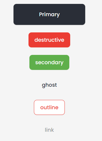
    <Button variant="destructive">destructive</Button>
    <Button variant="secondary">secondary</Button>
    <Button variant="ghost">ghost</Button>
    <Button variant="outline">outline</Button>
<Button variant="link">link</Button> variant: {
destructive:
"bg-destructive text-destructive-foreground shadow-sm hover:bg-destructive/90 focus:bg-[#C4332B] active:bg-[#C4332B] active:shadow-custom",
outline:
"border border-destructive text-destructive bg-background shadow-sm hover:bg-destructive/[0.05] hover:text-destructive focus:bg-destructive/[0.05] active:bg-destructive/[0.15] active:shadow-custom",
secondary:
"bg-secondary text-secondary-foreground shadow-sm hover:bg-secondary/80",
ghost: "hover:bg-accent hover:text-accent-foreground",
link: "text-muted-foreground/50 underline-offset-4 hover:underline hover:text-primary",
},
size: {
default: "h-10 px-4 py-2",
sm: "h-9 rounded-md px-3",
lg: "h-11 rounded-md px-8",
icon: "h-10 w-10",
},**** HINT : The primary button is depricated
//=================================================
Go back to the table of components
//=================================================
- cardTitle : Title appears on the top of the card
- classname ?: TailwindCSS classes to apply
- showFooter ?: boolean value to show footer if true
- footerHref ?: Link appears in the footer ( The footer has a - view all - word which refs to a link )
<CardWrapper
  className="w-[500px]"
  showFooter
  footerHref="#"
  cardTitle="Add business"
>
  Card Content
</CardWrapper>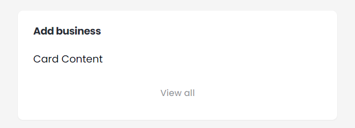
//=================================================
Go back to the table of components
//=================================================
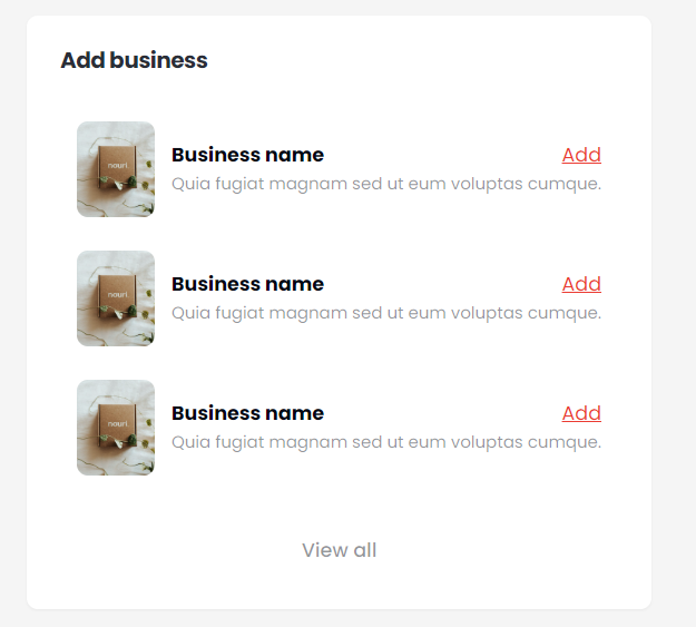
- title
- description
- imageUrl
- addHref : link added to the - add - keyword
<BusinessCard
  addHref="#"
  imageUrl={businessCard}
  title="Business name"
  description="Quia fugiat magnam sed ut eum voluptas cumque."
/>
CardWrapper containing business cards :
//=================================================
Go back to the table of components
//=================================================
A drop list with a search bar.
- placeHolder : The value appears initially in the droplist section
- className?
- items : items appear in the drop list
- targetKey ?: If the items array is an array of string, you don't have to send this prop. But if you sent an array of objects, you have to specify the key which contains the options to appear in the selector. for example you have an array of objects like this ({ id:1 , nationality : "Egyptian " }, ...) and you want to show nationalities in the switcher so you have to specify the targetKey as "nationality".
- heading : the title of the options in the drop list (eg. sizes)
- setSelectedOption : will return the selected item from the array weather it is object or string
- currentValue ?: It is the current selected value if You want the switcher to initially have a specific value
const [item, setItem] = (useState < null) | (string > null);
<Switcher
  items={["Large", "Medium", "Small"]}
  heading="Sizes"
  setSelectedOption={(item: null | string) => setItem(item)}
  placeHolder="Select your size"
/>;
//=================================================
Go back to the table of components
//=================================================
Used to upload file to a specific URL ( images ony allowed !! ).
- className?
- setState : setState for the to get the file value
- disabled ?: boolean value to indicate of the input is disabled or not
- name ?: name field of input
<InputFile setState={setState} />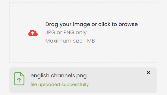
//=================================================
Go back to the table of components
//=================================================
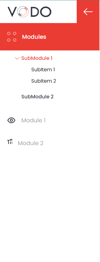
- modules ?: modules array of objects, each object takes 3 keys :
- title
- svg ?: icon
- link : link to which page navigates when user clicks on the module
- subModules ?: subModules array of objects, each object takes 3 keys :
- title
- svg ?: icon
- submoduleArr : an array of sub modules appears as a drop list when you click on the main subModule. This array is an array of objects,each object has the same keys as the modules array ( title , svg? , link)
- sideBarStyle ?: style of the whole sidebar
- className : object that has two keys:
- subModule : style applied to each element in the submodules list
- module : styles applies to each element in the modules list
**** HINT : Styles here refers to TailwindCSS classes ( same as the remaining components )
<SideBar
  modules={modules}
  subModules={subModules}
  className={{
    subModule: "bg-green-300 px-2 py-1",
    module: "bg-red-300 px-2 py-1",
  }}
/>
//=================================================
Go back to the table of components
//=================================================
- label ?
- labelStyle?: for styling label
- success ?: success message if validation is OK
- error ?: error message if there is a problem with validation
- onChangeFn ?: useState function to get change in value
<UserInput label="Username" type={"text"} placeholder="type your username" />
<UserInput disabled label="Password" type={"password"} />
//=================================================
Go back to the table of components
//=================================================
Button contains on/off status
<Status status={"on"} />
<Status status={"off"} />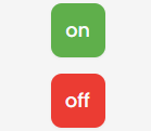
//=================================================
Go back to the table of components
//=================================================
- trailPage : The current page with the different color which will be the last element in the trial
- trailLink : These are the remaining previous elements in the trial. It is an array of objects, each object contains two properties ( label : the name of elements & href : the link to which the label refers )
<NavigationTrail
  trailLink={[
    { label: "Home", href: "/" },
    { label: "Products", href: "/" },
  ]}
  trailPage="Products Details"
/>
//=================================================
Go back to the table of components
//=================================================
- name
- avatarUrl : img url
- className ?: addition TailwindCSS classes to apply
<UserProfile
  className=" rounded-b-[32px]"
  name="Zain Ali"
  email="zain20@gmail.com"
  avatarUrl={avatar}
/>
//=================================================
Go back to the table of components
//=================================================
- setInputValue : setState function to get the value of the input field
- disabled ?
- props ?: default input props
- className ?: addition TailwindCSS classes to apply
<SearchInput setInputValue={setInputValue} disabled />
<SearchInput setInputValue={setInputValue}/>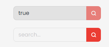
//=================================================
Go back to the table of components
//=================================================
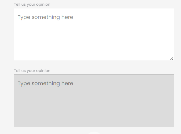
- label
- disabled?: boolean;
- placeHolder?
- className?: TailwindCSS classes;
- error?: error message to show;
- success?: success message to show;
- onChange?
- onBlur?
- onFocus?
<TextArea
    label="Tell us your opinion"
    placeHolder="Type something here"
/>
<TextArea
    label="Tell us your opinion"
    placeHolder="Type something here"
    disabled
/>
//=================================================
Go back to the table of components
//=================================================
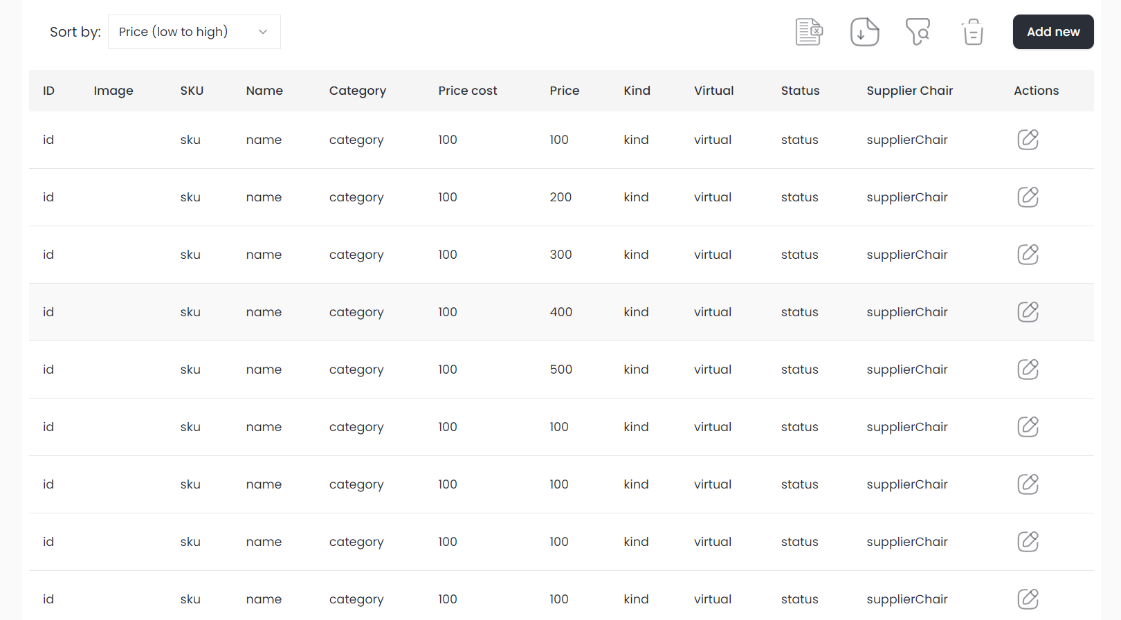
- TabelHead : Array of objects that represent headers, each object has two keys (accessorKey : is the key used in the tabelData array's objects to specify the value at a specific column & header : is the header that appears in the UI )
- TabelData : data added to table which is an array of objects, each object has keys ( which representthe accessorKey of the corresponding header ) and values
- tableStyling ?: optional object for styling that takes 4 keys :
- headStyle ?: style for the whole header
- headElementStyle ?: style for all elements in the header
- bodyStyle ?: style for each row in the body ( it doesn't work )
- bodyElementStyle ?: style for all elements in body
- bodyRowStyle?: style of rows in body , it has two keys :
- general? : for the wrapper of the body element
- text? : for the text appears in body element
- outerStyle?: The outer div that wraps the table element;
This is how the table component is used :
<MainTabel
  TabelHead={TabelHead}
  TabelData={TabelData}
  tableStyling={tableStyling}
/>To set headers you need to pass an array of objects to the columns prop, each object consists of 3 keys : id of the column - acessorKey ( Which is used for passing data in the data array ) - header ( The column's header that will appear in the table ).
export const columns: ColumnDef<Column>[] = [
  const tableHead: tableHeaderType[] = [
  {
    accessorKey: "id",
    header: "ID",
  },
  {
    accessorKey: "image",
    header: "Image",
  },
  {
    accessorKey: "sku",
    header: "SKU",
  },
  {
    accessorKey: "name",
    header: "Name",
  },
  .... remaining of headers
];To set headers you need to pass an array of objects to the data prop, each object consists of keys, each key is the accessorKey of the header which is defined in the objects of the columns' array.
export const tableData: Column[] = [
  {
    id: 'id',
    imageUrl: 'image',
    sku: 'sku',
    name: 'name',
    category: 'category',
    priceCost: 100,
    price: 100,
    kind: 'kind',
    virtual: 'virtual',
    status: 'status',
    actions: (
    <DropDown
      selections={selections}
      mainIcon={<EditIcon className="w-6 h-6" />}
      title="Actions"
    />
  ),
  },
  {
    id: 'id',
    imageUrl: 'image',
    sku: 'sku',
    name: 'name',
    category: 'category',
    priceCost: 100,
    price: 200,
    kind: 'kind',
    virtual: 'virtual',
    status: 'status',
    supplierChair: 'supplierChair',
    actions: (
    <DropDown
      selections={selections}
      mainIcon={<EditIcon className="w-6 h-6" />}
      title="Actions"
    />
  ),
  },
  .... The remaining of the data ..
]const tableStyling = {
headStyle: "bg-green-300 w-1/2",
headElementStyle: "bg-red-200 p-4 ",
bodyStyle: "bg-green-200",
bodyElementStyle: "bg-yellow-400",
};**** HINT : DropDown is illustrated down in the docs.
//=================================================
Go back to the table of components
//=================================================
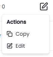
- selections : Array of objects, each object has 3 keys (icon , name and action ( the method that is called when click on the corresponding option in the droplist ) )
- mainIcon : Icon of the droplist
- title : title appears upwards the options.
- className?
This is how the table component is used :
<DropDown
  selections={selections}
  mainIcon={<EditIcon className="w-6 h-6" />}
  title="Actions"
/>interface dropOptions {
icon?: ReactNode;
name: string;
action: any;
}
const selections: dropOptions[] = [
{
icon: <Copy className="w-4 h-4 mr-2" />,
name: "Copy",
action: () => {
console.log("copy");
},
},
{
icon: <Edit className="w-4 h-4 mr-2" />,
name: "Edit",
action: () => {
console.log("edit");
},
},
];
//=================================================
Go back to the table of components
//=================================================
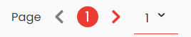
- The left one for pages
- The right one for limit
- totalDataLength : total number of rows (data)
- setPageFn : setState function to get the current page
- setLimitFn : setState function to get the limit
- constantLimit ?: if your API doesn't allow you to set limit for data per page, you will have to set this prop with the length of the array received from the API. If you set this prop, the limit input field will disappear.
This is how the table component is used :
<PaginationComponent
  setLimitFn={() => {}}
  setPageFn={() => {}}
  totalDataLength={100}
  constantLimit={20}
/>
* HINT : If you don't know the totalDataLength from back-end you can set it to a big random number
//=================================================
Go back to the table of components
//=================================================
A drop list with items ( same as select HTML tag )
- items : items array of objects, each object has two keys (name , value)
- placeholder ?: initial text that appears on the selector
- showCheckIcon ?: boolean value
- value ?: value of the selection
- defaultValue:default value of the selector
- onValueChange ?: setState function used to get the selected value
- className ?: styles of the selector
- itemsStyle ?: styles for each element in the selector
- id?: id for the selector -name?:name for the selector
This is how the selector component is used :
<Selector
  items={[{ name: "Item 1", value: "1" }]}
  value="item 2"
  placeholder="change"
/>
//=================================================
Go back to the table of components
//=================================================
A login page that will be used during development only to do login and get data needed for APIs' call ( token , secrect_key , ...). This login should be removed before deployment of your module.
- url ?: url of login that will get the userNAme and password and return json contains all data. url is set by default to this value ("https://accounts.vodoerp.com/api/login")
This is how the login component is used :
<Login url="https://accounts.vodoerp.com/api/login" />