Typereact


Typereact is a simple React typeahead component that supports grouped entries.
Demo
You can find a demo here: https://visusnet.github.io/typereact/
Install
With npm:
npm i typereactOr with yarn:
yarn add typereactUsage
; const handleBlur = { console}; <Typeahead options=options onBlur=handleBlur />Configuration
| Prop | Required | Default | Description |
|---|---|---|---|
| allowUnknownValue | false |
false |
If true, arbitrary values can be typed. |
| autoSelectSingleOption | false |
false |
If true, the component will automatically select an option if there are no other options available. |
| calculateGroupHeight | false |
59 or 28 |
A callback that returns the height of group entries in pixels. Parameters: group, index. |
| calculateListHeight | false |
28 or min(300, number of options * 28) |
A callback that returns the height of the menu in pixels. Parameters: rows, totalRowsHeight. |
| calculateOptionHeight | false |
28 |
A callback that returns the height of option entries in pixels. Parameters: option, index. |
| estimateMenuWidth | false |
undefined |
Either a callback that returns the width the menu in pixels or a boolean value. Parameters: rows. If true, a default implementation is used that tries to estimate the menu width based on label length. |
| groups | false |
undefined |
If supplied, options will be grouped according to these groups. |
| id | false |
undefined |
Sets the HTML input ID. |
| isClearable | false |
false |
Renders a button that unsets the selected value if set to true. |
| isDisabled | false |
false |
If true, the component is disabled. |
| menuWidth | false |
undefined |
A number that manually sets the width of the menu. |
| notFoundLabel | false |
nicht gefunden (German) |
A string that is displayed after the typed label for which no options could be found. |
| onBlur | false |
no op | A callback that is called when focus is lost. Parameters: fieldName, value. |
| onChange | false |
no op | A callback that is called when the value has changed. Parameters: fieldName, value. |
| options | false |
[] |
An array of label-value-pairs. |
| placeholder | false |
'' |
Sets the HTML placeholder attribute. |
| renderEmptyGroups | false |
false |
If true, groups will be rendered even if they don't have any options. Works only in conjunction with groups. |
| tabIndex | false |
undefined |
If set, this prop is passed down to the input field. |
| value | false |
undefined |
If set, selects the option with the specified value. |
Options
options must be an array with objects containing a label (string) and a value (can have any type), e.g.
label: 'This will be shown' value: 'this is the value'Groups
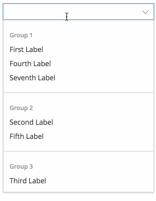
If you want your options to be grouped, you can set the groups prop which has the same structure as the options prop. In order to assign options to a group, you have to add an additional group property (of any type that matches the type of the group's value) to the options.
Example:
const options = label: 'First option in Group 1' value: 'firstOfGroup1' group: 'group1' label: 'Second option in Group 1' value: 'secondOfGroup1' group: 'group1' label: 'First option in Group 2' value: 'firstOfGroup2' group: 'group2' label: 'Second option in Group 2' value: 'secondOfGroup2' group: 'group2'; const groups = label: 'Group 1' value: 'group1' label: 'Group 2' value: 'group2';Styling
You can apply your own styling or use the example that is used by the demo page.
License
MIT