Vue.js Triangled Spider Chart
A Vue.js component that displays a triangled style spider chart.
Simple setup
npm install triangled-spider-chart
Simple usage
In the script
import TriangledSpiderChart from "triangled-spider-chart";

export default {
  ...
  components: {
    TriangledSpiderChart
  },
  data() {
    return {
      chartData: [5, 10, 15, 20, 25, 30, 35]
    }
  }
}
In the template
<TriangledSpiderChart
  :chartData="chartData"
></TriangledSpiderChart>
Customize configuration
Properties
- size: Number Dimension (for both width and height) of the chart. Default is 300.
- max: Number Maximum value to display within the chart. Maximum value of chartData if omitted.
- chartData: Array|required Chart series data. Data can be numbers only, ex: [5, 10, 15, 20, 25, 30, 35]. Or can define as array of Object with value and label, ex: chartData: [{ value: 500, label: 'Food', fill: '#25C1C3', hover: '#25C1C3BF' }, { value: 1500, label: 'Drink' }, ...].
- chartLabelData Array Chart series label.
- selectedIndex: Number Default selected (highlighted) item index.
- options Object Custom styling for the chart.
The options definition
- strokeWidth: Number Size of the chart serie stroke. Default is 3.
- strokeColor: Number Color fo the chart serie stroke. Default is White.
- fills String|Array Fill colors of chart series. Ramdomize colors if omitted.
- hoverFills String|Array Fill colors of chart series when mouse over. Opacity to 75% if omitted.
- tooltip String Display tooltip format. Use parameter ${label} and ${value} for data binding.
- showLegends Boolean Show or hide legends. Default is false.
- showGuideLines Boolean Show or hide guide lines. Default is false.
- guideColor String Guide line color. Default is #656565.
- showValues Boolean Show or hide data value. Default is false.
- valueColor String Color of the data value. Default is #000000.
- valueStroke String Stroke color of the data value. Default is #FFFFFF.
- numberFormat String Number formatting fo the data value. Refer to Numeraljs.
Events
- onItemMouseOver(index): Event emitted when move mouse over an item.
- onItemMouseOut(index): Evet emitted when move mouse out of an item.
- onItemClick(index): Event emitted when click on an item.
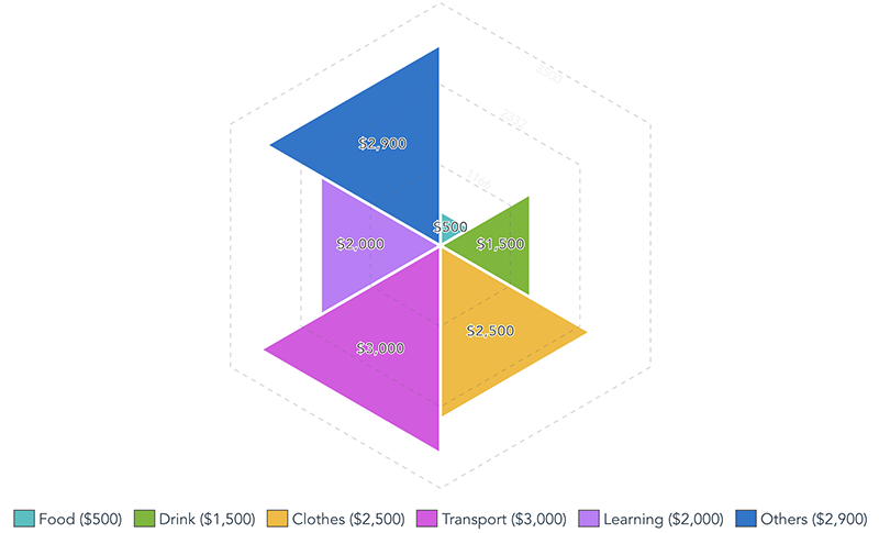
Full options example
In the script
import TriangledSpiderChart from "triangled-spider-chart";

export default {
  ...
  components: {
    TriangledSpiderChart
  },
  data() {
    return {
      chartSize: 500,
      chartMax: 3500,
      chartData: [
        { value: 500, label: 'Food', fill: '#25C1C3', hover: '#25C1C3BF'},
        { value: 1500, label: 'Drink' },
        { value: 2500, label: 'Clothes' },
        { value: 3000, label: 'Transport' },
        { value: 2000, label: 'Learning' },
        { value: 2900, label: 'Others' }
      ],
      chartOptions: {
        strokeWidth: 3,
        strokeColor: '#FFFFFF',
        fills: ['#FF0000', '#6CB91A', '#F7BA1B', '#E24CE5', '#C378FB', '#1674CD'],
        hoverFills: ['#FF0000', '#6CB91ABF', '#F7BA1BBF', '#E24CE5BF', '#C378FBBF', '#1674CDBF'],
        tooltip: '${label}: ${value}k',
        showLegends: true,
        showGuideLines: true,
        guideColor: '#656565',
        showValues: true,
        valueColor: '#000',
        valueStroke: '#FFF',
        numberFormat: '$0,0'
      }
    }
  }
}
In the template
<TriangledSpiderChart
  :size="chartSize"
  :chartData="chartData"
  :options="chartOptions"
  :max="chartMax"
></TriangledSpiderChart>
Result
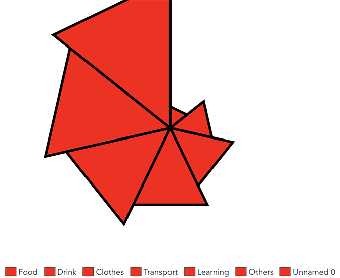
Full options example (1 fill color)
In the script
import TriangledSpiderChart from "triangled-spider-chart";

export default {
  ...
  components: {
    TriangledSpiderChart
  },
  data() {
    return {
      chartSize: 500,
      chartMax: 30,
      chartData: [5, 10, 15, 20, 25, 30, 35],
      chartLabelData: ['Food', 'Drink', 'Clothes', 'Transport', 'Learning', 'Others'],
      chartOptions: {
        strokeWidth: 5,
        strokeColor: '#000000',
        fills: '#ff0000', // all series will be fill Red.
        hoverFills: '#00ff00', // all series will be fill Green when mouse over.
        showLegends: true
      }
    }
  }
}
In the template
<TriangledSpiderChart
  :size="chartSize"
  :chartData="chartData"
  :options="chartOptions"
  :max="chartMax"
  :chartLabelData="chartLabelData"
  :showLegends="showLegends"
></TriangledSpiderChart>
Result