TourGuide


About
TourGuide is a JavaScript module that helps generate step-by-step instructions and demos in an easy way. It spotlights elements adding small commentary on them. See a demo working on CodePen.
It uses borders and box-shadows to create a spotlight area that will highlight a specific element, displaying commentary text, and animating from one step to another using CSS transitions. It is highly customizable, works on desktop and mobile, and users can opt to use the default controls or create their own using the plugin API.
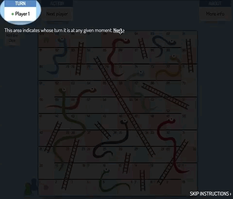
Initially, it was a CSS-only animation for a Snake & Ladders game. Then it was ported into JavaScript and this module was created.
How to use it
This is a simple 4-step way to start TourGuide:
-
Download an import the JS library and CSS file into your project. You can do this by:
-
Downloading/importing the files directly into your project:
<link rel="stylesheet" href="/css/tourguide.css" /> <script src="/js/tourguide.js"></script> -
Installing the package from npm
npm i tourguide -
Adding the package from yarn
yarn add tourguide
-
-
Add
data-sp-nextdata-attribute to the elements that you want to highlight as part of your instructions.There are more data-attributes that can be added, but only the
data-sp-nextis essential to create the list of steps for the instructions. -
Initialize TourGuide with the selector of the initial element of the instructions:
<script> let tour = new TourGuide({ init: "#step1" }); </script> -
With JavaScript, trigger the beginning of the instructions/demo using the
startmethod:tour.start();
For more examples on how to start, check the repository demos.
Parameters
| Parameter | Type | Description |
|---|---|---|
| color | Color | String with the color of the shadow. Default: "rgba(0, 0, 0, 0.5)". |
| init | String | Selector of the first element that will be highlighted, and from which the list of steps will be created. This field has no default value. Either this parameter of steps must be specified when starting TourGuide. |
| initTrigger | Boolean | Indicates if the first element will also be the trigger of the animation. Default: false. |
| next | Boolean | Indicates if the link to the next step will be displayed. Default: true |
| nextText | String | Specifies the text of the next step link. Admits HTML. Default: "Next" |
| previous | Boolean | Indicates if the link to the previous step will be displayed. Default: true |
| previousText | String | Specifies the text of the previous step link. Admits HTML. Default: "Previous" |
| shape | square|round | String that indicates the shape of the spotlight: squared or round/elliptical. Default value: "round". |
| skip | Boolean | Indicates if the link to skip the instructions will be displayed. Default: true |
| skipText | String | Specifies the text of the link to skip instructions. Default: "Skip presentation" |
| steps | Array | List with objects that will contain ID, text, and shape of the element to be highlighted (see more below). This field has no default value. Either this parameter of init must be specified when starting TourGuide. |
The structure of the steps list will be as follows:
[
  {
    selector: "selector-of-the-element-to-be-highglighted-(mandatory)",
    text: "text-to-be-displayed-(optional)",
    shape: "shape-of-the-element-(optional)"
  },
  ...
]
So, for example, the following ways of initializing SpolightJS would be equivalent:
Method 1:
<div id="step-1" data-sp-next="#step-2" data-sp-text="This is the first step.">Hello!</div>
<div id="step-2" data-sp-next="#step-3" data-sp-text="This is the last steop." data-sp-shape="round">Good Bye!</div>

<script>
let tourguide = new TourGuide({ init: "#step-1" });
</script>
Method 2:
<div id="step-1">Hello!</div>
<div id="step-2">Good Bye!</div>

<script>
let tourguide = new TourGuide({
                      steps:[
                              { selector: "#step-1", text: "This is the first step." },
                              { selector: "#step-2", text: "This is the last step.", shape: "round" }
                            ]
                    });
</script>
API methods
In order to customize the instructions, you could hide all the controls (next, previous, skip) and use your own using the methods from the provided API, or you could also hide the text associated to each step (via CSS) and design your own instruction text. For some examples of the possibilities, see the demos page.
| Method | Returns | Description |
|---|---|---|
| getCurrentElement() | Object | Returns the element that is currently highlighted. |
| getCurrentElementSelector() | String | Returns the selector provided for the element that is currently highlighted. |
| getStep() | Integer | Returns the integer value of the current step (from 1 to no). |
| getText() | String | Returns the text associated to the currently highlighted step. |
| getTotalSteps() | Integer | Returns the total number of steps in the presentation. |
| goToFirstStep() | - | Animates to the first step. |
| goToNextStep() | - | Animates to the following step in the presentation. |
| goToPreviousStep() | - | Animates to the previous step in the presentation. |
| goToStep(n) | - | Animates directly to step n. |
| start() | - | Starts the animation from the first step. |
| stop() | - | Stops the current animation. |
Browser Support
 IE/Edge |
 Firefox |
 Chrome |
 Safari |
 Opera |
|---|---|---|---|---|
| 9+ | 12+ | 4+ | 4+ | 11.5+ |