TODOvue Button
TvButton is a custom button component for web applications.


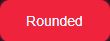

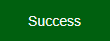

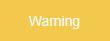

Table of Contents
Installation
Install with npm or yarn
npm install todovue-buttonyarn add todovue-buttonImport
import { TvButton } from 'todovue-button'You can also import it directly in the main.js file, so you don't have to import it in the pages
import { createApp } from "vue";
import App from "./App.vue";
import TvButton from "todovue-button";

const app = createApp(App);
app.component("TvButton", TvButton);
app.mount("#app");
Usage
<template>
<tv-button @click-button="clickHandler">
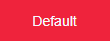
Default
</tv-button>
</template>
<script>
import TvButton from "todovue-button"; // Only if you have not imported it from main
export default {
components: {
TvButton // Only if you have not imported it from main
},
setup() {
const clickHandler = () => {
console.log("clicked");
}
return {
clickHandler
}
}
}
</script>Props
| Name | Type | Default | Description |
|---|---|---|---|
| type | String | button |
The type of button |
| customStyle | Object | {} |
object that defines the custom style of the button. You can include backgroundColor and color. |
| isOutlined | Boolean | false |
If true, the button will be outlined. |
| isSmall | Boolean | false |
If true, the button will be small. |
| isLarge | Boolean | false |
If true, the button will be large. |
| isSuccess | Boolean | false |
If true, the button will be success. |
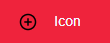
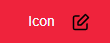
| icon | String | null |
The icon of the button. |
| isInfo | Boolean | false |
If true, the button will be info. |
| isWarning | Boolean | false |
If true, the button will be warning. |
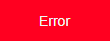
| isError | Boolean | false |
If true, the button will be error. |
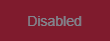
| isDisabled | Boolean | false |
If true, the button will be disabled. |
| isText | Boolean | false |
If true, the button will be text. |
| iconPosition | String | left |
The position of the icon. You can use left and right. |
| buttonText | String | null |
The text of the button. |
Icons
You can use the following icons (icon="account"):
accountalertarrow-downarrow-leftarrow-rightarrow-upcancelcancel-lighteditdarkfavoritehelplightmenumenu-lightminusplusremovesearchsearch-lightsettingssharestar
Events
| Name | Description |
|---|---|
| click-button | Emitted when the button is clicked. You can use it to call a function, etc. |
Customize
You can customize the button style by passing an object to the customStyle prop. You can include backgroundColor and color.
<template>
  <tv-button :customStyle="customStyle" @click-button="clickHandler">
    Default
  </tv-button>
</template>

<script>
  import { ref } from "vue";
  export default {
    setup() {
      const customStyle = ref({
        backgroundColor: "#000",
        color: "#fff"
      })

      const clickHandler = () => {
        console.log("clicked");
      }

      return {
        customStyle,
        clickHandler
      }
    }
  }
</script>
Development
Clone the repository and install the dependencies
git clone https://github.com/TODOvue/todovue-button.gitcd todovue-buttonInstall the dependencies
yarn installRun the project
yarn demoRun the tests
yarn test:unitRun the linter
yarn lintRun the build It is not necessary to generate build, since it is generated when you do PR to the master branch
yarn build