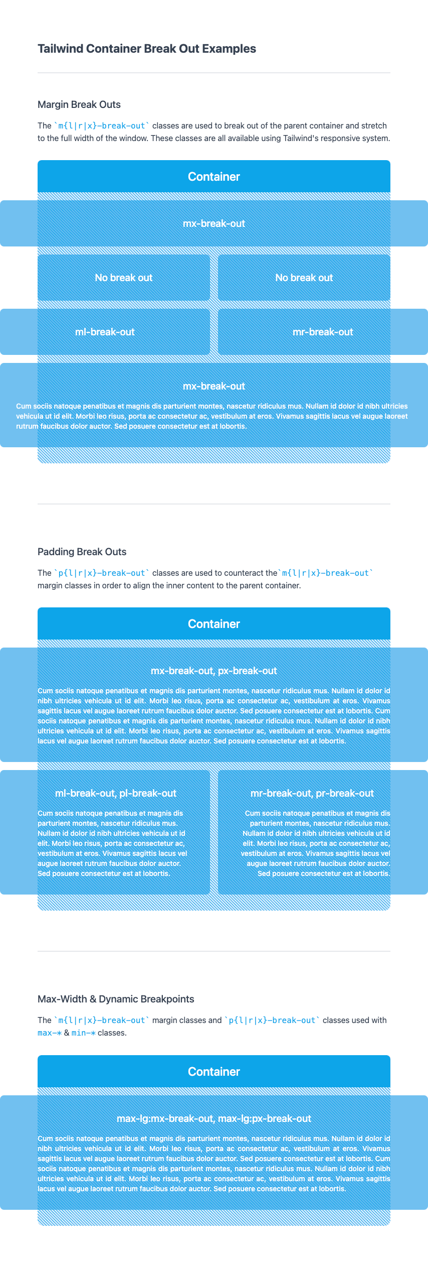
This is a TailwindCSS plugin that is used to 'break' child elements out of the Tailwind .container class. It works with any container padding customisations or custom breakpoints that are set within your tailwind.config.js.
For best results, set your .container to center mode in your tailwind.config.js, or use mx-auto whenever you use the .container class.
The m{l|r|x}-break-out and p{l|r|x}-break-out classes can be used anywhere inside of a container, but for the most reliable results, apply them to a direct child of .container.
These classes are simple utilities that calculate the negative margins (and inner padding, where required) needed for an element to 'break out' of the container at each responsive break point - they do not account for any extra padding or margins that have been added to your markup.
npm i tailwind-container-break-out
For best browser compatibility that combats varying scrollbar behaviour, also install Set Scrollbar Width and run setScrollbarWidth() on app mount
npm i set-scrollbar-width
// tailwind.config.js

module.exports = {
  theme: {
    container: {
      center: true,
      padding: '1rem'
    },
  },
  plugins: [require('tailwind-container-break-out')]
};
- Full width break out
<div class="container">
  <h1>This content is in a container</h1>
  <div class="mx-break-out">
    <img src="example.jpg" class="w-full" />
    <p>This whole div will expand beyond the container on both the left and right.</p>
  </div>
</div>
- Break out on one side only
<div class="container grid grid-cols-2">
  <div>
    <h1>This content is in a container, and sits on the left side of the grid.</h1>
  </div>
  <div class="mr-break-out">
    <img src="example.jpg" class="w-full" />
    <p>This div will expand beyond the container on the right hand side.</p>
  </div>
</div>
- Break out on one side only, with
p{l|r|x}-break-outclasses to keep inner content in line with.container
<div class="container grid grid-cols-2">
  <div class="bg-green-500 ml-break-out pl-break-out">
    <h1>This content is in a container, and sits on the left side of the grid.</h1>
    <p>The background color will break out of the `.container` but this text will align to the `.container` edge.
  </div>
  <div class="mr-break-out>
    <img src="example.jpg" class="w-full" />
    <p>This div will expand beyond the container on the right hand side.</p>
  </div>
</div>
See working example here.
This package may produce unintented scrollbar behaviour in some browsers, and so it is encouraged to use alongside this package https://github.com/LucidNinja/set-scrollbar-width, in order to set the scrollbar width as the --twcb-scrollbar-width CSS variable. By default, this is set as 0px, but should be overriden using this package or Javascript in the framework of your choosing.
