 svelte-simple-accordion


Overview
This package contains two Svelte components: Accordion and AccordionItem.
The Accordion component initializes and manages the list of AccordionItem components. It ensures that only one item is opened at a time.
The AccordionItem component includes the two HTML parts: title and content.
Full configuration
These components use slots: the application can insert any code into the main accordion part, the title part or the content part.
The components are unstyled by default. The slot feature and some utilities included in the components allow the application to apply any CSS rule or script on any DOM element.
Note: The application is responsible for the look and feel. For the best usability, see the W3C recommandations.
Demo
To see the demo and its source code, please click on this image:
Quick Start Guide
npm install --save-dev svelte-simple-accordionIn the application:
<script>
import {Accordion, AccordionItem} from 'svelte-simple-accordion';
</script>
<!-- A simple accordion with three items -->
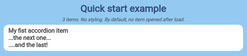
<Accordion>
<AccordionItem>
<div slot="title">
<h2>My fist accordion item</h2>
</div>
<div slot="content">
<p>
Lorem ipsum dolor sit amet, consectetur adipiscing elit.
Integer purus libero, vulputate pretium est vitae,
rutrum vestibulum nibh.
Proin malesuada ultricies dolor,
sit amet fringilla turpis efficitur faucibus.
</p>
</div>
</AccordionItem>
<AccordionItem>
<div slot="title">
<h2>...the next one...</h2>
</div>
<div slot="content">
<p>
Vestibulum dapibus, lectus et pretium dictum, odio metus maximus nunc,
eget accumsan magna sem quis ante. Suspendisse potenti.
</p>
</div>
</AccordionItem>
<AccordionItem>
<div slot="title">
<h2>....and the last!</h2>
</div>
<div slot="content">
<p>
Donec suscipit massa in sem commodo, non fringilla justo mattis.
Curabitur et varius lacus. Sed scelerisque
lobortis risus nec sollicitudin.
</p>
</div>
</AccordionItem>
</Accordion>Et voila! See the demo and the Quick Start example.
The Accordion component
This component manages a list of ApplicationItem components (title + content parts) and their open status. By design, only one item content part is displayed at a time.
As the Accordion component contains an unnamed slot, it can include any code plus the AccordionItem list.
To be compatible with your application and your design, Accordion offers three optional variables:
| name | type | default | description |
|---|---|---|---|
| dispatchName | string | accordionItemClick |
The name of the event dispatched by Accordion when a title is clicked. See the Events chapter below. |
| id | string | 'accordion-' + Math.random().toString(36) |
The ID of the Accordion DOM element. By setting this value, the application may easily retrieve the DOM element with the vanilla code: document.getElementById(id);
|
| transitionRule | string | height 300ms ease-in-out, opacity 700ms ease-in-out |
The CSS transition rule for the hide / show animations. |
Working with the accordion DOM element
As the application can set the Accordion 's custom ID, it's easy to get its DOM element:
<script>
    import {Accordion, AccordionItem} from 'svelte-simple-accordion';
    const accordionID = 'acc-01'; // the custom accordion ID

    /* When the components are loaded */
    onMount(() => {
        const myAccordion = document.getElementById(accordionID);
        // ...some work with the accordion...
    });
</script>

<!-- Accordion: the application can get its DOM element -->
<Accordion id={accordionID}>
    <!-- any code -->
    <h1>My accordion</h1>
    <!-- ...some AccordionItem components... -->
</Accordion>
Events
When the user clicks on an AccordionItem, the Accordion component ensures that this item content is displayed or closed (depending on its initial status) as the other items are closed.
For the best usability, the application could need to change the opened item look, updates some data, etc. That's why the Accordion can send a Custom Event to the application, by using:
-
event custom name: a string. The
dispatchNamevalue. As the application can set this variable, it can listen to it's named events. - event detail: an object. The event detail contains:
{
    "accordion": a-DOM-element, // the Accordion DOM element which send the event
    "itemIndexAttributeName": a-string, // the item index attribute name
    "itemTitle": a-DOM-element, // the item title DOM element which has been clicked
    "opened": a-boolean, // the item status applied when clicked
}
With this feature, the application may change anything. In the next example, the item title color changes when it is opened:
<script>
    import {Accordion, AccordionItem} from 'svelte-simple-accordion';

    /* Handles the open event */
    const handleOpened = event => {
        const title = event.itemTitle.querySelector('h2');
        title.style.color: 'dodgerblue'; // change the title color
    }
</script>

<!-- Accordion: the application listen to the open event -->
<Accordion
    dispatchName="itemOpened"
    on:itemOpened={handleOpened}
>
    <h1>My customized accordion</h1>
    <AccordionItem>
        <div slot="title">
            <h2>My color will change on click</h2>
        </div>
        <div slot="content">
            <!-- ...some HTML content... -->
        </div>
    </AccordionItem>
    <!-- ...some other AccordionItem components... -->
</Accordion>
With the itemIndexAttributeName value, the application can get the opened item range in the AccordionItem list:
const range = itemTitle.getAttribute(itemIndexAttributeName); // starts at 0Then, as each AccordionItem is created with the attribute named itemIndexAttributeName, the application can get any associated DOM element:
const accordion = document.getElementById(accordionID);
const items = accordion.querySelectorAll('[' + itemIndexAttributeName + ']'); // items = a NodeList
// gets the third item
const thirdItem = false;
items.forEach(item => {
   if (item.getAttribute(itemIndexAttributeName) === 2) { // starts at 0
       thirdItem = item;
   }
})
// ...some work with the third item...
With this feature, if the display order of items changes, they are always indexed the same way.
Animation
The display of an AccordionItem is animated by default, using this show and hide technique based on height and opacity rules. The application can configure the animation, by using the Accordion transitionRule variable.
The default string value is height 300ms ease-in-out, opacity 700ms ease-in-out. Here is an example with 2x slower animation:
<script>
    import {Accordion, AccordionItem} from 'svelte-simple-accordion';
    const myTransitionRule = 'height 600ms ease-in-out, opacity 1400ms ease-in-out';
</script>

<!-- Accordion: the animation is slow -->
<Accordion transitionRule={myTransitionRule}>
	<h1>My slow accordion</h1>
	<!-- ...some AccordionItem components... -->
</Accordion>
If no animation is needed, just set the transition rule as an empty string:
myTransitionRule = '';Changing anything
With the slot feature, the application can insert any code in the components.
And as the application can retrieve the Accordion DOM element and any AccordionItem DOM element, it can configure their entire style once mounted. See the demo and the styling example.
The AccordionItem component
This component must be encapsulated by a parent Accordion component, which manages the open / close status. As most of accordion features, this component contains two parts: the title and the content. Each part includes a slot.
The title
This part is always visible.
Thanks to the Svelte slot feature, an AccordionItem title includes a slot named title. So the application can insert any code. For example (with free Font Awesome icons):
<AccordionItem>
  <!-- The title is the customer name -->
  <div slot="title" class="myTitleClass">
      <i class="myIconClass fas fa-user"></i>
      <div>{customer.name}</div>
  </div>

  <div slot="content">
      <p>{customer.address}</p>
      <p>{customer.emailAddress}</p>
      <p>{customer.phone}</p>
  </div>
</AccordionItem>
Changing the look of the title
When the user clicks on the title, a custom event is sent to the parent Accordion, which manages the hide / show display of its items. The items display is changed by applying a class named hide to the content part. At the same time, the application can listen to this custom event (see the chapter Events before), to apply some changes.
With the slot feature and the ability to retrieve any ApplicationItem DOM element, the application may change anything. It could insert an icon in the title, and change it depending on the open status. For example 
The content
This part is hidden or shown, depending on the user interaction. The parent Accordion manages the display status.
Thanks to the Svelte slot feature, an AccordionItem content includes a slot named content. So the application can insert any code. For example:
<AccordionItem>
  <div slot="title">
      <h2>This item title</h2>
  </div>
  <!-- The content can be any code -->
  <div slot="content">
      <h2>What a nice content!</h2>
      <img
           src="https://www.musickeyboards.us/woman-playing-accordion-336.jpg"
           alt="Let's play!"
      >
      <p>
         {myapp.content}
      </p>
  </div>
</AccordionItem>
The display of an AccordionItem content is animated by default, using this show and hide technique based on height and opacity rules. See the Animation chapter before.
Set the item to open after load
By default, all the AccordionItem elements are closed when the components are loaded. The application can indicate what item has to be opened, by using the openAfterLoad boolean attribute. In this example, the second of the three items will be opened after load:
<script>
    import {Accordion, AccordionItem} from 'svelte-simple-accordion';
</script>

<!-- Accordion with three items: the second is opened after load -->
<Accordion>
    <AccordionItem>
        <div slot="title">
            <h2>My fist accordion item</h2>
        </div>
        <div slot="content">
            <p>
                Lorem ipsum dolor sit amet, consectetur adipiscing elit.
                Integer purus libero, vulputate pretium est vitae,
                rutrum vestibulum nibh.
                Proin malesuada ultricies dolor, sit amet fringilla
                turpis efficitur faucibus.
            </p>
        </div>
    </AccordionItem>
    <AccordionItem openAfterLoad="true">
        <div slot="title">
            <h2>...the next one...opened!</h2>
        </div>
        <div slot="content">
            <p>
                Vestibulum dapibus, lectus et pretium dictum, odio metus maximus nunc,
                eget accumsan magna sem quis ante. Suspendisse potenti.
            </p>
        </div>
    </AccordionItem>
    <AccordionItem>
        <div slot="title">
            <h2>....and the last.</h2>
        </div>
        <div slot="content">
            <p>
                Donec suscipit massa in sem commodo, non fringilla justo mattis.
                Curabitur et varius lacus. Sed scelerisque
                lobortis risus nec sollicitudin.
            </p>
        </div>
    </AccordionItem>
</Accordion>
Sub-accordions
Your application can insert a new accordion into the content of an accordion item. The component manages automatically the parent / child relationship. See the sub-accordion example on the demo site.
Enjoy!
License
Copyright (c) 2021 Jacques Desodt and contributors.