storybook-docs-themes
Set up theme colours of documentation previews in Storybook stories.
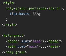
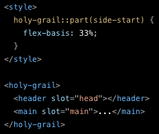
Original colours and colours according to the VS Code Dark+ theme:
Usage via NPM
Install the stylesheets using npm:
npm i -D storybook-docs-themes
Copy the stylesheets to the output directory in .storybook/main.js:
module.exports = {
  staticDirs: [
    { from: '../node_modules/storybook-docs-themes/stylesheets', to: 'themes' }
  ]
}
Load the selected stylesheet to Storybook stories in .storybook/preview-head.html:
<link rel="stylesheet" href="themes/vscode-dark-plus.min.css">Usage via CDN
Load the selected stylesheet to the stories in .storybook/preview-head.html:
<link rel="stylesheet"
  href="https://unpkg.com/storybook-docs-themes@1.0.0/stylesheets/vscode-dark-plus.min.css">
Themes
Stylesheets are located in the stylesheets directory of the distributed package.
VS Code Dark+
Colours according to the VS Code theme "Dark+", enhanced to the WCAG AAA contrast.
vscode-dark-plus.css
vscode-dark-plus.min.css
vscode-dark-plus.min.css.map
Contributing
In lieu of a formal styleguide, take care to maintain the existing coding style.
License
Copyright (C) 2023 Ferdinand Prantl
Licensed under the MIT License.


