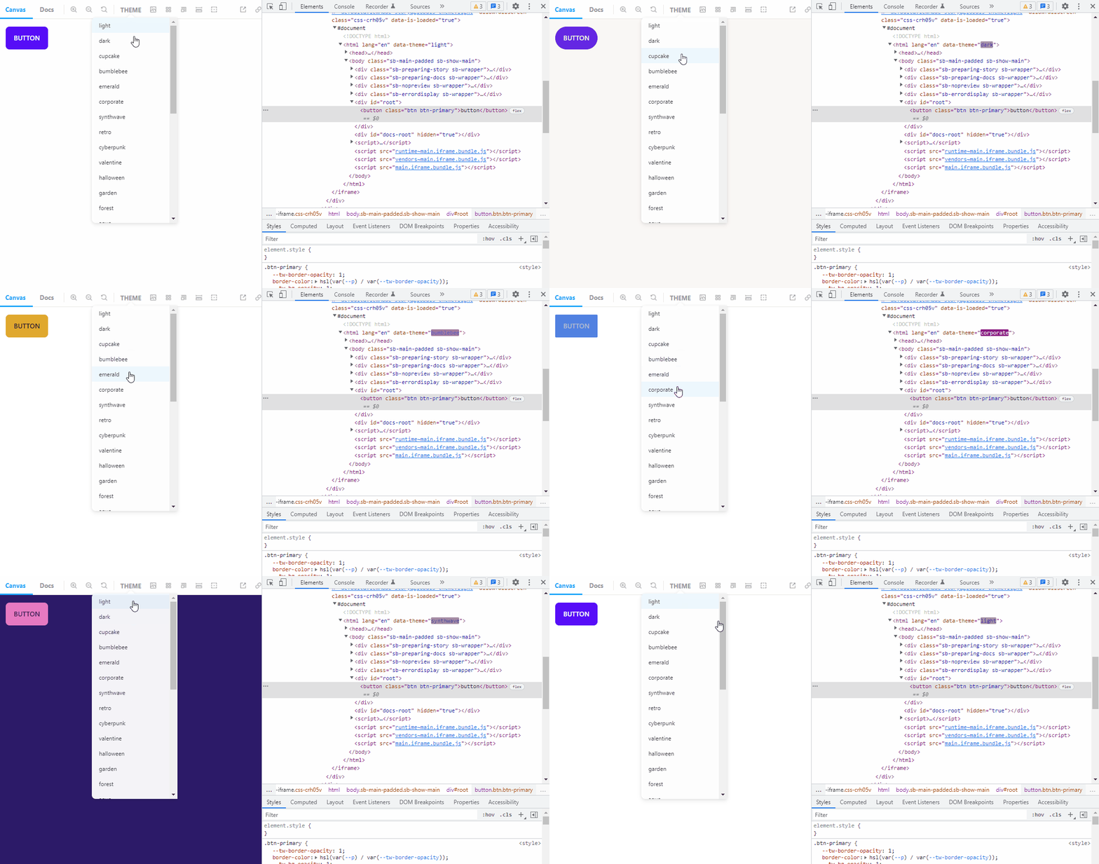
Storybook Addon Theme Changer
A simple addon for changing theme on Storybook. Inspired by theme-change
This addon just controls themes (for example, light and dark), just adding data-theme attribute to the html tag.
It works nicely with UI libraries such as daisyUI.
Getting Started
Add this addon to the .storybook/main.js file.
module.exports = {
  ...
 addons: [
     // your addons here
     "storybook-addon-theme-changer"
  ],
};
Add your themes to the .storybook/preview.js file
...
export const globalTypes = {
 themes: {
   defaultValue: [
     "light",
     "dark",
     ...
   ],
 },


