SharePoint Lookup Selector
A control that can be used with any form or without a form to Select List Items. Best used with SharePoint Custom Forms (New or Edit)
Dependencies
sp-pnp-js, react-select, react, react-dom, @microsoft/sp-webpart-base, @microsoft/sp-http
How to use
This is a react Component that needs to be installed first and used with any SPFx react projects as follows
To Install the component
npm i sp-lookup
Usage
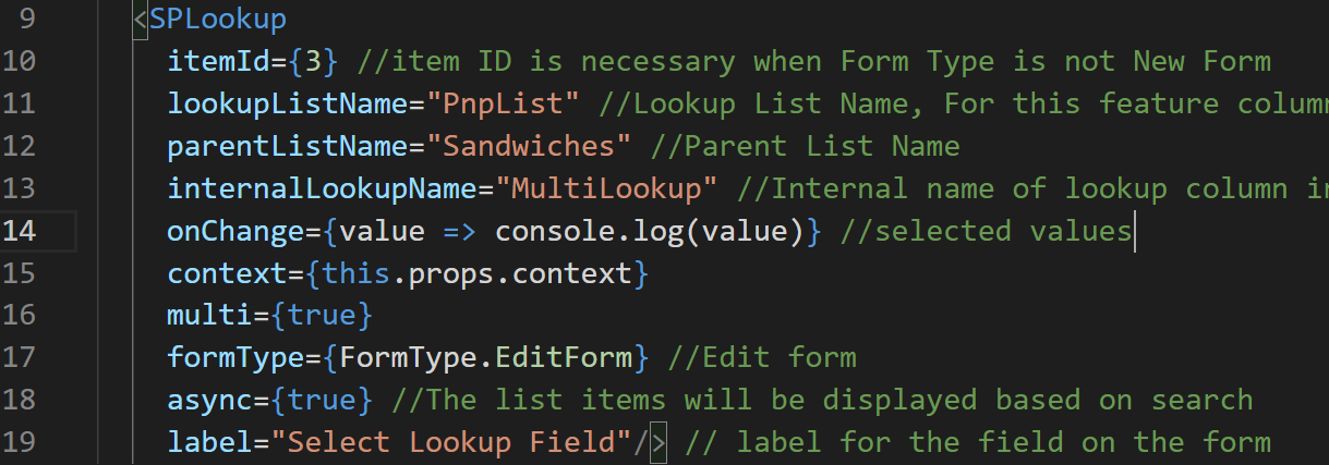
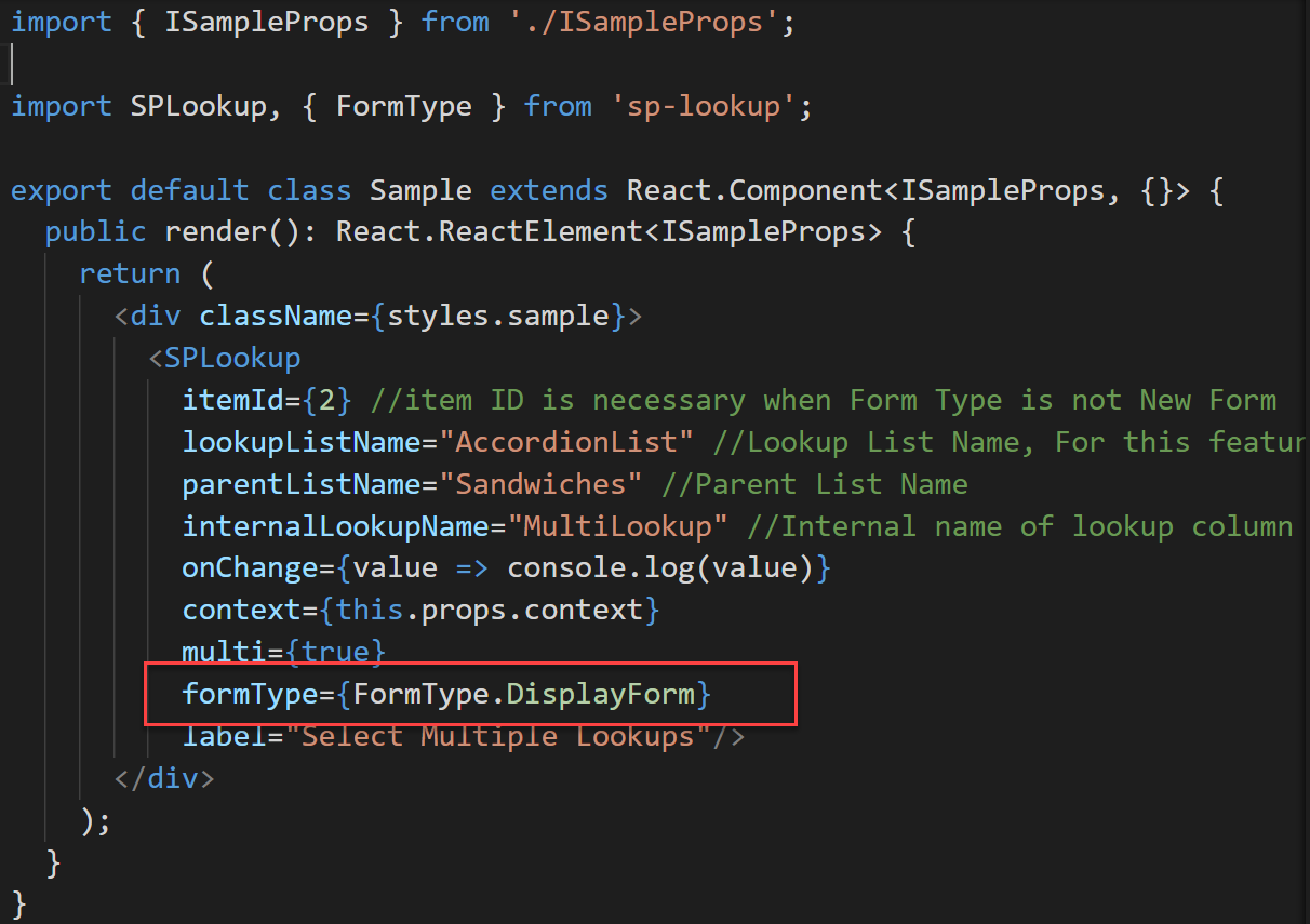
import SPLookup, { FormType } from 'sp-lookup'; .............. <SPLookup itemId={2} //item ID is necessary when Form Type is not New Form lookupListName="AccordionList" //Lookup List Name, For this feature column is Title internal name parentListName="Sandwiches" //Parent List Name internalLookupName="MultiLookup" //Internal name of lookup column in Parent List onChange={value => console.log(value)} context={this.props.context} multi={true} formType={FormType.EditForm}/>The Complete Props are
interface ISPLookupProps {
  lookupListName: string; //List name of the lookup
  parentListName: string; //List name of the list which uses Lookup field
  internalLookupName?: string; //field internal name used for lookup column
  itemId?: number; //if edit or display form item id to be edited or displayed
  onChange: (value: any[]) => void; //selected value will be returned here
  styles?: any; // custom css to be used
  context: WebPartContext; // Webpart context needs to be passed
  formType?: FormType; //Display Edit and New form types
  multi?: boolean; // single or multi item selector
  label?: string; // Label used for the field
  async?: boolean; // This new feature allows for a large list, search for item to select
}

//Form Types are as follows
enum FormType {
  NewForm = 1,
  EditForm,
  DisplayForm
}
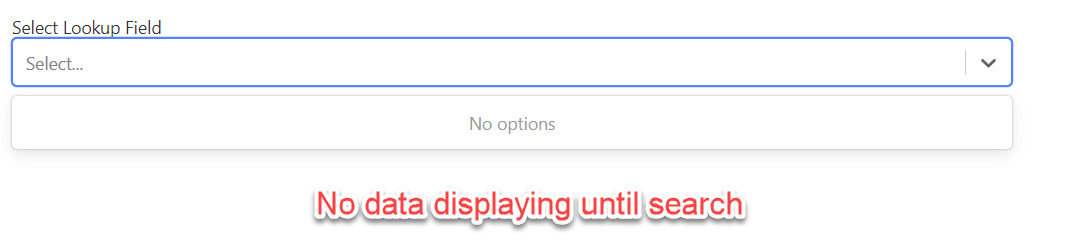
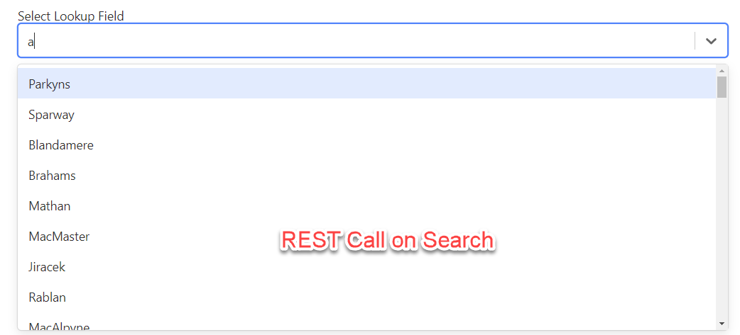
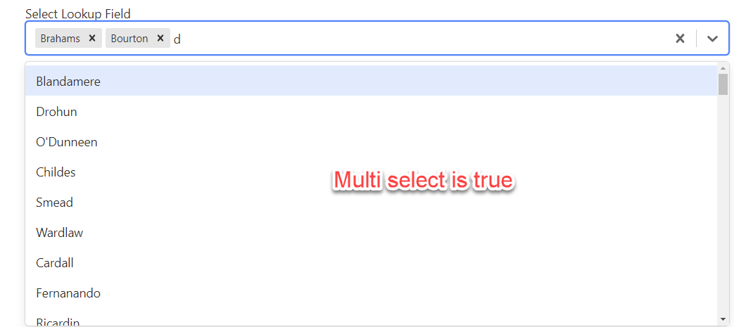
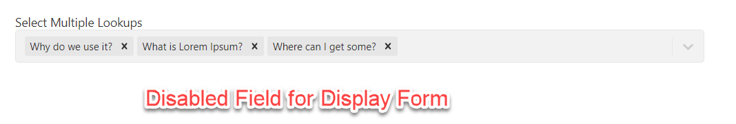
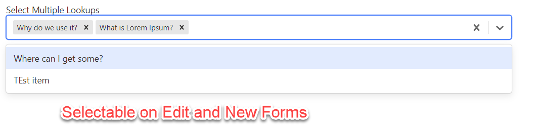
Screen Shots
-
Display Form
-
Edit Form

-
Edit form with async true and custom label for the field on the form
You can freely download the code and extend on your own