This is a simple Modal component for react projects.
The Modal component renders a pre-styled modal It consists of:
- the modal background with an easily customizable style,
- the modal container with an easily customizable style,
- the modal content with an easily customizable style,
- the possibility to add the children you want in the modal content
- the possibility to turned on or not the animation of the modal appear
- the possibility to display or not the modal's closing button
You can install the simple-react-modal-ui with npm:
npm install simple-react-modal-ui
Simply import the Modal component into the file you want to use the modal with and define its children for the content of your modal and, of course, define the styles if you want to customise them.
import { Modal } from simple-react-modal-ui
<Modal
hideModal={closeModal}
styleModalBackground
styleModal={{padding: 25, backgroundColor: 'red' }}
styleModalContent
animation={true}
closeButton={true}
>
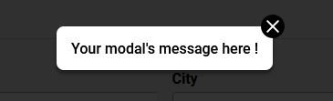
<h1>Your modal's message here !</h1>
<p>more text, or an image or an input</>
</Modal>
The modal functionality is handled by the local state of the modal's parent. Therefore, the parent component requires state. I have used modaleIsOpen and setModaleIsOpen as variable names, but you can call them whatever you like.
const [modalIsOpen, setModalIsOpen] = useState(false)
The initial state should be set to false.
An action at the parent component's level allows to change the state to true
const  handleSubmit = ( => {
    setModalIsOpen(true)
}
This displays the Modal component:
{modalIsOpen && (
    <Modal
	    hideModal={closeModal}
	    styleModalBackground
	    styleModal
	    styleModalContent
	    animation={true}
	    closeButton={true}
    >
	    <p>Your modal's message here !</p>
    </Modal>
)}
| Name | Type | Description | Required |
|---|---|---|---|
| hideModal | Function | to close modal | required |
| styleModalBackground | Object | inline styles | optional |
| styleModal | Object | inline styles | optional |
| styleModalContent | Object | inline styles | optional |
| animation | Boolean | to activate or not the animation of the modal appear | required |
| closeButton | Boolean | to display or not button close | required |
1. hideModal prop
The "hideModal" prop receives the close modal function as value. This enables the modal to be closed on button click or on modal's background click.
"hideModal" is required.
 const  closeModal = () => {
    setModalIsOpen(false)
 }
2. styleModalBackground prop
The "styleModalBackground" prop receives inline styles you want to customize for the modal background
3. styleModal prop
The "styleModal" prop receives inline styles you want to customize for the modal container
4. styleModalContent prop
The "styleModalContent" prop receives inline styles you want to customize for the modal's content
5. animation prop
The modal comes with a built-in animation effect that can be turned on by setting the animation prop to true or turned off with false.
"animation" is required.
6. closeButton prop
The "closeButton" prop receives a boolean value. It's equal true to display the button close. It's equal false if you don't want to display any close button.
"closeButton" is required.