Silky Charts
A silky smooth D3/React chart library.
Disclaimer: Silky Charts is a work in progress, there is still many charts and features to add before is considered stable so the API is subject to change during its development.


- Features
- Roadmap
- Installation
- Basic usage
- Common props
- Color themes
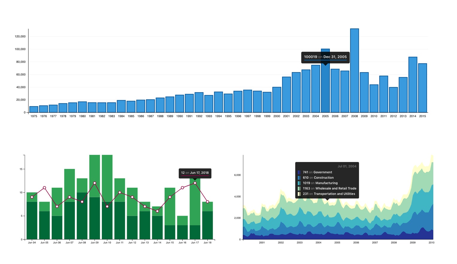
- Bar
- Combination
- StackedArea
- Contributing
Features
- Full React implementation (not a wrapper)
- Tree shaking and code splitting
- Small and fast
- Customizable and easy to style
- Two visual styles (solid and outlined)
- Fully responsive
- Built in tooltips
- Choropleth color themes
Roadmap
- Empty state
- Custom color themes
- SVG | PNG export
Installation
Install Silky Charts using Yarn
yarn add silky-chartsInstall Silky Charts using npm
npm install --save silky-chartsPeer dependencies
Silky Charts uses React >= 16.8.0, React DOM >= 16.8.0, and Styled Components >= 4.1.3 as peer dependencies.
Install peer dependencies using Yarn
yarn add react react-dom styled-componentsInstall peer dependencies using npm
npm install --save react react-dom styled-componentsBasic usage
From NPM
;/* or */; ... <Bar data= ... />...In the browser with UNPKG
Common props
Most props and options are present indistinguishable in all charts.
| Name | Type | Default | Description |
|---|---|---|---|
| aspectRatio | String |
"16:9" |
Sets the shape and size of the chart using the parent element width as a guide. Is overriden setting a width or height props. |
| data | Array |
Chart data. | |
| dataSource | String Object |
Sets the data source label on the chart's bottom right corner with optional link [3]. |
|
| dateFormat | String |
"%a %d" |
Name values as ISO dates will be formatted as dates. [1] |
| grid | Boolean |
false |
Display the chart's grid. |
| height | Number |
Sets the chart's height (breaks responsiveness). | |
| margin | Object |
Sets the margin sizes around the chart from an object with top, right, bottom, and left key-values [2]. |
|
| onClick | Function |
Callback function to call during the onClick event. | |
| onMouseEnter | Function |
Callback function to call during the onMouseEnter event. | |
| onMouseLeave | Function |
Callback function to call during the OnMouseLeave event. | |
| outlinedStyle | Boolean | false |
Activates the outlined design style. |
| responsive | Boolean |
false |
Activates the chart responsiveness feature. |
| staticTooltip | String |
Makes the tooltip to be static on the provided position. [3] |
|
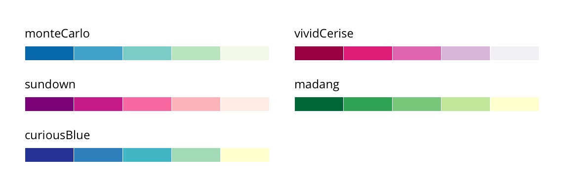
| theme | String |
"monteCarlo" |
Color theme name. Color themes |
| title | String |
Sets the title of the chart. | |
| tooltip | Boolean |
false |
Activates the built in tooltip. |
| width | Number |
640 |
Sets the chart's width. |
| xAxisChartLabel | String |
Sets the Chart's X axis label (you might need to adjust the margin). | |
| xAxisLabelRotation | Boolean |
false |
Rotates the X axis labels when these are to long to fit horizontally. |
| xAxisLabelRotationValue | Number |
-50 |
Overrides the default X axis label rotation value. |
| xAxisTicks | Number |
10 |
Sets the number of ticks of the x axis on the chart. [4] |
| yAxisChartLabel | String |
Sets the Chart's Y axis label (you might need to adjust the margin). | |
| yAxisTicks | Number |
5 |
Sets the number of ticks of the y axis on the chart. [5] |
[1]The ISO dates will be formatted using D3's date formatting rules.[2]The default values for the marginpropis{ top: 40, right: 50, bottom: 50, left: 50 }.[3]The static tooltip requirestooltipand the available positions aretop-left,top-right,bottom-right, andbottom-left.[4]If you want to display the data source label as a link you can pass an object with{ href, target, text, title }instead.[5]The specified count is only a hint; the scale may return more or fewer values depending on the domain. Read more...
Color themes
Bar
As known as Bar Graph or Column Graph.
The classic Bar Chart uses either horizontal or vertical bars (column chart) to show discrete, numerical comparisons across categories. One axis of the chart shows the specific categories being compared and the other axis represents a discrete value scale.
Bars Charts are distinguished from Histograms, as they do not display continuous developments over an interval. Bar Chart's discrete data is categorical data and therefore answers the question of "how many?" in each category.
One major flaw with Bar Charts is that labelling becomes problematic when there are a large number of bars.
--The Data Visualisation Catalogue
Data definition
[
  {
    name: String | Date {ISO String},
    value: Number,
  },
]
Props
| Name | Type | Default | Description |
|---|---|---|---|
| padding | Number |
0.15 |
Sets the padding between the chart bars. |
Combination
The combination chart is a visualization that combines the features of the bar chart and the line chart. The combination chart displays the data using a number of bars and/or lines, each of which represent a particular category.
A combination of bars and lines in the same visualization can be useful when comparing values in different categories, since the combination gives a clear view of which category is higher or lower. An example of this can be seen when using the combination chart to compare the projected sales with the actual sales for different time periods.
The series in the combination chart is a way to divide the data into slices. The difference is that the slices in the combination chart, called series, can be defined as bars or lines as well as being colored separately. That is, each series in the combination chart will be represented by a line or a set of bars in the visualization.
Data definition
[
  {
    name: String | Date {ISO String},
    series: String,
    value: Number,
  },
]
Props
| Name | Type | Default | Description |
|---|---|---|---|
| lineSeries | [String] |
Series names of the datasets you want to appear as lines in the chart. | |
| lineType | String |
"curveLinear" |
Define the line style to use based on D3 Curves options. |
| lineTypeOption | Any |
If the line style accepts optional values you can set them using this prop. | |
| padding | Number |
0.15 |
Sets the padding between the chart bars. |
| secondaryTheme | String |
"vividCerise" |
Color theme for the chart lines. Hint: opposite colors have better contrast. |
| stackedSeries | [String] |
Series names of the datasets you want to appear as stacked bars in the chart. |
StackedArea
Stacked Area Graphs work in the same way as simple Area Graphs do, except for the use of multiple data series that start each point from the point left by the previous data series.
The entire graph represents the total of all the data plotted. Stacked Area Graphs also use the areas to convey whole numbers, so they do not work for negative values. Overall, they are useful for comparing multiple variables changing over an interval.
--The Data Visualisation Catalogue
Data definition
[
  {
    name: Date {ISO String},
    series: String,
    value: Number,
  },
]
Props
| Name | Type | Default | Description |
|---|---|---|---|
| lineType | String |
"curveLinear" |
Define the line style to use based on D3 Curves options. |
| lineTypeOption | Any |
If the line style accepts optional values you can set them using this prop. |
Contributing
- Fork this repository to your own GitHub account and then clone it to your local device
- Install yarn:
npm install -g yarn| yarn installation - Install the dependencies:
yarn - Link Silky Charts:
yarn link - Run
yarn devto build and watch for code changes - Get into the Playground:
cd playground - Install the dependencies:
yarn - Link to Silky Charts:
yarn link silky-charts - Start the playground:
yarn start
How to use the playground
Once you are in the playground you will find a React application created with RCA. The App structure is the following:
.
├── README.md
├── package.json
├── public
│   ├── favicon.ico
│   ├── index.html
│   └── manifest.json
├── src
│   ├── App.js
│   ├── components
│   │   ├── ChartContainer.js
│   │   └── Container.js
│   ├── data.js
│   ├── index.js
│   └── styles.css
└── yarn.lock
After installing all the dependencies you will be able to start the application and use the App.js to play with the current charts or test new ones. The App file is already importing all the charts available and the example data sets included in the application for testing purposes, and is also already rendering one of the charts with most common props already defined and comment out to make it easier to test these.
There is also a data.js that contains all the testing data sets. Use this data set to test your charts and add new ones if you need them for your new chart or just for testing the current ones and include them in your pull request.
Create a Pull Request
Silky Charts uses git flow in its repository, so if you want to contribute and publish a pull request please create a feature branch out of develop with a name describing you change or feature and create the pull request pointing back to the develop branch.
git flow feature start <feature-name>- Make your changes and commit them
- Run the tests with
yarn testornpm run tests - Add unit tests and fix the linting issues and broken tests
- Create the pull request.
Tests
To lint your code:
yarn lint
To run the test suite:
yarn test
Testing in your own app
If you haven't yet, follow the first five steps described in Contributing to Silky Charts then inside your project directory:
- Link to Silky Charts:
yarn link silky-charts
And start coding...
Troubleshooting
- When you use bundlers like Webpack and Parcel you might encounter some issues related with Hooks throwing an error that says "
Hooks can only be called inside the body of a function component". This problem is caused by a duplicate React in your bundle and you have to follow this workaround to make it work. -- Use this package.json file as an example.