


Simplifies loading state sharing in React.
You can play with it yourself here filipchalupa.cz/shared-loading-indicator.
npm install shared-loading-indicatorWrap all by one <SharedLoadingIndicatorContextProvider>.
import { SharedLoadingIndicatorContextProvider } from 'shared-loading-indicator'

export const App => () => {
	return (
		<SharedLoadingIndicatorContextProvider>
			My app
		</SharedLoadingIndicatorContextProvider>
	)
}Place SharedProgressLoadingIndicator inside SharedLoadingIndicatorContextProvider to use prestyled loading indicator. See demo to change color or placement.
import { SharedLoadingIndicatorContextProvider, SharedProgressLoadingIndicator } from 'shared-loading-indicator'

export const App => () => {
	return (
		<SharedLoadingIndicatorContextProvider>
			<SharedProgressLoadingIndicator/>
			My app
		</SharedLoadingIndicatorContextProvider>
	)
}
You can change the <SharedProgressLoadingIndicator> color by setting a CSS custom property on its parent named --ProgressLoadingIndicator-color. Or you can build your own indicator using useSharedLoading hook.
:root {
	--ProgressLoadingIndicator-color: #ff00ff;
}
Hook useSharedLoading returns true if some component is in loading state. Use this information to show your own loading indicator (spinner, progress bar, …).
import { useSharedLoading } from 'shared-loading-indicator'

export const LoadingIndicator => () => {
	const isLoading = useSharedLoading()

	if (!isLoading) {
		return null
	}

	return (
		<div>
			App is loading something
		</div>
	)
}You can optionally configure startDelay and minimalDuration in milliseconds.
const isLoading = useSharedLoading({
	startDelay: 300, // isLoading won't be true if all local loads get finished under 300 milliseconds
	minimalDuration: 1000, // isLoading will be true for at least 1000 milliseconds
})Place <Loading> inside <SharedLoadingIndicatorContextProvider> to signalize something is loading.
import { SharedLoadingIndicatorContextProvider, Loading } from 'shared-loading-indicator'
export const App => () => {
const somethingIsLoading = true // Hook this to a state
return (
<SharedLoadingIndicatorContextProvider>
{somethingIsLoading && <Loading/>}
My app
</SharedLoadingIndicatorContextProvider>
)
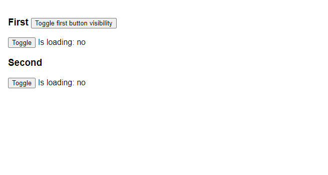
}Hook useLocalLoading works similarly to useState. It returns array with boolean state indicating that component is loading and set function.
import { useLocalLoading } from 'shared-loading-indicator'

export const MyComponent => () => {
	const [isLoading, setIsLoading] = useLocalLoading()

	return (
		<div>
			<div>
				Is loading: {isLoading ? 'yes' : 'no'}
			</div>
			<button onClick={() => {
				setIsLoading(!isLoading)
			}}>
		</div>
	)
}
import { useLocalLoading } from 'shared-loading-indicator'
import { useEffect } from 'react'
export const LazyComponent => () => {
const [isLoading, setIsLoading] = useLocalLoading()
const [data, setData] = useState(null)
useEffect(() => {
setIsLoading(true)
fetch('https://example.com')
.then(response => response.json())
.then(receivedData => {
setData(receivedData)
})
.finally(() => {
setIsLoading(false)
})
}, [])
return (
<div>
<div>
Is loading: {isLoading ? 'yes' : 'no'}
</div>
<pre>
{JSON.stringify(data, null, 2)}
</pre>
</div>
)
}Mirrors first argument to useLocalMirror under the hood.
import { useMirrorLoading } from 'shared-loading-indicator'
import { useQuery } from '@tanstack/react-query'

const Mirror = () => {
	const query = useQuery([], getData)
	useMirrorLoading(query.isLoading)

	return <div>{query.data}</div>
}To capture loading state using Suspense wrap your content by <LoadingSuspense>.
import { LoadingSuspense } from 'shared-loading-indicator'

const LazyWithSuspense = () => {
	return (
		<LoadingSuspense>
			<LazyComponent />
		</LoadingSuspense>
	)
}- Install dependencies:
npm ci - Run:
npm run dev