Shape.so Library
1000+ Customizable, animated icons & illustrations. Shape lets you customize the style, colors and border of static & animated icons and illustrations.
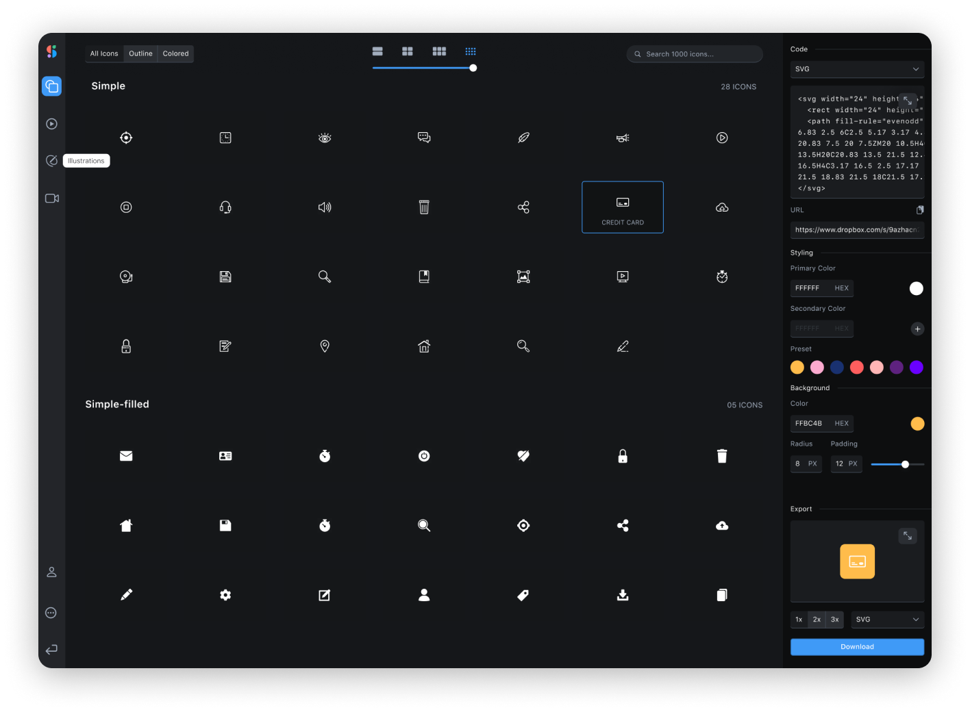
For the full list of icons/illustrations, please head over to Shape.so

Install
npm install --save shape-libraryImport
import Shape from 'shape-library';Props
| Prop | Type | Default | Description |
|---|---|---|---|
| type | string |
icons |
Specifies between rendering an icon or an illustration |
| category | string |
simple |
The type of icons/illustrations. Example: Color, Bold-Filled, Object, Elements |
| name | string |
lock |
The name of the icons/illustrations. Example: lock, home, bookmark |
| primaryColor | string |
#000 |
Hex colors, rgba, and browser supported colors. The fill for the icons/illustrations |
| secondaryColors | string |
#000 |
Hex colors, rgba, and browser supported colors. The fill for the icons/illustrations |
| backgroundColor | string |
none |
Hex colors, rgba, and browser supported colors |
| theme | number |
0 |
Enter a number from 1-8 to specify each themes. See chart below for specific colors |
| size | number |
24 |
Changes the width and height of the icon/illustrations |
| borderRadius | number |
0 |
Changes the rx on the <rect/> element |
Theme Colors
const themeOne = primaryColor: '#FF5E5E' secondaryColor: '#1B5C6A'; const themeTwo = primaryColor: '#FCAACF' secondaryColor: '#2249B3'; const themeThree = primaryColor: '#193170' secondaryColor: '#2357DD'; const themeFour = primaryColor: '#F8B500' secondaryColor: '#5E227F';const themeFive = primaryColor: '#FFB6B6' secondaryColor: '#139DB8'; const themeSix = primaryColor: '#FFD06F' secondaryColor: '#28323F'; const themeSeven = primaryColor: '#07038C' secondaryColor: '#F20505';How To Use - Icons
import React from 'react'; import Shape from 'shape-library'; const App = return <Shape ='icons' ='color' ='lock' = = ='black' = /> ;; ;How To Use - Illustrations
import React from 'react'; import Shape from 'shape-library'; const App = return <Shape ='illustrations' ='abstract' ='code' = = />;; ;License
MIT © ThatGalNatalie