
semantic-ui-react-labeledinput
Input control with integrated label and validation support for Semantic UI React


Examples of box inputs
Examples of line inputs


Prerequisites
"react": "^16.0.0",
"react-dom": "^16.0.0",
"semantic-ui-react": "^0.87.0"
Installation
npm install --save semantic-ui-react-labeledinput
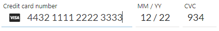
Demo
LabeledInput demo
Example usage
import React from 'react';
import LabeledInput from 'semantic-ui-react-labeledinput';
class LabeledInputExample extends React.Component {
constructor(props) {
super(props);
this.state = {
value: ""
};
}
changeValue = (newValue) => {
this.setState({ value: newValue });
}
render() => {(
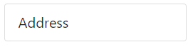
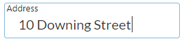
<LabeledInput inputId="address" label="Address" value={this.state.value} onValueChange={this.changeValue} />
)};
}
LabeledInput with box presentation (default presentation mode)
<LabeledInput inputId="address" label="Address" presentation="box" value={this.state.value} onValueChange={this.changeValue} />
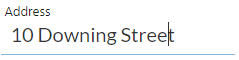
LabeledInput with line presentation
<LabeledInput inputId="address" label="Address" presentation="line" value={this.state.value} onValueChange={this.changeValue} />
LabeledInput with predefined validations
<LabeledInput errorText="value must be an integer" inputId="input1" label="Age" validation="integer" value={this.state.value} onValueChange={this.changeValue} />
<LabeledInput errorText="Invalid e-mail address" inputId="input2" label="E-mail address" validation="emailAddress" value={this.state.value} onValueChange={this.changeValue} />
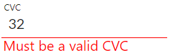
LabeledInput with regular expression validation
const regExp = /^\d{3,4}$/;
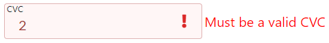
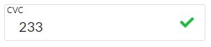
<LabeledInput inputId="input1" label="CVC" validation={regExp} value={this.state.value} onValueChange={this.changeValue} />
LabeledInput with validation function
const isEvenNumber = (valueStr) => {
    const value = parseInt(valueStr, 10);
    return value % 2 === 0;
}

<LabeledInput inputId="input1" label="Enter even number" validation={isEvenNumber} value={this.state.value} onValueChange={this.changeValue} />
LabeledInput with list of allowed values validation (case sensitive)
const allowedValues = ['value1', 'value2', 'value3'];
<LabeledInput inputId="input1" label="Enter value" validation={allowedValues} value={this.state.value} onValueChange={this.changeValue} />
More examples can be found in demo/demo.tsx file
Mandatory properties
inputId: string,  // Each input must to have a unique id
label: string,
value: string,
onValueChange: (newValue: string) => void,
Optional properties
| Property | Description |
|---|---|
| allowEmptyValue | Specifies if empty value for input is allowed |
| className | class names for outer div |
| countryCode | Default country code ISO 3166-1 Alpha-2 code for phone number validation, if not supplied, browser's country code is used |
| creditCardNumber | Credit card number to be used for CVC validation |
| disabled | Specifies if input is enabled or disabled |
| errorText | Text shown if validation fails |
| errorTextPosition | Position where error text is shown |
| focus | Specifies if input has initially focus style |
| icon | Name of Semantic UI icon to be shown in input, is overridden by validationErrorIcon or validationSuccessIcon, has no effect for validation type 'creditCardNumber |
| iconColor | Color for icon (red, orange, yellow, olive, green, teal, blue, violet, purple, pink, brown, grey, black |
| iconPosition | Position where the icon is shown |
| maxLength | Maximum number of characters allowed for input control value |
| maxValue | Maximum allowed value when validation is 'number' or 'integer' |
| minLength | Minimum number of characters needed for input control value |
| minValue | Minimum allowed value when validation is 'number' or 'interger' |
| presentation | Look & feel of input control (box or line) |
| size | Size of control |
| type | HTML input type, if undefined, sets type automatically according to validation or otherwise 'text' |
| validation | Validation keyword, a regular expression or a validation function |
| validationErrorIcon | Semantic UI icon name to be shown if validation fails, overrides icon set by icon prop, has no effect for validation type 'creditCardNumber' |
| validationSuccessIcon | Semantic UI icon name to be shown if validation succeeds, overrides icon set by icon prop, has no effect for validation type 'creditCardNumber' |
Optional property types
allowEmptyValue: boolean,
className: string,
countryCode: string,
creditCardNumber: string,
disabled: boolean,
errorText: string,
errorTextPosition: 'bottom' | 'right',
focus: boolean,
icon: string,
iconColor: string,
iconPosition: 'right',
maxLength: number,
maxValue: number,
minLength: number,
minValue: number,
presentation: 'box' | 'line',
size: 'large' | 'big' | 'huge' | 'massive',
type: string,
validation: RegExp | string[] | (inputString: string) => boolean | 'url' | 'emailAddress' | 'creditCardNumber' | 'creditCardExpiration' | 'creditCardVerificationCode' | 'number' | 'integer' | 'alphaNumeric' | 'usZipCode' | 'caPostCode' | 'ukPostCode' | 'phoneNumber' | 'usSSN' | 'ipAddress' | 'ipv4Address' | 'ipv6Address' | 'hexColor'
Default values for optional properties
allowEmptyValue: false,
className: undefined,
countryCode: '',
creditCardNumber: '',
disabled: false,
errorText: '',
errorTextPosition: 'bottom',
focus: false,
icon: '',
iconColor: undefined,
iconPosition: 'right',
maxLength: undefined,
maxValue: undefined,
minLength: undefined,
minValue: undefined,
presentation: 'box',
size: 'huge',
type: undefined,
validation: undefined
Class names
| Class name | Description |
|---|---|
| errorLabel | Applied to div that contains error label, see following styling examples how it can be used to style error messages |
| focusedOrValued | Applied to input label when input has focus or it contains a value. This class name can be used to adjust label top offset (default: 2px) or font size, for example. |
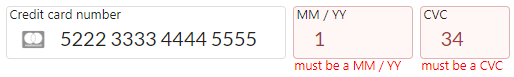
Box input styling example
styles.css
.creditCardNumber .ui.label.errorLabel, .creditCardExpiration .ui.label.errorLabel, .cvc .ui.label.errorLabel {
  font-size: 0.9em;
}

.creditCardNumber input {
  width: 14em;
}

.creditCardExpiration {
  margin-left: 0.5em;
}

.creditCardExpiration input {
  width: 6em;
}

.cvc {
  margin-left: 0.5em;
}

.cvc input {
  margin-left: 0.5em;
  width: 4.5em;
}
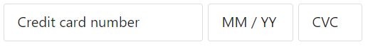
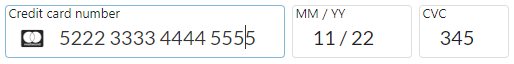
Applying CSS using className
<LabeledInput className="creditCardNumber" inputId="creditCardNumber" label="Credit card number" errorText="must be a cc number" presentation="box" validation="creditCardNumber" onValueChange={this.changeCreditCardNumber} value={creditCardNumber}/>
<LabeledInput className="creditCardexpiration" inputId="creditCardExpiration" label="MM / YY" errorText="must be a MM / YY" presentation="box" validation="creditCardExpiration" onValueChange={this.changeCreditCardExpiration} value={creditCardExpiration}/>
<LabeledInput className="cvc" inputId="cvc" label="CVC" errorText="must be a CVC" presentation="box" validation="creditCardVerificationCode" onValueChange={this.changeCVC} value={cvc}/>
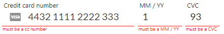
Line input styling example

styles.css
.creditCardNumber .ui.label.errorLabel, .creditCardExpiration .ui.label.errorLabel, .cvc .ui.label.errorLabel {
  font-size: 0.7em;
}

.creditCardNumber input {
  width: 13.5em;
}

.creditCardExpiration {
  margin-left: 0.5em;
}

.creditCardExpiration input {
  width: 4.5em;
}

.cvc {
  margin-left: 0.5em;
}

.cvc input {
  margin-left: 0.5em;
  width: 3.5em;
}
Applying CSS using className
<LabeledInput className="creditCardNumber" inputId="creditCardNumber" label="Credit card number" errorText="must be a cc number" presentation="line" validation="creditCardNumber" onValueChange={this.changeCreditCardNumber} value={creditCardNumber}/>
<LabeledInput className="creditCardexpiration" inputId="creditCardExpiration" label="MM / YY" errorText="must be a MM / YY" presentation="line" validation="creditCardExpiration" onValueChange={this.changeCreditCardExpiration} value={creditCardExpiration}/>
<LabeledInput className="cvc" inputId="cvc" label="CVC" errorText="must be a CVC" presentation="line" validation="creditCardVerificationCode" onValueChange={this.changeCVC} value={cvc}/>
Credit card validations
Supported cards
- American Express
- Dankort
- Diners Club
- Discover
- JCB
- Laser
- Maestro
- MasterCard
- UnionPay
- Visa
- Visa Electron
Credit card number must pass Luhn check
Credit card expiration is supported in format 'MM / YY'
Credit card verification code (CVC) can validated with two options
- Without credit card number: it must be 3-4 digits
- With credit card number: it must be 3-4 digits depending on the supplied credit card type
License
MIT License