Sass Button Builder
sass-button-builder
Overview
Description
Lorem ipsum dolor sit amet, consectetur adipisicing elit, sed do eiusmod tempor incididunt ut labore et dolore magna aliqua. Ut enim ad minim veniam, quis nostrud exercitation ullamco laboris nisi ut aliquip ex ea commodo consequat.
Installation
1. Get the code into your project using a package manager.
If you're using NPM, run the following from the commandline:
npm install sass-button-builder --savenpm installIf you're using Yarn, run:
yarn add sass-button-builder2. Import the main Scss partial somewhere in your stylesheets
Do so with:
;Inside your main or 'master' stylesheet is generally a good default location (for example,
myproject/app/stylesheets/main.scss).A Scss partial holding all 3rd-party code, plugins, or vendor packages is also common (often someting like,
myproject/src/styles/lib/_vendor.scss).
Usage
Main Mixins
File Location:
sass-button-builders/button-builder.scss
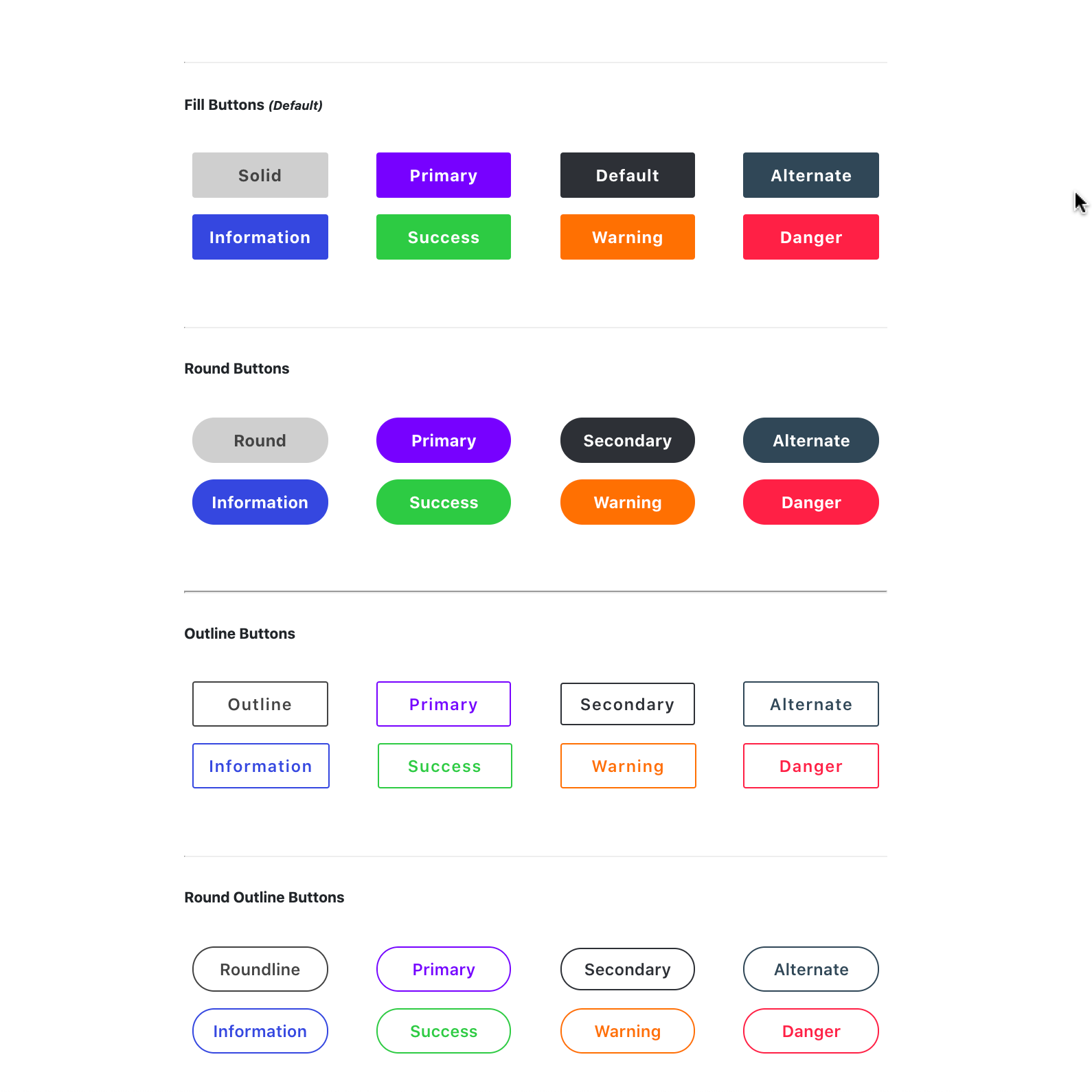
Create Solid Button
/** * Creates a solid button of a supplied fill color with slightly-rounded corners. * * @param: $_color HEX/HSL/RGB(a) value, unquoted CSS-Color string-identifier * (DEFAULT : $default-button-color) * * @example: .my-button { @include solidButton(mediumslateblue); } * .my-other-button { @include solidButton(#333333); }**/ Create Round Button
/** * Creates a rounded button of a supplied fill color with fully-rounded, oval corners. * * @param: $_color HEX/HSL/RGB(a) value, unquoted CSS-Color string-identifier * (DEFAULT : $default-button-color) * * @example: .my-button { @include roundButton(mediumslateblue); } * .my-other-button { @include roundButton(#333333); }**/ Create Outline Button
/** * Creates a outlined button of supplied text- and border-color with slightly-rounded corners. * * @param: $_color HEX/HSL/RGB(a) value, unquoted CSS-Color string-identifier * (DEFAULT : $default-button-color) * * @example: .my-button { @include outlineButton(mediumslateblue); } * .my-other-button { @include outlineButton(#333333); }**/ Mixing These Styles
Rounded Outline Button
.round // or ... .round.outline Color Classes
Add these classes to automatically adjust the color
.primary .secondary .danger .warning .success .alternate .info A Note On Semantics
This project's aim was to enable button creation with the fewest possbile implementation steps and cleanest / most semantic markup. Thus, the preference is to write markup as such:
Default Primary Default Outline <!-- No need to add `.button` class, as `role="button"` is more effective -->Button-Style Link <!-- No need to add `.button` class, as `role="button"` is more effective, --><!-- but `type="button"` is still a good idea. --> Button-Style Input /> <!-- No need to add `.button` class, as `role="button"` is more effective, --><!-- but `type="button"` is still a good idea. --> Button-Style Submit /> SuccessVariables, Settings, and Configurations
File Locations:
sass-button-builders/core/_variables.scss
sass-button-builders/core/_config.scss
sass-button-builders/core/_settings.scss
Images
Screenshots