Sajari React SDK · 


sajari-react is a client side javascript library of React Components for the Sajari search platform to help build fast and powerful search interfaces.
React provides a simple and elegant way to structure user interfaces. The Sajari React SDK provides a way to seamlessly integrate the Sajari platform into any web-based app through the use of easily composable Components.
We also provide a vanilla Sajari JS library here.
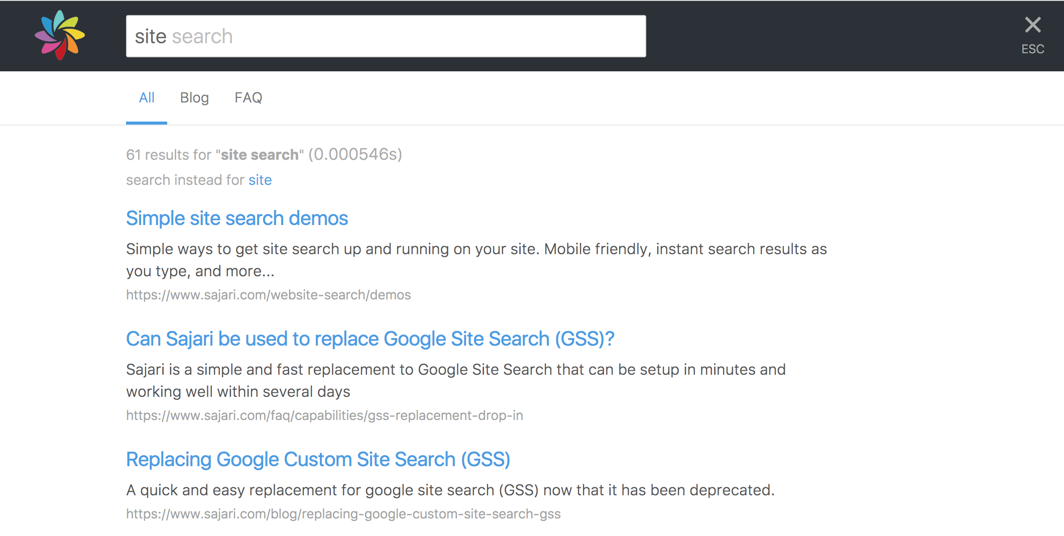
Table of contents
Examples
It's easy to get up and running using one of our examples as a starting point. They're pre-configured with all the correct dependencies, so all you need to do is copy the example directory into your own workspace and you're on your way!
- Autocomplete: search box with autocomplete.
- Autocomplete with suggestions: search box with autocomplete + suggestions.
- Simple search: instant search with autocomplete.
- Standard search: instant search with autocomplete + tab filtering.
- Custom result renderer: instant search with autocomplete + custom result renderers.
- Radio/checkbox: radio/checkbox filtering.
- Aggregate: aggregate filtering.
Setup
Check out our examples for the best way to get started.
If you want to add the SDK to an existing project, or want to start from scratch, then you can get sajari-react using NPM.
NPM
We currently distribute the sajari-react library through NPM. NPM is only required for downloading the library. The SDK is made to be used from the browser.
$ npm install --save sajari sajari-reactQuick reference
This library includes a standard set of components for building search interfaces.
Setting up API calls
Before you can use any components, you'll need to initialise a Pipeline for handling search requests to the API:
; // Create a pipeline for running searches.const pipeline = "<your-project>" "<your-collection>" "website"; // Now you're ready to perform a search.pipeline;AutocompleteInput

AutocompleteInput provides a text-box which performs searches as the user types and renders appropraite autocomplete suggestions back in the input box.
; <AutocompleteInput values=values pipeline=pipeline />Input
Input is a plain search box which does not show autocomplete suggestions.
; <Input values=values pipeline=pipeline />AutocompleteDropdown
AutocompleteDropdown is a text box which performs autocomplete as the user types and renders autocomplete suggestions in a list underneath.

; <AutocompleteDropdown values=values pipeline=pipeline />Handling results
A typical search result UI could includes a summary of the search, maybe with options to change spellings or search for alternatives, and a list of the paginated results. We include components for all of these pieces so it's easy to get started.
A standard search response handler would look something like this:
<Response pipeline=pipeline> <Summary values=values pipeline=pipeline /> <Results pipeline=pipeline /> <Paginator values=values pipeline=pipeline /></Response><Response/>
The <Response /> component doesn't render its children if the pipeline Response is empty (i.e. the initial pre-search state, or after pipeline.clearResponse() has been called).
<Results />
The <Results /> component can also take a custom renderer which will be used to render its individual results. See the custom result renderer example for more details.
Building facets
Use the Filter helper-class from sajari-react/controllers to integrate facets into UI. The library provides a standard set of components under sajari-react/ui/facets which can automatically bind state to Filter instances. For more details, see the full documentation.
Single-select filters
A single-select filter is used to handle state for components that offer multiple filtering options but only allow one option to be enabled at any one time. For example: a drop-down box or group of radio buttons.
; const categories = // Options: Name -> Filter "all": "" "blog": "dir1='blog'" // limit to results with dir1='blog' "articles": "dir1='articles'" // limit to results with dir1='articles' // The default option. "all";Each filter is given a name (in this example: all, blog, articles) which can then be used to bind them to UI components:
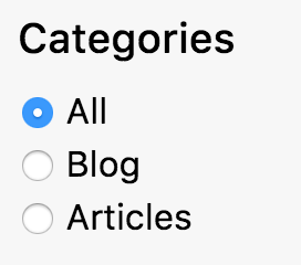
; <div> <h3>Categories</h3> <RadioFacet filter=categories name="all" /><label>All</label> <RadioFacet filter=categories name="blog" /><label>Blog</label> <RadioFacet filter=categories name="articles" /><label>Articles</label></div>Or a drop-down select box:
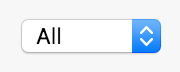
; <SelectFacet filter=categories options= // Options: Name -> Display Name all: "All" blog: "Blog" articles: "Articles" />To include the filter in a search it needs to be attached to the Values instance used by Pipeline:
; // Add the filter to `values`. Note: category.filter() will be// evaluated in `values.get()`.values; // Trigger a search every time the filter selection changes.categories;Multi-select filters
A multi-select filter is used to represent state for UI components that can have multiple options selected at once, i.e. a list of check boxes or a multi-select list.
const categories = // Options: Name -> Filter "blog": "dir1='blog'" // limit to dir1='blog' "articles": "dir1='articles'" // limit to dir1='articles' "other": "dir1!='blog' AND dir1!='articles'" // everything else // The default filters to be enabled "blog" "articles" // default filter will be "dir1='blog' OR dir1='articles'" true // Allow multiple selections;This can be hooked up to a list of checkboxes:
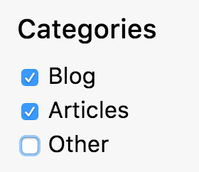
; <div> <h3>Categories</h3> <CheckboxFacet filter=categories name="blog" /><label>Blog</label> <CheckboxFacet filter=categories name="articles" /><label>Articles</label> <CheckboxFacet filter=categories name="other" /><label>Other</label></div>The default operator used to combine selected filters is OR, but this can be overriden by the last argument in the Filter construtor. See the full class docs for more details.
To include the filter in a search it needs to be attached to the Values instance used by Pipeline:
; // Add the filter to `values`. Note: category.filter() will be// evaluated in `values.get()`.values; // Trigger a search every time the filter selection changes.categories;Tidying up filter listeners
The listen method returns a closure that will unregister the new listener:
const unregister = filter; // sometime later...;Combining multiple filters
To combine multiple Filter instances into one, use the CombineFilters function.
; // Define recency filter...const recencyFilter = ...; // Define category Filter...const categoryFilter = ...; // Combine both recency and category filters.const filter = // Add the filter to `values`. Note: filter.filter() will be// evaluated in `values.get()`.values // When either recencyFilter or categoryFilter is updated, they trigger// an event on the combined filter.const unregister = filter; // Sometime later...;Using Values
The Values convenience class used to manage parameters for running searches.
; // Initialise with resultsPerPage parameter.const values = resultsPerPage: "5" ;Setting values
Use to the set method to set values in an instance of Values:
values;It's also possible to assign closures to value keys, these will be evaluated whenever Values.get() is called (i.e. pipeline.search(values.get())).
valuesListening for changes
Register listeners to be notified of changes to a Values instance (via valuesUpdatedEvent). All listeners are passed the dictionary of values that were updated and a set function will set a new value without triggering another valuesUpdatedEvent.
; const unregister = values; // Sometime later...;Using Pipeline
The Pipeline controller handles all the search request/response lifecycle.
; const pipeline = "<your-project>" "<your-collection>" "website";Performing searches
To perform a search you need a dictionary of parameter key-value pairs.
pipeline;Listening for responses
Register listeners to be notified when search responses come back from the server, or are cleared by UI events. Every listener is passed a Response which wraps the server response with convenience methods:
isEmpty(): returnstrueif the response is empty (i.e. as a result of a call toPipeline.clearResponse())isError(): returnstrueif the response is an error response.getError(): returns the underlying error.getResponse(): returns the full search response.getResults(): returns the search results from the response.getTotalResults(): returns the total results found.getTime(): returns the total query time.getAggregates(): returns aggregate data attached to response.
; const unregister = pipeline;License
We use the MIT license
Browser support
The browser support is dependent on the React library, which currently supports recent versions of Chrome, Firefox, Sajari, Opera, and IE9+. (17/8/2016)