rocket-preset-code-tabs
Add tab elements for code blocks
Configuration
Add the preset to your rocket.config.js, and configure it with a collections object. collections is a record of collection names to tab types. For example, if you want code tabs which switch between install commands for npm, yarn, and pnpm, add the following:
import { codeTabs } from 'rocket-preset-code-tabs';

export default {
  presets: [
    codeTabs({
      collections: {
        packageManagers: {
          npm: { label: 'NPM', iconHref: '/_merged_assets/brand-logos/npm.svg' },
          yarn: { label: 'Yarn', iconHref: '/_merged_assets/brand-logos/yarn.svg' },
          pnpm: { label: 'PNPM', iconHref: '/_merged_assets/brand-logos/pnpm.svg' },
        },
      }
    })
  ]
}
Usage
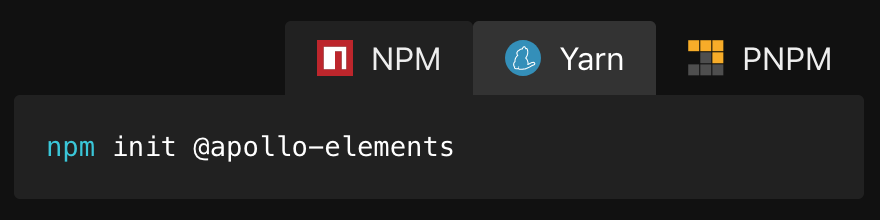
Now, to add a tab switcher to a page, write code blocks with the tab ${id} directive, and wrap the set of tabs in a <code-tabs collection="package-managers" default-tab="npm"> element. You can indent the code blocks by one two spaces, but no more.
<code-tabs collection="package-managers" default-tab="npm">

  ```bash tab npm
  npm i -S rocket-preset-code-tabs
  ```

  ```bash tab yarn
  yarn add rocket-preset-code-tabs
  ```

  ```bash tab pnpm
  pnpm add rocket-preset-code-tabs
  ```

</code-tabs>
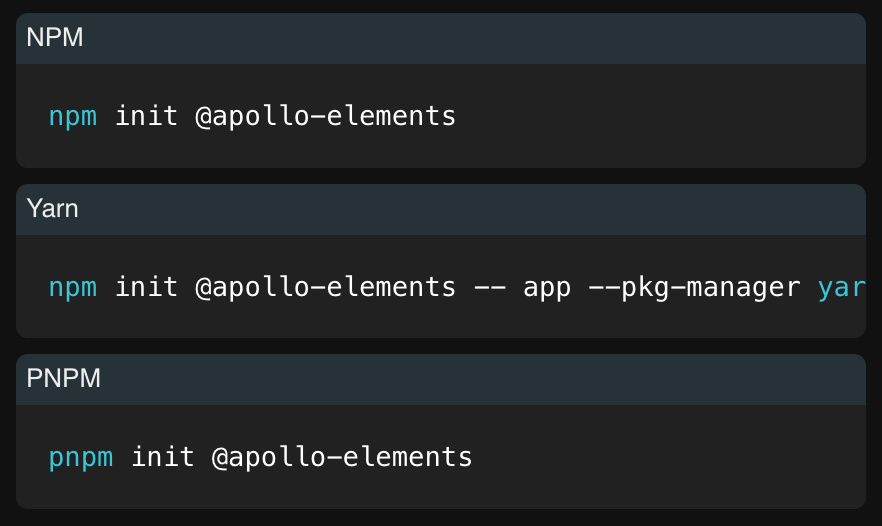
Ad-Hoc Tabs
If you omit the collection attribute, you can create an ad-hoc tab group by passing the tab name as the first argument to the tab directive
<code-tabs default-tab="my-element.js">

  ```js tab my-element.js
  class MyElement extends HTMLElement {
    static is = 'my-element';
  }

  customElements.define(MyElement.is, MyElement);
  ```

  ```json tab custom-elements.json
  {
    "schemaVersion": "1.0.0",
    "readme": "",
    "modules": [
      {
        "kind": "javascript-module",
        "path": "my-element.js",
        "declarations": [
          {
            "kind": "class",
            "description": "",
            "name": "MyElement",
            "tagName": "my-element",
            "members": [
              {
                "kind": "field",
                "name": "is",
                "default": "'my-element'",
                "static": true
              }
            ],
            "superclass": {
              "name": "HTMLElement"
            }
          }
        ]
      }
    ]
  }

  ```

</code-tabs>
Results
With JavaScript enabled, users will be able to pick their preferred 'flavour', which persists across page loads via local storage.
<noscript>
Content is king! Users with JavaScript disabled get a gracefully degraded experience
Styling
Enjoy consistent site-wide theming by setting --markdown-syntax-background-color and --markdown-table-row-odd-background-color
API Docs
rocket-preset-code-tabs.js:
Functions
| Name |
Description |
Parameters |
Return |
codeTabs |
Set up code tabs rocket preset |
options: CodeTabsOptions |
RocketPreset |
Exports
| Kind |
Name |
Declaration |
Module |
Package |
js |
codeTabs |
codeTabs |
rocket-preset-code-tabs.js |
|
components/code-copy.ts:
class: CodeCopy
Superclass
| Name |
Module |
Package |
LitElement |
|
lit |
Static Fields
| Name |
Privacy |
Type |
Default |
Description |
Inherited From |
is |
|
string |
'code-copy' |
|
|
styles |
|
array |
[ButtonHostStyles, CopyStyles] |
|
|
shadowRootOptions |
|
ShadowRootInit |
`{ |
|
|
mode: 'open',
delegatesFocus: true,
} | | | |copyIcon | | | `` html ` `` | | |
Fields
| Name |
Privacy |
Type |
Default |
Description |
Inherited From |
host |
|
HTMLElement |
this |
The element to copy text from. |
|
success |
|
string |
'pending' |
|
|
timeout |
|
number |
2000 |
Number of milliseconds to wait after successfully copying before restoring the copy button's icon to 'pending'. |
|
Methods
| Name |
Privacy |
Description |
Parameters |
Return |
Inherited From |
render |
|
|
|
TemplateResult |
|
Events
| Name |
Type |
Description |
Inherited From |
copy |
CustomEvent<string> |
when successfully copying |
|
CSS Properties
| Name |
Default |
Description |
--code-button-active-color |
|
button background when focused |
--code-button-background |
var(--markdown-table-row-odd-background-color) |
button background |
--code-button-color |
inherit |
button text color |
--code-button-focus-background |
var(--primary-lines-color) |
button background when focused |
--code-button-focus-color |
inherit |
button text color when focused |
--code-border-radius |
6px |
border radius for code-copy and code-tabs |
CSS Parts
| Name |
Description |
copy-button |
copy button |
Slots
| Name |
Description |
copy-icon |
Button content |
success-icon |
Button content which alerts on copying. Use role="alert" if overriding default. |
Private API
Methods
| Name |
Privacy |
Description |
Parameters |
Return |
Inherited From |
onCopy |
private |
|
|
Promise<void> |
|
Exports
| Kind |
Name |
Declaration |
Module |
Package |
js |
CodeCopy |
CodeCopy |
components/code-copy.ts |
|
components/code-tabs.ts:
class: CodeTabs
Superclass
| Name |
Module |
Package |
LitElement |
|
lit |
Mixins
| Name |
Module |
Package |
SelectMixin |
|
@pwrs/mixins/select/select-mixin |
Static Fields
| Name |
Privacy |
Type |
Default |
Description |
Inherited From |
allowedChildren |
|
array |
['code-tab'] |
|
|
styles |
|
array |
[ButtonHostStyles, TabsStyles] |
|
|
keyboardMode |
|
string |
'tablist' |
|
|
Fields
| Name |
Privacy |
Type |
Default |
Description |
Inherited From |
tabs |
|
NodeListOf<HTMLButtonElement> |
|
The tab buttons. |
|
defaultTab |
|
string |
|
Which tab name to treat as default, in case the use has not yet made a selection. |
|
align |
|
'start'|'end' |
'start' |
Tablist alignment |
|
collection |
|
string |
|
Which tab collection to use. |
|
onClickTab |
|
|
|
|
|
Methods
| Name |
Privacy |
Description |
Parameters |
Return |
Inherited From |
firstUpdated |
|
|
changed: PropertyValues<this> |
Promise<void> |
|
updated |
|
|
changed: PropertyValues<this> |
void |
|
render |
|
|
|
TemplateResult |
|
selectId |
public |
|
idToSelect: string |
void |
|
CSS Properties
| Name |
Default |
Description |
--code-tabs-icon-height |
|
size of the tab icon |
--code-tabs-tabs-background |
|
background for the tablist |
--code-tabs-justify-tabs |
|
flex justification for tab buttons. Alternatively, set the align attribute |
--code-tabs-min-height |
1px |
tabpanel minimum height |
--code-tabs-tabpanel-background |
var(--markdown-syntax-background-color, #f6f8fa) |
tabpanel background |
--code-tabs-background |
var(--markdown-syntax-background-color, #f6f8fa) |
content and selected button background |
--code-tabs-border |
1px solid var(--code-tabs-border-color, var(--primary-color)) |
border for code-tabs |
--code-tabs-border-color |
transparent |
border color for code-tabs |
--code-tabs-border-focus-color |
var(--primary-color) |
border color for code-tabs when focused |
--code-tabs-selected-highlight-color |
var(--markdown-link-color) |
color for selected tab highlight |
--code-button-active-color |
|
button background when focused |
--code-button-background |
var(--markdown-table-row-odd-background-color) |
button background |
--code-button-color |
inherit |
button text color |
--code-button-focus-background |
var(--primary-lines-color) |
button background when focused |
--code-button-focus-color |
inherit |
button text color when focused |
--code-border-radius |
6px |
border radius for code-copy and code-tabs |
CSS Parts
| Name |
Description |
tablist |
container for tab buttons |
tabpanels |
container for content |
tab |
tab button |
default-container |
container for default tab |
Private API
Fields
| Name |
Privacy |
Type |
Default |
Description |
Inherited From |
labels |
private |
|
new Map<string, Tab>() |
|
|
initialSelectedIndex |
protected |
number |
0 |
|
|
Methods
| Name |
Privacy |
Description |
Parameters |
Return |
Inherited From |
getInitialSelectedIndex |
protected |
|
|
Promise<number> |
|
initCollection |
private |
|
|
|
|
onSlotchange |
private |
|
|
|
|
onSelect |
private |
|
|
void |
|
onClickTab |
private |
|
event: Event & { target: HTMLButtonElement } |
|
|
initLabels |
protected |
|
event: Event |
void |
|
class: CodeTab
Superclass
| Name |
Module |
Package |
LitElement |
|
lit |
Static Fields
| Name |
Privacy |
Type |
Default |
Description |
Inherited From |
styles |
|
array |
[TabStyles] |
|
|
Fields
| Name |
Privacy |
Type |
Default |
Description |
Inherited From |
tab |
|
string |
|
|
|
noCopy |
|
boolean |
false |
|
|
Methods
| Name |
Privacy |
Description |
Parameters |
Return |
Inherited From |
render |
|
|
|
TemplateResult |
|
CSS Properties
| Name |
Default |
Description |
--code-button-active-color |
|
button background when focused |
--code-button-background |
var(--markdown-table-row-odd-background-color) |
button background |
--code-button-color |
inherit |
button text color |
--code-button-focus-background |
var(--primary-lines-color) |
button background when focused |
--code-button-focus-color |
inherit |
button text color when focused |
--code-border-radius |
6px |
border radius for code-copy and code-tabs |
CSS Parts
| Name |
Description |
content |
container for tab content |
Exports
| Kind |
Name |
Declaration |
Module |
Package |
js |
CodeTabs |
CodeTabs |
components/code-tabs.ts |
|
js |
CodeTab |
CodeTab |
components/code-tabs.ts |
|
