
- Install library
npm install rn-segmented-tab-controls
- Use components
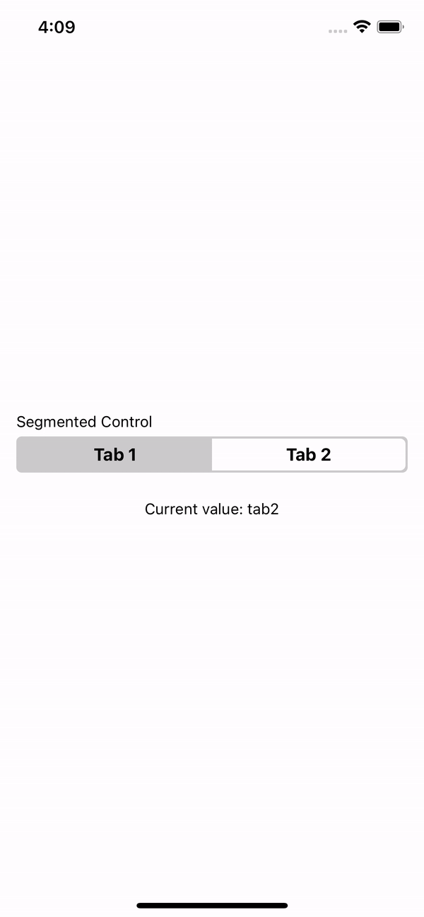
import {SegmentedControl} from 'rn-segmented-tab-controls';

const App = () => {
  const [value, setValue] = useState('tab1');

  const values = [
    {key: 'Tab 1', value: 'tab1'},
    {key: 'Tab 2', value: 'tab2'},
  ];

  return (
    <SegmentedControl
      label="Segmented Control"
      values={values}
      onChange={value => setValue(value)}
    />
  );
};| Prop | Description | Type | Required | Default |
|---|---|---|---|---|
values |
Key and value array to generate each tab. | {key: string; value: string}[] |
Yes | None |
onChange |
Function that returns the selected value. | (value: string) => void |
Yes | None_ |
label |
The label with which you want to identify the segmentedControl. | string |
No | None |
labelStyle |
Styles for label. | StyleProp<TextStyle> |
No | None |
selectedIndex |
Selected initial value. | number |
No | 0 |
backgroundColor |
SegmentedControl background color. | string |
No | '#CCCCCC' |
tintColor |
Tint color for the selected tab. | string |
No | '#FFFFFF' |
textColor |
Text color in the segmentedControl. | string |
No | '#000000' |
selectedTextColor |
Text color en the selected tab. | string |
No | '#000000' |
style |
Styles for the component container. | StyleProp<ViewStyle> |
No | None |
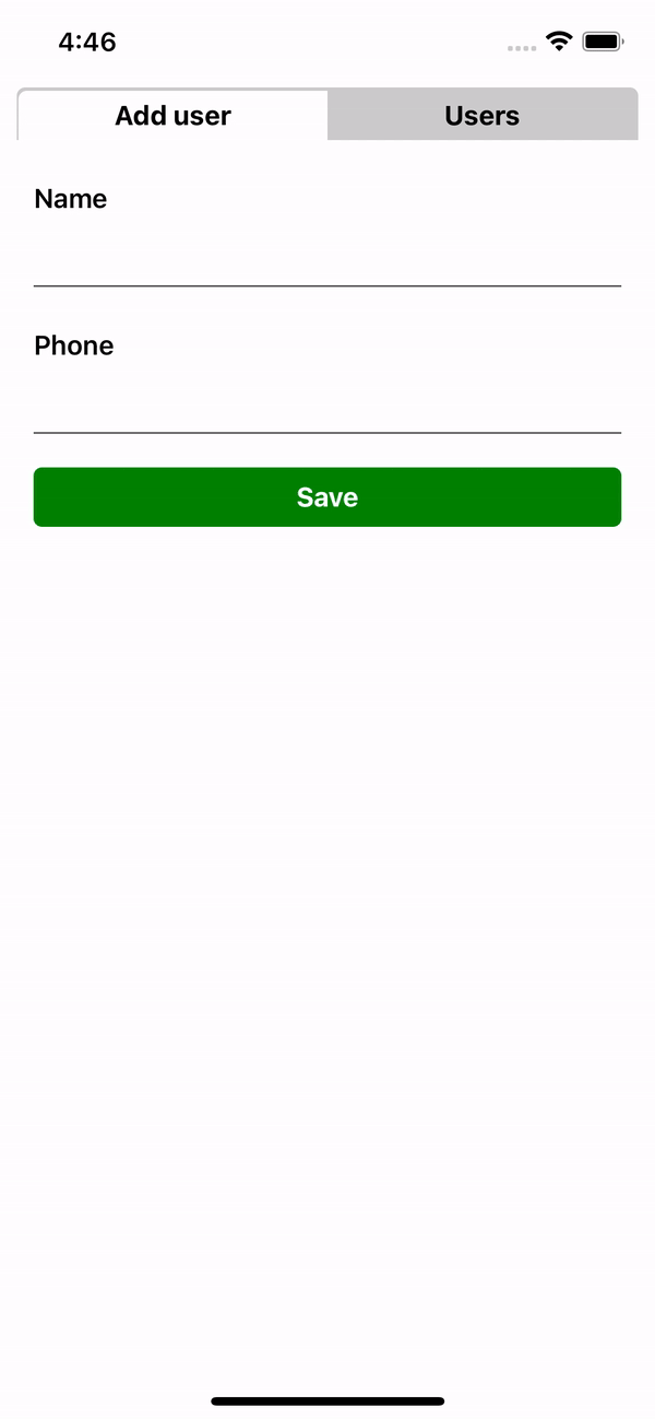
import {TabControl} from 'rn-segmented-tab-controls';
import {FormUser, Users} from './components';

const App = () => {
  const values = [
    {key: 'Add user', renderItem: FormUser},
    {key: 'Users', renderItem: Users},
  ];

  return <TabControl values={values} />;
};| Prop | Description | Type | Required | Default |
|---|---|---|---|---|
values |
Key and renderItem array to generate each tab. | {key: string; renderItem: JSX.Element}[] |
Yes | None |
label |
The label with which you want to identify the tabControl. | string |
No | None |
labelStyle |
Styles for label. | StyleProp<TextStyle> |
No | None |
selectedIndex |
Selected initial value. | number |
No | 0 |
backgroundTabColor |
TabControl background color. | string |
No | '#CCCCCC' |
tabTintColor |
Tint color for the selected tab. | string |
No | '#FFFFFF' |
textColor |
Text color in the TabControl. | string |
No | '#000000' |
selectedTextColor |
Text color en the selected tab. | string |
No | '#000000' |
containerStyle |
Styles for the rendered component. | StyleProp<ViewStyle> |
No | None |
style |
Styles for the component container. | StyleProp<ViewStyle> |
No | None |
This project is licenced under the MIT License.