
React Native Content Shimmer 


This a fork of this package, it resolves the issue with using it with reanimated and removes the hard requirement on redash
A simple and fully customizable implementation of a shimmer placeholder for React Native. Works in both iOS and Android.
Installation
bun install rn-content-shimmeror
npm install rn-content-shimmeror
yarn add rn-content-shimmerThis package requires an external package for linear gradient. By default it uses react-native-linear-gradient package. If you want to use it with the default behaviour you have to install the package:
bun install react-native-linear-gradientor
npm install react-native-linear-gradientor
yarn add react-native-linear-gradientBut you can always swap it out with your preferred gradient implementation and pass it via the LinearGradientComponent prop.
Also install the following peer dependencies as the package depends on them. We prefer you install these dependencies in order to prevent double instance errors.
bun install react-native-reanimatedor
npm install react-native-reanimatedor
yarn add react-native-reanimatedUsage
- Import rn-content-shimmer:
import { Shimmer } from 'rn-content-shimmer';- Once you create the Shimmer, you have two options:
- Child Layout : The component will figure out the layout of its bones with the dimensions of its direct children.
-
Custom Layout : You provide a prop
layoutto the component specifying the size of the bones (see the Examples section below). Herunder is the example with a custom layout. A key prop is optional but highly recommended.
export default function Placeholder() {
  return (
    <Shimmer
      containerStyle={{ flex: 1, width: 300 }}
      isLoading={false}
      layout={[
        { key: 'someId', width: 220, height: 20, marginBottom: 6 },
        { key: 'someOtherId', width: 180, height: 20, marginBottom: 6 },
      ]}
    >
      <Text style={styles.normalText}>Your content</Text>
      <Text style={styles.bigText}>Other content</Text>
    </Shimmer>
  );
}- Then simply sync the prop
isLoadingto your state to show/hide the Shimmer when the assets/data are available to the user.
export default function Placeholder() {
  const [loading, setLoading] = useState(true);
  return (
    <Shimmer
      containerStyle={{ flex: 1, width: 300 }}
      isLoading={isLoading}
      {...otherProps}
    />
  );
}
Props
| Name | Type | Default | Description |
|---|---|---|---|
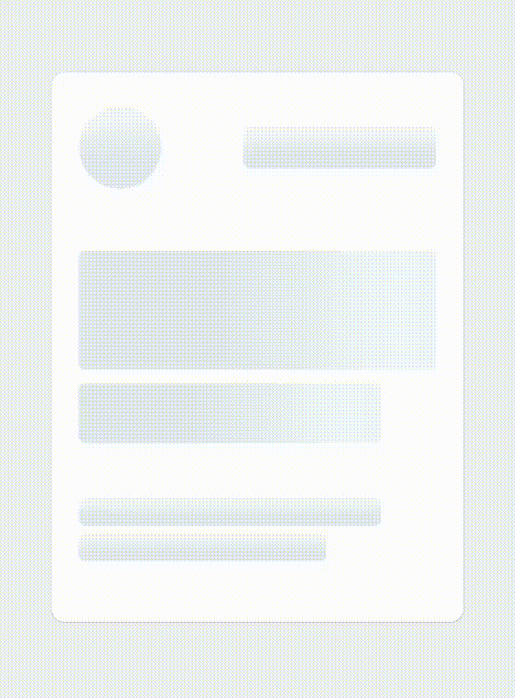
| isLoading | bool | required | Shows the Shimmer bones when true |
| layout | array of objects | [] | A custom layout for the Shimmer bones |
| duration | number | 1200 ms | Duration of one cycle of animation |
| containerStyle | object | flex: 1 | The style applied to the View containing the bones |
| easing | Easing | bezier(0.5, 0, 0.25, 1) | Easing of the bones animation |
| animationType | string | "shiver" | The animation to be used for animating the bones (see demos below) |
| animationDirection | string | "horizontalRight" | Used only for shiver animation, describes the direction and end-point (ex: horizontalRight goes on the x-axis from left to right) |
| boneColor | string | "#E1E9EE" | Color of the bones |
| highlightColor | string | "#F2F8FC" | Color of the highlight of the bones |
Note: The Easing type function is the one provided by react-native-reanimated, so if you want to change the default you will have to install it as a dependency.
Examples
See the playground section to experiment : 1 - Changing the direction of the animation (animationDirection prop) :
export default function Placeholder() {
  return (
    <Shimmer
      containerStyle={{ flex: 1, width: 300 }}
      animationDirection="horizontalLeft"
      isLoading={true}
      // ...
    />
  );
}
2 - Changing the colors and switching to "pulse" animation (boneColor, highlightColor and animationType prop) :
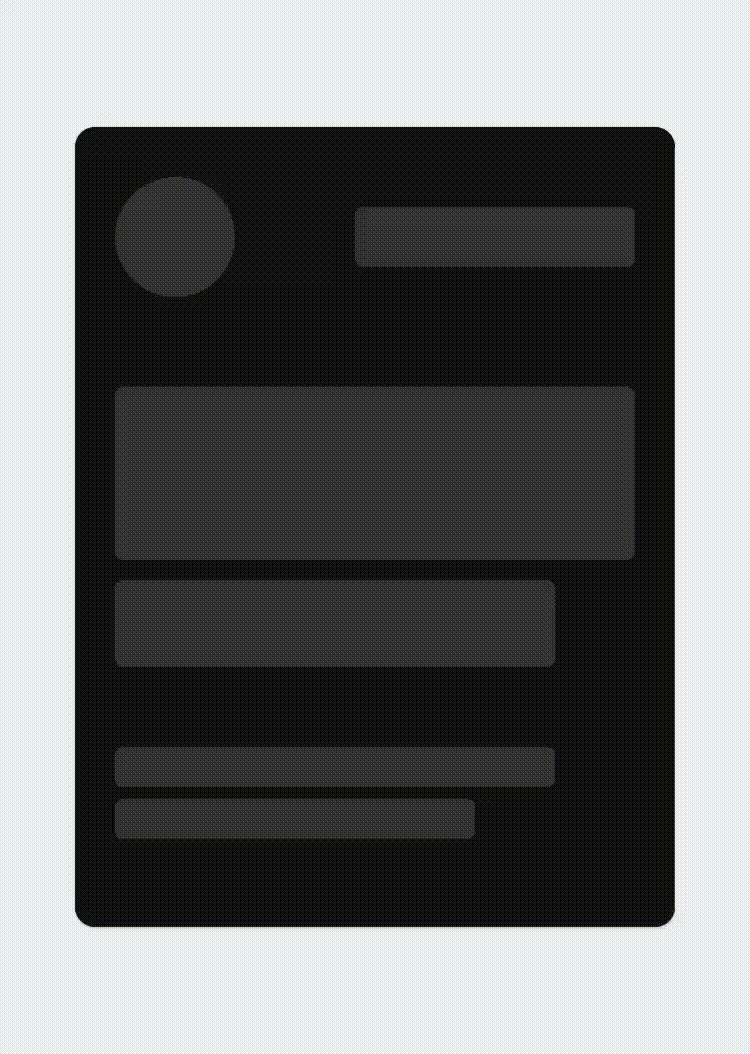
export default function Placeholder() {
  return (
    <Shimmer
      containerStyle={{ flex: 1, width: 300 }}
      boneColor="#121212"
      highlightColor="#333333"
      animationType="pulse"
      isLoading={true}
      // ...
    />
  );
}
3 - Customizing the layout of the bones (layout prop) :

export default function Placeholder() {
  return (
    <Shimmer
      containerStyle={{ flex: 1, width: 300 }}
      animationDirection="horizontalLeft"
      layout={[
        // long line
        { width: 220, height: 20, marginBottom: 6 },
        // short line
        { width: 180, height: 20, marginBottom: 6 },
        // ...
      ]}
      isLoading={true}
      // ...
    />
  );
}