

A library of React components created using create-react-app to make secure and customizable date picker.
RHDatePicker is a time picker displaying a label and an html input as well as a clickable calendar.
- It manages dates, times and periods.
- Input value can be retrieved in number, string, array or Date object format.
- It retrieves the language and the theme defined to navigator in order to apply the input and output format as well as the colors used.
Alexandre Bidaud
- JS
- CSS
- HTML
- NodeJs
- React.js
- React-Redux
- Styled-components
- Prop-Type
Run the following command:
npm i rh-date-picker
For use, only "inputId" and "label" parameters are required. By default, "valueFormat" attribute is "number" and "type" attribute is "dateTime".
Input value can be retrieved using input id or name (equal to "inputId" argument), or a custom event function (see "eventFunction" argument). If "type" argument is a period (datePeriod, dateTimePeriod or timePeriod), a second input is generated. Its name and id correspond to "inputId" argument with the addition of the suffix "-end" (ex: "myInputId-end").
Below is an example implementation of the RHDatePicker component. You can also see other examples in src/lib/examples/ .
import DatePicker from "rh-date-picker/dist/component/datePicker"
<DatePicker inputId={"myInputId"} label={"my label text"} />
Below is the list of parameters accepted by DatePicker component :
- {string} : accepts alphanumeric characters and hyphen
- REQUIRED
- {object} : contains min and max attributes
- optional
- example :
const myDeadlines = { max: 2022-02-02, min: 2020-01-01 }
<DatePicker inputId={"myInputId"} label={"my label text"} deadlines={ myDeadlines } />
- {string} : accepts alphanumeric characters, hyphen, space and apostrophe
- REQUIRED
- {object} : contains function to apply to events. Input value is passed as first argument of custom event function (not for onClick function)
- optional
- example :
const myEventFunction = { onChange: myCustomOnChangeFunction, onClick: myCustomOnClickFunction, onBlur: myCustomOnBlurFunction }
<DatePicker inputId={"myInputId"} label={"my label text"} eventFunction={ myEventFucntion } />
- {object} : contains classes to apply to the container, to the input and to the error message
- optional
- example :
const myHtmlClass = { container: "container-class", input: "input-class", error: "error-class" }
<DatePicker inputId={"myInputId"} label={"my label text"} htmlClass={ myHtmlClass } />
- {string} : output format of DatePicker input value.
- default value : "number"
- accept :
- "array" -> return array contains input value ( [YYYY, MM, DD] ),
- "dateObject" -> return an instance of Date,
- "number" -> return "YYYY/MM/DD",
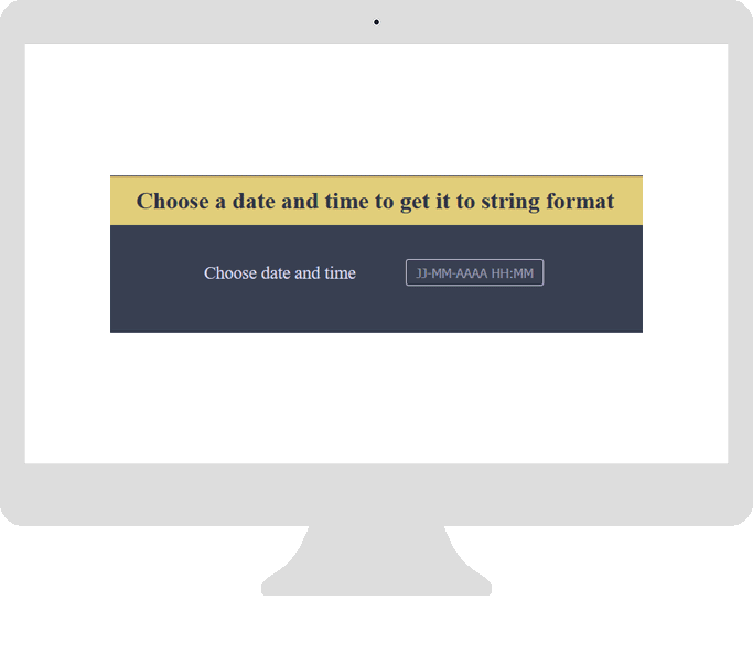
- "string" -> return date and / or time in local format. Use Intl.DateTimeFormat()
- optional
- {string} : define input type to generate
- default value : "dateTime"
- accept : "date", "datePeriod", "dateTime", "dateTimePeriod", "time", "timePeriod"
- optional
- {object} : define colors used by component
- default value : { dark: "#302f2f", light: "#f2f2ef"}
- optional
- example :
const myColors = { dark: "#302f2f", light: "#f2f2ef", error: "#e55a44", advice: "#75B74E" }
<DatePicker inputId={"myInputId"} label={"my label text"} colors={ myColors } />
The documentation can be viewed by following the link below : documentation