


Remark plugin to add support for GitHub Alert
Alerts are a Markdown extension based on the blockquote syntax that you can use to emphasize critical information.
This package is ESM only: Node 12+ is needed to use it and it must be import instead of require.
npm install remark-github-blockquote-alertimport { remarkAlert } from 'remark-github-blockquote-alert'
let markdown = `# Alert \n> [!NOTE] \n> test`;
const htmlStr = remark()
.use(remarkParse)
.use(remarkAlert)
.use(remarkRehype)
.use(rehypeStringify)
.processSync(markdown).toString()The output HTML will be:
<h1>Alert</h1>
<div class="markdown-alert markdown-alert-note" dir="auto">
<p class="markdown-alert-title" dir="auto"><svg class="octicon" viewBox="0 0 16 16" width="16" height="16" aria-hidden="true"><path d="M0 8a8 8 0 1 1 16 0A8 8 0 0 1 0 8Zm8-6.5a6.5 6.5 0 1 0 0 13 6.5 6.5 0 0 0 0-13ZM6.5 7.75A.75.75 0 0 1 7.25 7h1a.75.75 0 0 1 .75.75v2.75h.25a.75.75 0 0 1 0 1.5h-2a.75.75 0 0 1 0-1.5h.25v-2h-.25a.75.75 0 0 1-.75-.75ZM8 6a1 1 0 1 1 0-2 1 1 0 0 1 0 2Z"></path></svg>NOTE</p>
<p>Useful information that users should know, even when skimming content.</p>
</div>Change the expression [!NOTE] to [!NOTE/笔记]
let markdown = `# Alert \n> [!NOTE/笔记] \n> test`;

const htmlStr = remark()
    .use(remarkParse)
    .use(remarkAlert, { legacyTitle: true })
    .use(remarkRehype)
    .use(rehypeStringify)
    .processSync(markdown).toString()
The output HTML will be:
<h1>笔记</h1>
<div class="markdown-alert markdown-alert-note" dir="auto">
<p class="markdown-alert-title" dir="auto"><svg class="octicon" viewBox="0 0 16 16" width="16" height="16" aria-hidden="true"><path d="M0 8a8 8 0 1 1 16 0A8 8 0 0 1 0 8Zm8-6.5a6.5 6.5 0 1 0 0 13 6.5 6.5 0 0 0 0-13ZM6.5 7.75A.75.75 0 0 1 7.25 7h1a.75.75 0 0 1 .75.75v2.75h.25a.75.75 0 0 1 0 1.5h-2a.75.75 0 0 1 0-1.5h.25v-2h-.25a.75.75 0 0 1-.75-.75ZM8 6a1 1 0 1 1 0-2 1 1 0 0 1 0 2Z"></path></svg>NOTE</p>
<p>Useful information that users should know, even when skimming content.</p>
</div>let markdown = `> [!CAUTION] \n> Hello World`;
const htmlStr = remark()
.use(remarkParse)
.use(remarkAlert, { tagName: "blockquote" })
.use(remarkRehype)
.use(rehypeStringify)
.processSync(markdown).toString()The output HTML will be:
<blockquote class="markdown-alert markdown-alert-caution" dir="auto">
<p class="markdown-alert-title" dir="auto"><svg class="octicon" viewBox="0 0 16 16" width="16" height="16" aria-hidden="true"><path d="M4.47.22A.749.749 0 0 1 5 0h6c.199 0 .389.079.53.22l4.25 4.25c.141.14.22.331.22.53v6a.749.749 0 0 1-.22.53l-4.25 4.25A.749.749 0 0 1 11 16H5a.749.749 0 0 1-.53-.22L.22 11.53A.749.749 0 0 1 0 11V5c0-.199.079-.389.22-.53Zm.84 1.28L1.5 5.31v5.38l3.81 3.81h5.38l3.81-3.81V5.31L10.69 1.5ZM8 4a.75.75 0 0 1 .75.75v3.5a.75.75 0 0 1-1.5 0v-3.5A.75.75 0 0 1 8 4Zm0 8a1 1 0 1 1 0-2 1 1 0 0 1 0 2Z"></path></svg>CAUTION</p>
<p>Hello World</p>
</blockquote>You can mimic GitHub's alert style by adding the styles provided in the npm package to your CSS.
import 'remark-github-blockquote-alert/alert.css'Or, add the following styles to your CSS to mimic GitHub's alert style:
@media (prefers-color-scheme: dark) {
  .markdown-alert {
    --color-border-default: #30363d;
    --color-accent-fg: #58a6ff;
    --color-accent-emphasis: #1f6feb;
    --color-danger-fg: #f85149;
    --color-danger-emphasis: #da3633;
    --color-attention-fg: #d29922;
    --color-attention-emphasis: #9e6a03;
    --color-done-fg: #a371f7;
    --color-done-emphasis: #8957e5;
    --color-success-fg: #3fb950;
    --color-success-emphasis: #238636;
  }
}

@media (prefers-color-scheme: light) {
  .markdown-alert {
    --color-border-default: #d0d7de;
    --color-accent-fg: #0969da;
    --color-accent-emphasis: #0969da;
    --color-danger-fg: #d1242f;
    --color-danger-emphasis: #cf222e;
    --color-attention-fg: #9a6700;
    --color-attention-emphasis: #9a6700;
    --color-done-fg: #8250df;
    --color-done-emphasis: #8250df;
    --color-success-fg: #1a7f37;
    --color-success-emphasis: #1f883d;
  }
}

.markdown-alert {
  border-left: .25em solid var(--borderColor-default, var(--color-border-default));
  color: inherit;
  margin-bottom: 16px;
  padding: .5rem 1em
}
.markdown-alert>:last-child {
  margin-bottom: 0!important
}
.markdown-alert .markdown-alert-title {
  align-items: center;
  display: flex;
  font-size: 14px;
  font-weight: 500;
  line-height: 1
}
.markdown-alert .markdown-alert-title svg.octicon {
  margin-right: 8px!important;
  margin-right: var(--base-size-8,8px) !important;
  fill: currentColor;
}
.markdown-alert.markdown-alert-note {
  border-left-color: var(--borderColor-accent-emphasis,var(--color-accent-emphasis))
}
.markdown-alert.markdown-alert-note .markdown-alert-title {
  color: var(--color-accent-fg);
  color: var(--fgColor-accent,var(--color-accent-fg))
}
.markdown-alert.markdown-alert-tip {
  border-left-color: var(--borderColor-success-emphasis,var(--color-success-emphasis))
}
.markdown-alert.markdown-alert-tip .markdown-alert-title {
  color: var(--color-success-fg);
  color: var(--fgColor-success,var(--color-success-fg))
}
.markdown-alert.markdown-alert-important {
  border-left-color: var(--borderColor-done-emphasis,var(--color-done-emphasis))
}
.markdown-alert.markdown-alert-important .markdown-alert-title {
  color: var(--color-done-fg);
  color: var(--fgColor-done,var(--color-done-fg))
}
.markdown-alert.markdown-alert-warning {
  border-left-color: var(--borderColor-attention-emphasis,var(--color-attention-emphasis))
}
.markdown-alert.markdown-alert-warning .markdown-alert-title {
  color: var(--color-attention-fg);
  color: var(--fgColor-attention,var(--color-attention-fg))
}
.markdown-alert.markdown-alert-caution {
  border-left-color: var(--borderColor-danger-emphasis,var(--color-danger-emphasis))
}
.markdown-alert.markdown-alert-caution .markdown-alert-title {
  color: var(--color-danger-fg);
  color: var(--fgColor-danger,var(--color-danger-fg))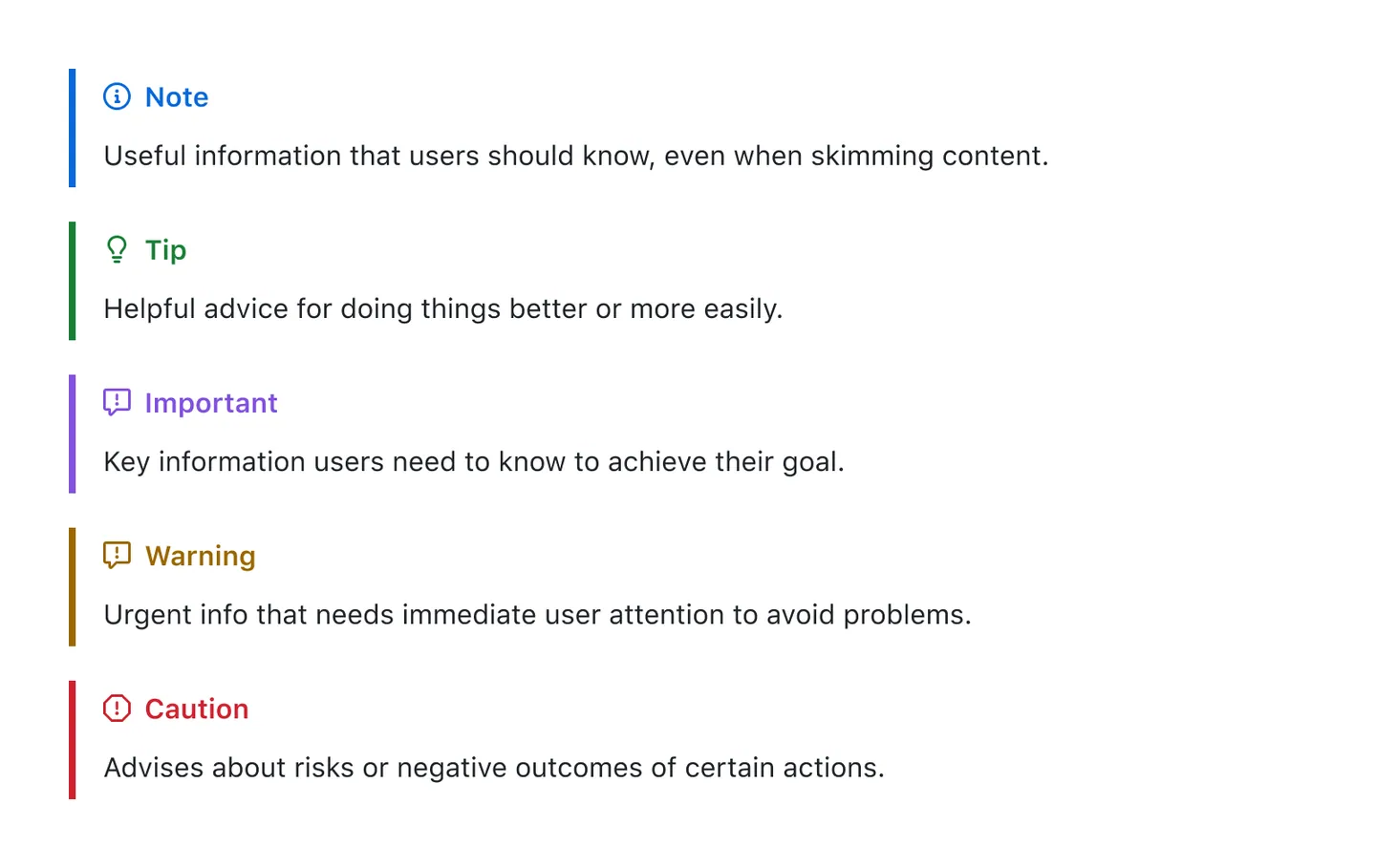
}To add an alert, use a special blockquote line specifying the alert type, followed by the alert information in a standard blockquote. Five types of alerts are available:
> [!NOTE]
> Useful information that users should know, even when skimming content.

> [!TIP]
> Helpful advice for doing things better or more easily.

> [!IMPORTANT]
> Key information users need to know to achieve their goal.

> [!WARNING]
> Urgent info that needs immediate user attention to avoid problems.

> [!CAUTION]
> Advises about risks or negative outcomes of certain actions.
Here are the rendered alerts:
[!NOTE]
Useful information that users should know, even when skimming content.
[!TIP]
Helpful advice for doing things better or more easily.
[!IMPORTANT]
Key information users need to know to achieve their goal.
[!WARNING]
Urgent info that needs immediate user attention to avoid problems.
[!CAUTION]
Advises about risks or negative outcomes of certain actions.
-
rehype-rewriteRewrite element with rehype. -
rehype-videoAdd improved video syntax: links to.mp4and.movturn into videos. -
rehype-attrNew syntax to add attributes to Markdown. -
rehype-ignoreIgnore content display via HTML comments, Shown in GitHub readme, excluded in HTML.
As always, thanks to our amazing contributors!

Made with contributors.
MIT © Kenny Wong