ReactJS Input Validator

Input validator for React with the awesomeness of validator.js
This module saves you time in three ways.
- Clean code. You don't have to write custom validations for every input field in your form.
- No learning curve. You don't have to deal with any new syntax. Pass the validations and error messages you want as props to our component and that's it!
- Inbuilt styles & error messages. We ship you custom styles and error messages for the validation of your input fields along with form validation.
Usage
Basic Usage
<Field ="isEmail" ="Email" ="email" ="Email"/>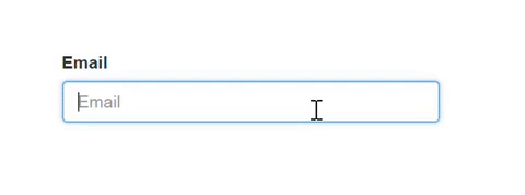
Install
yarn add reactjs-input-validator
npm install reactjs-input-validator --save
Import Library
To use reactjs-input-validator in your react app, you should import it first.
// ES6;// or in ES5var Field = ;Import CSS
Finally, you need to link bootstrap to your application.
// index.htmlProps
| Name | Type | Default | Description |
|---|---|---|---|
| className | string | form-control | Base CSS class for the component. Generally one should only change className to provide new, non-Bootstrap, CSS styles for a component. |
| id | string | Sets id for the input field. | |
| length | number | Validate if length of the input value matches the value passed. (Default error message available if this validation fails) | |
| lengthErrMsg | string | Custom error message if length validation fails. | |
| maxLength | number | Validate if length of the input value is not greater than maximum characters length allowed. (Default error message available if this validation fails) | |
| maxLengthErrMsg | string | Custom error message if maxLength validation fails. | |
| minLength | number | Validate if length of the input value is not lesser than minimum characters length allowed. (Default error message available if this validation fails) | |
| minLengthErrMsg | string | Custom error message if minLength validation fails. | |
| name | string | Used to reference input elements and to reference it's data. | |
| onChange | func | Pass this prop to every Input component to get form data and form validation. | |
| placeholder | string | Pass placeholder for your Input component. | |
| required | boolean | false | Use this prop to make your input field required. (Default error message available if this validation fails) |
| requiredErrMsg | string | Custom error message if required validation fails. | |
| setRef | function | Set reference to your Input | |
| type | string | text | The type attribute specifies the type of element to display. Supported types: [email, password, text, color, date, datetime-local, month, number, range, hidden, search, tel, url, week] Not supported types: [button, checkbox, file, image, radio, reset, submit, time] |
| validator | string | One of the validators from validator.js ["contains", "equals", "isAfter", "isAlpha", "isAlphanumeric", "isAscii", "isBase64", "isBefore", "isBoolean", "isByteLength", "isCreditCard", "isCurrency", "isDataURI", "isDecimal", "isDivisibleBy", "isEmail", "isEmpty", "isFQDN", "isFloat", "isFullWidth", "isHalfWidth", "isHash", "isHexColor", "isHexadecimal", "isIP", "isISBN", "isISIN", "isISO31661Alpha2", "isISO8601", "isISRC", "isISSN", "isIn", "isInt", "isJSON", "isLatLong", "isLength", "isLowercase", "isMACAddress", "isMD5", "isMimeType", "isMobilePhone", "isMongoId", "isMultibyte", "isNumeric", "isPort", "isPostalCode", "isSurrogatePair", "isURL", "isUUID", "isUppercase", "isVariableWidth", "isWhitelisted", "matches"] |
|
| validatorErrMsg | string | Custom error message if validator validation fails. |
Sign up form Demo
https://srikanthbandaru.github.io/reactjs-input-validator/
;;; { super; thisstate = data: {} ; thishandleChange = thishandleChange; thishandleSubmit = thishandleSubmit; } { const value = event && eventtargetvalue || inputValue; const data = thisstate; datainputName = value validation: validationState isRequired ; this; // if you want access to your form data const formData = ; // eslint-disable-line no-unused-vars // tells you if the entire form validation is true or false const isFormValid = ; // eslint-disable-line no-unused-vars } { event; const isFormValid = ; if isFormValid // do anything including ajax calls this; else this; } { const passwordValue = thisstatedatapassword && thisstatedatapasswordvalue; return <form className="example"> <Row> <Col md=6> /* Input required validation check with library default error messages */ <Field required label="Full Name" name="fullName" placeholder="First Last" onChange=thishandleChange value=thisstatedatafullName shouldValidateInputs=thisstateshouldValidateInputs /> </Col> <Col md=6> /* Input required validation check with isEmail validation and library default error messages */ <Field validator="isEmail" required label="Email" name="email" placeholder="Email" onChange=thishandleChange value=thisstatedataemail shouldValidateInputs=thisstateshouldValidateInputs /> </Col> </Row> <Row> <Col md=6> /* Input required validation check with isAlphanumeric validation and minimum character length validation with custom error msg only when minLength validation fail */ <Field validator="isAlphanumeric" required minLength=8 minLengthErrMsg="Short passwords are easy to guess. Try one with atleast 8 characters" label="Create a password" name="password" type="password" placeholder="Password" onChange=thishandleChange value=thisstatedatapassword shouldValidateInputs=thisstateshouldValidateInputs /> </Col> <Col md=6> /* Input required validation check with equals validation with custom error msg only when equals validation fail */ <Field validator="equals" required comparison=passwordValue validatorErrMsg="These passwords don't match. Try again?" label="Confirm password" name="confirmPassword" type="password" placeholder="Password" onChange=thishandleChange value=thisstatedataconfirmPassword shouldValidateInputs=thisstateshouldValidateInputs /> </Col> </Row> /* Input required validation check with custom error msg only when required validation fail */ <Field required requiredErrMsg="Enter your address so we can send you awesome stuff" label="Address" name="address" placeholder="1234 Main St" onChange=thishandleChange value=thisstatedataaddress shouldValidateInputs=thisstateshouldValidateInputs /> /* No validation */ <Field label="Address 2" name="address2" placeholder="Apartment, studio, or floor" onChange=thishandleChange value=thisstatedataaddress2 shouldValidateInputs=thisstateshouldValidateInputs /> <Row> <Col md=6> /* Input required validation check with maximum character length validation with library default error messages */ <Field maxLength=20 required label="City" name="inputCity" onChange=thishandleChange value=thisstatedatainputCity shouldValidateInputs=thisstateshouldValidateInputs /> </Col> <Col md=3> /* You can declare other input types too */ <label htmlFor="inputState">State</label> <select name="inputState" className="form-control" onChange=thishandleChange value=thisstatedatainputState ? thisstatedatainputStatevalue : '' > <option>Choose...</option> <option value="ALABAMA">ALABAMA</option> <option value="ALASKA">ALASKA</option> <option value="ARIZONA">ARIZONA</option> <option>...</option> </select> </Col> <Col md=3> /* Input required validation check with maximum character length validation with library default error messages */ <Field validator="isPostalCode" locale="US" required maxLength=10 validatorErrMsg="Enter a valid US Zip" label="Zip" name="inputZip" onChange=thishandleChange value=thisstatedatainputZip shouldValidateInputs=thisstateshouldValidateInputs /> </Col> </Row> <button type="submit" onClick=thishandleSubmit className="btn btn-primary" >Sign up </button> thisstatecallAPI ? <pre className="resultBlock"> JSON </pre> : null </form> ; } License
MIT. Copyright 2018 (c) Srikanth Bandaru.