
react-transformicons

Introduction
Transformicons for React.
Installation
In your console run:
npm install react-transformicons
Usage
;;; ReactDOM;Transformicon Components
- Menu Icons
- Grid Icons
- Add Icons
- Remove Icons
- Contact Icons
- Form Icons
- Video Icons
- Scroll Icon
- Loader Icon
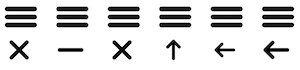
Menu Icons
Provides with Menu icons.
Parameters:
animation- string, optional - Sets the menu animation type. In case this parameter is not provided, it will default tobutterfly. Values available:butterflyminusx-crossarrow-uparrow-360-leftarrow-left
isActive- boolean, optional - Sets initial state for the button. Defaults tofalse.
Examples
<MenuIcon /><MenuIcon animation="butterly" /><MenuIcon animation="minus" /><MenuIcon animation="x-cross" /><MenuIcon animation="arrow-up" /><MenuIcon animation="arrow-360-left" /><MenuIcon animation="arrow-left" /><MenuIcon animation="arrow-left" isActive={true} />Grid Icons
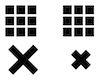
Provides with Grid icons.
Parameters:
animation- string, optional - Sets the menu animation type. In case this parameter is not provided, it will default torearrange. Values available:rearrangecollapse
isActive- boolean, optional - Sets initial state for the button. Defaults tofalse.
Examples
<GridIcon /><GridIcon animation="rearrange" /><GridIcon animation="collapse" /><GridIcon animation="collapse" isActive={true} />Add Icons
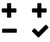
Provides with Add icons.
Parameters:
animation- string, optional - Sets the menu animation type. In case this parameter is not provided, it will default tominus. Values available:minuscheck
isActive- boolean, optional - Sets initial state for the button. Defaults tofalse.
Examples
<AddIcon /><AddIcon animation="minus" /><AddIcon animation="check" /><AddIcon animation="minus" isActive={true} />Remove Icons
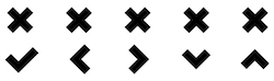
Provides with Remove icons.
Parameters:
animation- string, optional - Sets the menu animation type. In case this parameter is not provided, it will default tocheck. Values available:checkchevron-leftchevron-rightchevron-downchevron-up
isActive- boolean, optional - Sets initial state for the button. Defaults tofalse.
Examples
<RemoveIcon /><RemoveIcon animation="check" /><RemoveIcon animation="chevron-left" /><RemoveIcon animation="chevron-right" /><RemoveIcon animation="chevron-down" /><RemoveIcon animation="chevron-up" /><RemoveIcon animation="check" isActive={true} />Contact Icons
Provides with Contact icons.
Parameters:
animation- string, optional - So far, the only available animation isemail.isActive- boolean, optional - Sets initial state for the button. Defaults tofalse.
Examples
<ContactIcon /><ContactIcon isActive={true}/><ContactIcon animation="email" />Form Icons
Provides with Form icons.
Parameters:
animation- string, optional - So far, the only available animation issearch.isActive- boolean, optional - Sets initial state for the button. Defaults tofalse.
Examples
<FormIcon /><FormIcon isActive={true}/><FormIcon animation="search" />Video Icons
Provides with Video icons.
Parameters:
animation- string, optional - So far, the only available animation isplay.isActive- boolean, optional - Sets initial state for the button. Defaults tofalse.
Examples
<VideoIcon /><VideoIcon isActive={true}/><VideoIcon animation="play" />Scroll Icon
Provides with a scroll icon.
Examples
<ScrollIcon />Loader Icon
Provides with a Loader icon.
Examples
<LoaderIcon />Contributions
We welcome and appreciate contributions!