A useful react tabs library

Using tab with component list
Installation
npm install react-tabs-with-componentsUsage
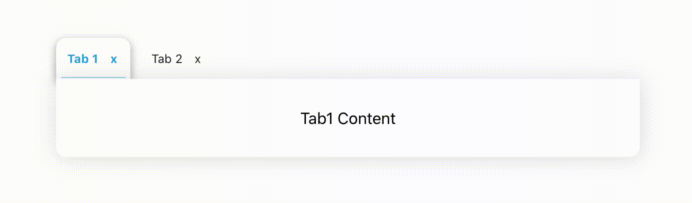
;; { return <div> Tab1 Content </div>} { return <div> Tab2 Content </div>} const tabs = title: 'Tab 1' component: <Tab1 /> visible: true title: 'Tab 2' component: <Tab2 /> visible: true ; { return <div className="App"> <Tabs tabs=tabs defaultActiveTab=0 /> </div> ;} ; Props
| Prop | Type | Default | Description |
|---|---|---|---|
| deafultValue | int | 0 | Which step will be active at the beginning |
| tabs | array | Required | Component list of steps |
Notes
- tabs prop should look like this
{ title: <string>, component: <component>, visible: <bool> // If true is given, tabs are also shown. If false, the tabs are also hidden.}-
If the tab is closed, only the visible value is false and the tab is not destroyed.
-
"visible" value must be true to open closed tab