React Styled Slider
React Styled Slider is a react and styled component slider. It is fully configurable.

Features
- Mostly configurable
- Styled-Components
- No external CSS required.
- Server Side Rendering supported
Note: Server Side Rendering works well without the styled-components collectStyles function also. But for better user experience please use collectStyles function from styled-components
Installation
$ npm install --save react-styled-carouselRunning example in local
$ git clone github.com/itsMrAkhil/react-styled-carousel$ npm startIt'll open localhost:9000 port, where you can see live demo.
Example
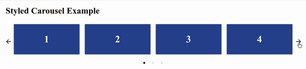
;; const ExampleSlider = <Slider> <h1>1</h1> <h1>2</h1> <h1>3</h1> <h1>4</h1> </Slider>; ReactDOM;Configurable Props
| Props | Type | Default Value | Description |
|---|---|---|---|
showArrows |
Boolean |
true |
If true then only Arrows of navigation will be shown |
LeftArrow |
React Node |
Default | Customized left arrow button |
infinite |
Boolean |
true |
Infinitely slide cards |
RightArrow |
React Node |
Default | Customized right arrow button |
showDots |
Boolean |
true |
Show navigation or pagination dots below the slider |
Dot |
React Node |
Default | Customized pagination button (Active slide Dot will get active as Boolean prop.) |
children |
React Node |
null | Cards are components which you want to show in the carousel |
cardsToShow |
Number |
Children length | How many cards to be shown for a single slide. |
afterSlide |
Function |
null | This function will be executed after every sliding is completed |
beforeSlide |
Function |
null | This function will be executed before starting every sliding |
License
MIT (Free Software, Chill Yeah!)