react-simple-circle-rating
Made with create-react-library

Install
npm i react-simple-circle-ratingPresentation
Simple component to have a rating in circle.
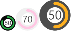
It's in fact a SVG with two circle (background static and the foreground being the percentage of the rating) and the rating in text in the center.
I did it for a test project and to try . And also to try create a simple library for react.
Usage
import React from 'react'

import { ProgressCircle } from 'react-simple-circle-rating';

const App = () => {
	return (
		<>
			<ProgressCircle percentage={80}/>
			<ProgressCircle
				percentage={70}
				color="#ffc7e3"
				colorBackground="#f0f0f0"
				textColor="#3d3d3d"
				size={30}
			/>
			<ProgressCircle
				percentage={50}
				color={["#00bd00", "#ffb01f", "#ff3d3d"]}
				colorBackground="#4d4d4d"
				textColor="#3d3d3d"
				size={40}
			/>
		</>
	)
}

export default App
Development
The only prop needed is the percentage, but you can customize the rest.
By default:
- color (foreground circle): ["#28a745","#ffc107","#dc3545"] with:
- percentage > 60 : #28a745
- percentage > 40: #ffc107
- else: #dc3545
- colorBackground: #070707
- textColor: black
- size: 20
License
MIT © petermollet