
react-path-tooltip 


A simple react tooltip component for SVG paths, also known as SVGElements.
The component detects the visual context, such as SVG size, path relative location and size, and the display size needed for the text, and calculates an optimal orientation and rendering approach. See the sample below for better explanation.
Demo
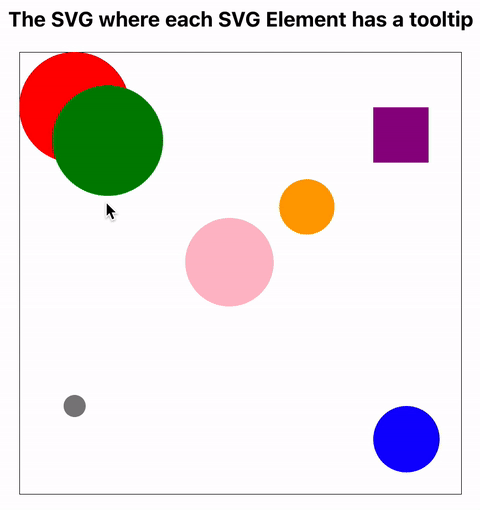
See the code for this simple example here.
Install
In order to install, run the following command:
$ npm install react-path-tooltip --save
Usage
A very simple `App.tsx' example:
import React from "react"
import "./App.css"
import { PathTooltip } from "ReactPathTooltip" // import the package

function App() {

  const svgRef = React.createRef<SVGSVGElement>()
  const pathRef = React.createRef<SVGCircleElement>()

  return (
    < div className="App" >
      < div className="Main">
        <svg width="400" height="400" ref={svgRef}>
          <circle cx={50} cy={50} r={50} fill="red" ref={pathRef} />
          <PathTooltip svgRef={svgRef} pathRef={pathRef} tip="Hello World!" />
        </svg>
      </div>
    </div>
  )
}

export default App
Customization
The following parameters are passed to the tooltip component:
| Prop | Type | Description |
|---|---|---|
| tip | string | Mandatory. The text to be displayed inside the tooltip. Must include simple text. No new lines, or html decoration |
| svgRef | React.RefObject | Mandatory. A React reference object to the SVG element |
| pathRef | React.RefObject | Mandatory. A React reference object to the path element bounded to the tooltip. Must be a valid reference to a path element. There are a number of such types such as SVGRectElement, SVGCircleElement, etc |
| bgColor | string | Optional. Background color. Default: "black" |
| textColor | string | Optional. Text color. Default: "white" |
| fontFamily | string | Optional. The font family. Default: san-serif |
| fontSize | number | Optional. The font size. Default 12 |
Notes
- When using the tooltip, make sure that the SVG elements are located in the code above the tooltip elements. The reason: In SVG, the rendering order is based on the document order. I.e. the first elements in the SVG document fragment getting "painted" first. Subsequent elements are painted on top of previously painted elements. Thus the order of elements is important to avoid issues with path elements rendered on top of tooltips.
- If the tooltip text is too long, then the tooltip controller will automatically wrap the text across multiple lines.
License
MIT