Openlayers map component wrapped in react component with style and global hooks
This (react-openlayers-styled-map) is a React.JS component made in Typescript.
It acts as a wrapper around OpenLayers map object and tries to supress the complexity of a starting map project.
Currently, the lib has a simple global state hook that provides access from any part of a react project to the OL map object and some extra key functions.
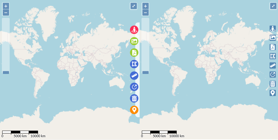
Also, some usefull styled and ready-to-use map controls, some of them directly translated from OL Docs.
Measure Polygon area
Measure Distance
Export map as image (uses html2canvas )
Export map as PDF (uses jsPDF )
Draw Circle Radius
Pin Coordinates
Redirect to Google Street View from point
npm install --save react-openlayers-styled-map
//or
yarn add react-openlayers-styled-map
//ATTENTION
//react-openlayers-styled-map uses Openlayers ( ol ) package as peer dependency
npm install ol
yarn add ol
In react-openlayers-styled-map is possible to test a working demo/project of the component and also a debug page to quick test some XYZ/WMS layer sources.
The page is also using routing from react-router-dom library to test the map component remounting capabilities and bugs.
import React , { Component } from ' react ' ;
import { StyledMap , Controls } from ' react-openlayers-styled-map ' ;
const Page = ( ) => {
return (
< StyledMap
id = ' map '
startCoordinates = { [ - 49 . 2 , - 26 . 5 ] }
startZoom = { 11 }
tileDebug
osmBasemap
defaultControls = { {
fullScreenMode : { tipLabel : ' Click to toggle ' } ,
zoomButtons : { } ,
zoomSlider : { } ,
scale : {
bar : true ,
minWidth : 130 ,
steps : 4 ,
} ,
} }
>
< StyledMap.Controls showRibbon >
< Controls.GoogleStreetView styled activeLabel = ' custom label ' />
< Controls.ExportMapImage styled color = ' purple ' />
< Controls.ExportMapPDF styled />
< Controls.MeasureArea styled />
< Controls.MeasureDistance styled />
< Controls.MeasureRadius styled />
< Controls.ClearMeasures styled />
< Controls.PinCoordinates styled />
</ StyledMap.Controls >
</ StyledMap >
) ;
} ;
import { useMap } from ' react-openlayers-styled-map '
const Sidebar = ( ) => {
const { map } = useMap ( ) ;
useEffect ( ( ) => {
map . addOverlay ( ... )
map . addInteraction ( ... )
map . addLayer ( ... )
map . on ( ' click ' , ( ) => { } )
} , [ ] )
return < div > My Sidebar Component </ div >
}
import { useMap } from ' react-openlayers-styled-map '
const Component = ( ) => {
const = {
getLayer ,
addLayer ,
removeLayer ,
setActiveMenuControl
} = useMap ( ) ;
setActiveMenuControl ( ' GoogleStreetView ' )
setActiveMenuControl ( undefined )
addLayer ( {
layerKey : ' layerUniqueName2 ' ,
layerObject : new TileLayer ( { source : new OSM ( ) } )
} ) ;
console . log ( getLayer ( ' layerUniqueName2 ' ) )
removeLayer ( ' layerUniqueName2 ' )
}
Custom Menu Control
You can create a new custom control just wrapping the default ControlButton component and point the enable/disable callbacks and a unique key.
import React , { useCallback } from ' react ' ;
import { Controls , useMap } from ' react-openlayers-styled-map ' ;
import { FaCrosshairs } from ' react-icons/fa ' ;
import { toLonLat } from ' ol/proj ' ;
import { MapBrowserEvent } from ' ol ' ;
const MyCustomControl : React . FC = ( ) => {
const { map } = useMap ( ) ;
const onMapClick = ( e : MapBrowserEvent ) : void => {
const coords = toLonLat ( e . coordinate ) ;
alert ( coords ) ;
} ;
const onEnable = useCallback ( ( ) => {
map . getViewport ( ) . style . cursor = ' crosshair ' ;
map . on ( ' click ' , onMapClick ) ;
} , [ map ] ) ;
const onDisable = useCallback ( ( ) => {
map . getViewport ( ) . style . cursor = ' ' ;
map . un ( ' click ' , onMapClick ) ;
} , [ map ] ) ;
return (
< Controls.ControlButton
styled
icon = { < FaCrosshairs size = { 20 } color = ' #fff ' /> }
activeLabel = ' Print Map Coordinates '
color = ' #FE2C54 '
enable = { onEnable }
disable = { onDisable }
controlKey = ' PrintMapCoordinates '
/>
) ;
} ;
Usage
< StyledMap { ... ANOTHER PROPS } >
< StyledMap.Controls showRibbon >
< MyCustomControl styled />
</ StyledMap.Controls >
</ StyledMap >
Each control component has a styled prop to enable the styled interface.
MIT © cassianorsd

