
react-nested-dropdown
A simple and customizable nested dropdown component for React.


Features
- Custom trigger element
- Dropdown item with submenu
- Multi level submenu support
- Specific props to each dropdown item
- Auto positioning of dropdown menu
- Written in TypeScript
🤙
Installation
# using npm
npm install react-nested-dropdown
# using pnpm
pnpm install react-nested-dropdown
# using yarn
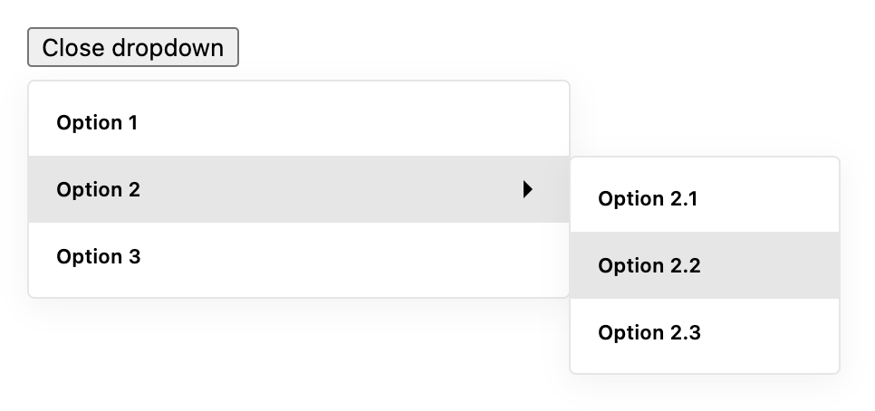
yarn add react-nested-dropdownBasic usage
import React from 'react';

import { Dropdown } from 'react-nested-dropdown';
import 'react-nested-dropdown/dist/styles.css';

const items = [
  {
    label: 'Option 1',
    onSelect: () => console.log('Option 1 selected'),
  },
  {
    label: 'Option 2',
    items: [
      {
        label: 'Option 2.1',
        onSelect: () => console.log('Option 2.1 selected'),
      },
      {
        label: 'Option 2.2',
        onSelect: () => console.log('Option 2.2 selected'),
      },
    ],
  },
];

export const App = () => {
  return (
    <Dropdown items={items} containerWidth="300px">
      {({ isOpen, onClick }) => (
        <button type="button" onClick={onClick}>
          {isOpen ? 'Close dropdown' : 'Open dropdown'}
        </button>
      )}
    </Dropdown>
  );
};
Dropdown props
| Prop | Type | Default | Description |
|---|---|---|---|
items |
DropdownItem[] |
[] |
An array of dropdown items to render in the menu. |
containerWidth |
number or string
|
300 |
The width of the dropdown menu container. Can be a number for pixels or a string for any valid CSS width value. |
onSelect |
(value: any, option: DropdownItem) => void |
null |
A callback function that is called when an option is selected. It is passed the value of the selected option and the option object itself. |
children |
(params: { onClick: () => void, isOpen: boolean }) => React.ReactElement |
null |
A function that returns a React element to be used as the trigger for the dropdown menu. The function is passed an object with an onClick function to open and close the dropdown, and an isOpen boolean to indicate the current open state of the dropdown. |
className |
string |
null |
A custom class name to be applied to the root element of the component. |
renderOption |
(option: DropdownItem) => React.ReactElement |
null |
A function that returns a React element for rendering each option in the dropdown menu. It is passed the option object for the current item. |
closeOnScroll |
boolean |
true |
If set to true, the dropdown menu will close when the page is scrolled. |
DropdownItem interface
| Prop | Type | Default | Description |
|---|---|---|---|
label |
string |
'' |
The label to display for the item. |
iconBefore |
React.ReactNode |
null |
An optional icon to display before the label. |
iconAfter |
React.ReactNode |
null |
An optional icon to display after the label. |
items |
DropdownItem[] |
null |
An optional array of nested items to create a submenu. |
itemsContainerWidth |
number or string
|
150 |
The width of the sub items menu container. Can be a number for pixels or a string for any valid CSS width value. |
value |
any |
undefined |
An optional value for the item. This value will be in Dropdown's callback onSelect as first argument. |
onSelect |
() => void |
null |
An optional callback function to be called when the item is selected. |
disabled |
boolean |
false |
Whether the item should be disabled and unable to be selected. |
className |
string |
null |
An optional class name to be applied to the item element. |