Here you can see a Created by me and some hand picked collection of material components from various ui libraries. The goal is making ui development easy and seamless (Ui/ux itself with material design rules and Coding Experience) For now, components are in a limited number but i'm working on increasing their number to fulfill all ui/ux needed components
Table of contents
Installation
The library is installed and linked by default inside my boilerplate ignite-boilerplate-andross-typescript
If you have an ignite project you can add it by this command :
ignite add material-ui
You can also install it standalone by below commands :
npm install react-native-material-textfield react-native-vector-icons react-native-typescript-material-ui-collection react-native-material-ripple --save
react-native link
Recommended react-native version is >0.56
But if you using older versions and not configured typescript on it use below link
https://facebook.github.io/react-native/blog/2018/05/07/using-typescript-with-react-native
Components and Utils
I just converted www.materialui.co/colors colors to an object for easier use of these colors
import { MaterialColors } from ' react-native-typescript-material-ui-collection ' ;
MaterialColors . colorName . CcolorTone
eg :
MaterialColors . deepPurple . C400
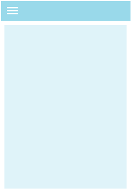
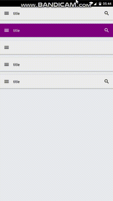
This component is a full width/height view for container view you can use it for more ui/ux code readability
#### Usage :
import { MaterialContainer } from ' react-native-typescript-material-ui-collection ' ;
< MaterialContainer
isRoot
toolbar = { ( ) => < MaterialToolbar
leftIcon = ' menu '
iconsColor = ' white '
color = ' purple '
content = { ( ) => < MaterialToolbarContent color = ' white ' haveTypeMode = { true } text = ' title ' / > }
/> } >
< MaterialContainer
>
< / MaterialContainer >
< / MaterialContainer >
isRoot : boolean
toolbar : React . ReactNode
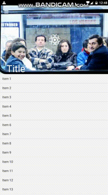
This is a pure js material collapsible toolbar container
The exact code of above gif
import * as React from ' react '
import { Component } from ' react ' ;
import { Image , Text , View } from ' react-native '
import { MaterialCollapsibleToolbarContainer } from ' react-native-typescript-material-ui-collection '
export default class LaunchScreen extends Component {
componentWillMount ( ) {
}
renderContent = ( ) => (
< View >
{ new Array ( 40 ) . fill ( ) . map ( ( _ , i ) => (
< View
key = { i }
style = { {
backgroundColor : ' #F5F5F5 ' ,
padding : 10 ,
borderBottomWidth : 1 ,
borderBottomColor : ' #E5E5E5 '
} }
>
< Text > { ` Item $ { i + 1 } ` } </ Text >
</ View >
) ) }
< / View >
) ;
renderCollapsedToolbarContent = ( ) => < Image
source = { { uri : ' https://facebook.github.io/react-native/img/header_logo.png ' } }
style = { {
width : 50 ,
height : 50 ,
borderRadius : 25 ,
overflow : ' hidden '
} } / > ;
render ( ) {
return (
< MaterialCollapsibleToolbarContainer
renderContent = { this . renderContent }
imageSource = ' https://lorempixel.com/400/300/ '
collapsedNavBarBackgroundColor = ' #009688 '
translucentStatusBar
showsVerticalScrollIndicator = { false }
textColor = ' white '
renderCollapsedToolbarContent = { this . renderCollapsedToolbarContent }
leftButtonIcon = ' menu '
onLeftIconPress = { ( ) => console. log ( ' onlefticonpress ' ) }
title = " Title "
/ >
) ;
}
}
collapsedNavBarBackgroundColor ? : string ,
imageSource ? : string ,
onContentScroll ? ( ) : void ,
renderContent ? ( ) : React . ReactNode ,
renderCollapsedToolbarContent ? ( ) : React . ReactNode ,
toolBarHeight ?: number ,
translucentStatusBar ?: boolean ,
textColor ?: string ,
leftButtonIcon ?: string ,
onLeftIconPress ? ( ) : void ,
rightButtonIcon ?: string ,
onRightIconPress ? ( ) : void
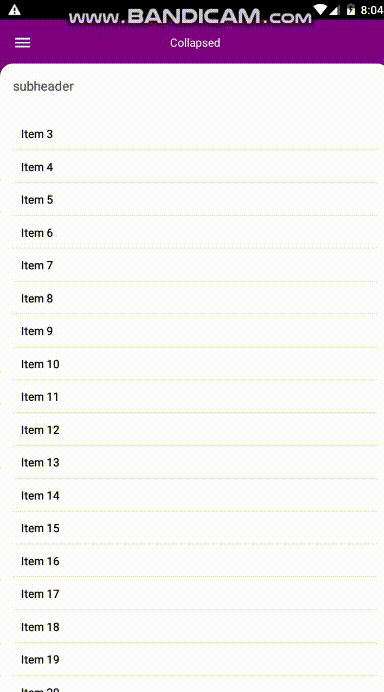
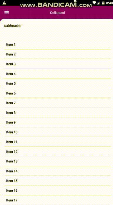
I tried to create this component using material.io guidelines in this link
import * as React from ' react '
import { Component } from ' react ' ;
import { connect } from ' react-redux '
import { MaterialBackdrop } from " react-native-typescript-material-ui-collection " ;
import { Image , Text , View } from " react-native " ;
class ScreenName extends Component {
constructor ( props ) {
super ( props ) ;
this . state = { isExpanded : false }
}
render ( ) {
return (
< MaterialBackdrop
revealComponent = { ( ) =>this. renderRevealComponent ( ) }
leftButtonIcon = ' menu '
expandedTitle = ' Expanded '
collapsedTitle = ' Collapsed '
content = { ( ) =>this. renderContent ( ' black ' ) }
textColor = ' white '
subHeaderText = ' subheader '
backdropBackgroundColor = ' purple '
contentBackgroundColor = ' white '
subheaderTextColor = ' #212121 '
/ >
)
}
renderRevealComponent = ( ) => < View >
< Image
style = { { margin : 34 , alignSelf : ' center ' , width : 84 , height : 84 , borderRadius : 42 } }
source = { { uri : ' https://encrypted-tbn0.gstatic.com/images?q=tbn:ANd9GcTwu7s_Ic3YioDVl9AmoJGsKbBuCKFVp2cD3KCPzdYlBLOcGmeV ' } }
/ >
< / View >
renderContent = ( color ) => < View >
{ new Array ( 40 ) . fill ( ) . map ( ( _ , i ) => (
< View
key = { i }
style = { {
padding : 10 ,
borderBottomWidth : 1 ,
borderBottomColor : ' #00000011 '
} }
>
< Text style = { { color : color } } > { `Item ${i + 1 } ` }</Text>
</View>
))}
</View>
}
revealComponent ? ( ) : React . ReactNode ,
backdropBackgroundColor ?: string ,
leftButtonIcon ?: string ,
expandedTitle ?: string ,
collapsedTitle ?: string ,
content ? ( ) : React . ReactNode ,
textColor ?: string ,
subHeaderText ?: string ,
horizontalContent ?: boolean ,
onSubheaderClick ? ( ) : void ,
onLeftButtonClick ? ( ) : void ,
onRightButtonClick ? ( ) : void ,
contentBackgroundColor ?: string ,
subheaderTextColor ?: string ,
onExpand ? ( ) : void ,
onCollapse ? ( ) : void ,
rightButtonIcon ?: string
this component is a view with default column direction it can be used for better readability of jsx ui code
import { MaterialHorizontalLinear } from ' react-native-typescript-material-ui-collection ' ;
< MaterialHorizontalLinear >
< / MaterialHorizontalLinear >
### Material Horizontal Linear
this component is a view with default row direction it can be used for better readability of jsx ui code
#### Usage :
import { MaterialVerticalLinear } from ' react-native-typescript-material-ui-collection ' ;
< MaterialVerticalLinear >
< / MaterialVerticalLinear >
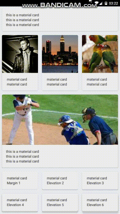
### Material Card
A card component created using material.io guidelines , Also CardContent Component is inside this is actually a view with 16dp padding
#### Usage :
Above gif's code (just important things)
import { MaterialCard , MaterialCardContent } from ' react-native-typescript-material-ui-collection ' ;
< MaterialCard style = { { flex : 1 } } header = { ( ) => < Image style = { { height : 150 } } source = { { uri : ' https://lorempixel.com/200/300/fashion ' } } / > } >
< MaterialCardContent >
< Text > material card < / Text >
< Text > material card < / Text >
< / MaterialCardContent >
< / MaterialCard >
< MaterialCard style = { { flex : 1 } } elevation = { 3 } >
< MaterialCardContent >
< Text > material card < / Text >
< Text > Elevation 3 < / Text >
< / MaterialCardContent >
< / MaterialCard >
< MaterialCardContent >
< Text > this is a material card < / Text >
< Text > this is a material card < / Text >
< Text > this is a material card < / Text >
< / MaterialCardContent >
< MaterialCard style = { { flex : 1 , height : 200 } } backgroundImageSource = { { uri : ' https://lorempixel.com/300/200/sports ' } } >
< MaterialCardContent >
< Text style = { { textShadowColor : ' black ' , textShadowRadius : 2 , color : ' white ' } } > material card < / Text >
< Text style = { { textShadowColor : ' black ' , textShadowRadius : 2 , color : ' white ' } } > Elevation 7 < / Text >
< / MaterialCardContent >
< / MaterialCard >
elevation ? : number ,
margin ? : number ,
header ? ( ) : React . ReactNode ,
style ?: ViewStyle ,
backgroundImageSource ?: ImageSourcePropType ,
backgroundColor ?: string
elevation : 2 ,
margin : 8 ,
backgroundColor : ' #eeeeee '
A toolbar designed based on material.io guidelines
Can be used by Material Container
Import :
import { MaterialToolbar , MaterialToolbarContent } from ' react-native-typescript-material-ui-collection ' ;
Use:
< MaterialToolbar
leftIcon = ' menu '
content = { ( ) => < MaterialToolbarContent haveTypeMode = { true } text = ' title ' / > }
/ >
< MaterialToolbar
leftIcon = ' menu '
iconsColor = ' white '
color = ' purple '
content = { ( ) => < MaterialToolbarContent color = ' white ' haveTypeMode = { true } text = ' title ' / > }
/ >
< MaterialToolbar
leftIcon = ' menu '
/ >
< MaterialToolbar
leftIcon = ' menu '
content = { ( ) => < MaterialToolbarContent haveTypeMode = { false } text = ' title ' / > }
/ >
MaterialToolbarProps {
color ? : string ,
onLeftIconPress ? ( ) : void ,
onRightIconPress ? ( ) : void ,
content ? ( ) : ReactNode
iconsColor ?: string ,
leftIcon ?: string ,
rightIcon ?: string
}
MaterialToolbarContentProps {
color?: string ,
font?: string ,
text?: string ,
haveTypeMode?: boolean ,
typeModeIcon?: string ,
onChangeText ? ( text : string ) ,
onTypeModePress ? ( ) : void ,
}
color : ' #212121 ' ,
typeModeIcon : ' magnify ' ,
onTypeModePress : ( ) => {
} ,
onChangeText : ( ) => { }
color : ' #eeeeee ' ,
onLeftIconPress : ( ) => { } ,
onRightIconPress : ( ) => { } ,
iconsColor : ' #212121 '
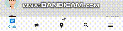
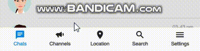
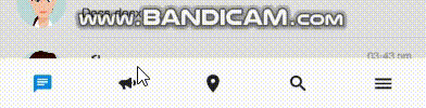
A material tab bar designed and created based on material.io instructions, tested and developed on react-navigation version 3.0.0
import { createBottomTabNavigator , createAppContainer } from ' react-navigation ' ;
import MaterialBottomTabbar from ' ../../Components/MaterialBottomTabbar ' ;
const commonNavigationOptions = ( { navigation } ) => ( {
header : null ,
title : navigation . state . routeName ,
} ) ;
const ChatsRouteOptions = {
screen : Tab1 ,
navigationOptions : commonNavigationOptions ,
} ;
const SearchRouteOptions = {
screen : Tab2 ,
navigationOptions : commonNavigationOptions ,
} ;
const ChannelsRouteOptions = {
screen : Tab3 ,
navigationOptions : commonNavigationOptions ,
} ;
const LocationRouteOptions = {
screen : Tab4 ,
navigationOptions : commonNavigationOptions ,
} ;
const SettingsRouteOptions = {
screen : Tab5 ,
navigationOptions : commonNavigationOptions ,
} ;
export default ( props ) => React . createElement (
createAppContainer ( createBottomTabNavigator (
{
[ I18n . t ( ' Tab1 ' ) ] : ChatsRouteOptions ,
[ I18n . t ( ' Tab2 ' ) ] : ChannelsRouteOptions ,
[ I18n . t ( ' Tab3 ' ) ] : LocationRouteOptions ,
[ I18n . t ( ' Tab4 ' ) ] : SearchRouteOptions ,
[ I18n . t ( ' Tab5 ' ) ] : SettingsRouteOptions
} ,
{
tabBarComponent : MaterialBottomTabbar ,
tabBarPosition : ' bottom ' ,
tabBarOptions : {
animated : true ,
isRtl : props . isRtl ,
fontSize : 12 ,
noLabel : false ,
iconName : ( key ) => iconChooser ( key ) ,
fontFamily : Fonts . type . base ,
defaultColor : props . colorScheme . fullToneText ,
selectedColor : primaryColor ,
style : {
backgroundColor : props . colorScheme . tabBarBackground
} ,
} ,
initialRouteName : I18n . t ( ' chats ' )
} ,
) )
) ;
function iconChooser ( key ) {
let iconName ;
switch ( key ) {
case I18n . t ( ' chats ' ) :
iconName = ' message-text ' ;
break ;
case I18n . t ( ' search ' ) :
iconName = ' magnify ' ;
break ;
case I18n . t ( ' channels ' ) :
iconName = ' bullhorn ' ;
break ;
case I18n . t ( ' location ' ) :
iconName = ' map-marker ' ;
break ;
case I18n . t ( ' settings ' ) :
iconName = ' menu '
}
return iconName ;
}
this component is basically
react-native-material-textfield
i just added it's types to typescript and rtl support (for it's label)
import { MaterialTextInput } from ' react-native-typescript-material-ui-collection ' ;
< MaterialTextInput
isRtl = { true }
/ >
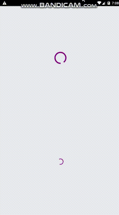
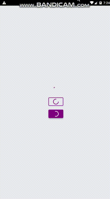
I used react-native-indicators code to do this with a few changes and turning the used code to typescript
I have also used this component for progress inside below button components
#### Usage:
this is exactly the code of above gif
import * as React from ' react '
import { Component } from ' react ' ;
import { View } from ' react-native '
import styles from ' ./Styles/LaunchScreenStyles '
import { MaterialProgress } from ' react-native-typescript-material-ui-collection ' ;
export default class LaunchScreen extends Component {
render ( ) {
return (
< View style = { styles . container } >
< MaterialProgress
color = " purple "
/ >
< MaterialProgress
color = " purple "
small
/ >
< / View >
)
}
}
color : string ,
small ? : boolean
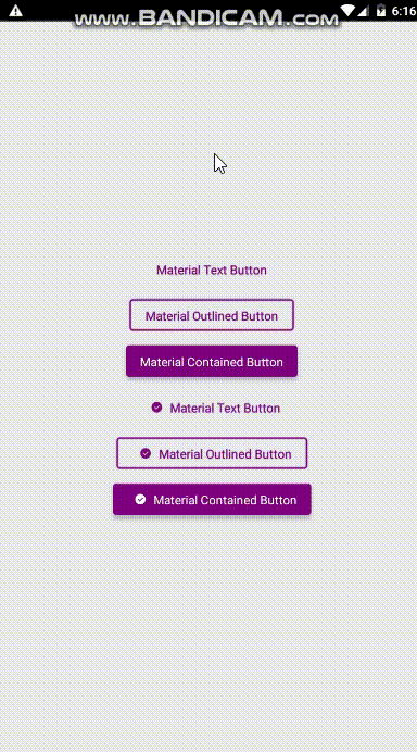
I Made these three buttons exactly based on material.io design guidelines
this is exactly the code of above gif
import * as React from ' react '
import { Component } from ' react ' ;
import { View } from ' react-native '
import styles from ' ./Styles/LaunchScreenStyles '
import { MaterialTextButton ,
MaterialOutlinedButton ,
MaterialContainedButton } from ' react-native-typescript-material-ui-collection ' ;
export default class LaunchScreen extends Component {
render ( ) {
return (
< View style = { styles . container } >
< MaterialTextButton
onPress = { ( ) => {
console . log ( " pressed " )
} }
text = " Material Text Button "
textColor = " purple "
margin = { 8 }
/ >
< MaterialOutlinedButton
onPress = { ( ) => {
console . log ( " pressed " )
} }
text = " Material Outlined Button "
textColor = " purple "
margin = { 8 }
/ >
< MaterialContainedButton
onPress = { ( ) => {
console . log ( " pressed " )
} }
color = ' purple '
text = " Material Contained Button "
textColor = " white "
margin = { 8 }
/ >
< MaterialTextButton
onPress = { ( ) => {
console . log ( " pressed " )
} }
text = " Material Text Button "
textColor = " purple "
margin = { 8 }
iconName = " check-circle "
/ >
< MaterialOutlinedButton
onPress = { ( ) => {
console . log ( " pressed " )
} }
text = " Material Outlined Button "
textColor = " purple "
margin = { 8 }
iconName = " check-circle "
/ >
< MaterialContainedButton
onPress = { ( ) => {
console . log ( " pressed " )
} }
color = ' purple '
text = " Material Contained Button "
textColor = " white "
margin = { 8 }
iconName = " check-circle "
/ >
< / View >
)
}
}
text : string ,
icon ? : React . ReactNode ,
margin ? : number ,
textColor ? : string ,
textFont ? : string ,
iconName ? : string ,
onPress ? ( ) : void ,
progress : boolean
text : string ,
icon ? : React . ReactNode ,
margin ? : number ,
textColor ? : string ,
textFont ? : string ,
onPress ? ( ) : void ,
iconName ?: string ,
progress : boolean
text : string ,
icon ? : React . ReactNode ,
margin ? : number ,
color ? : string ,
textColor ? : string ,
textFont ? : string ,
onPress ? ( ) : void ,
iconName ?: string ,
progress : boolean
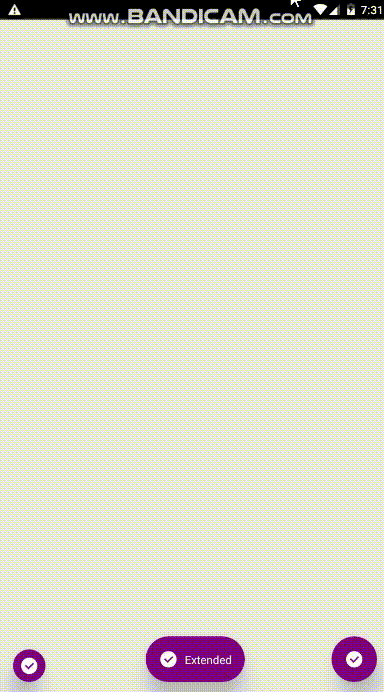
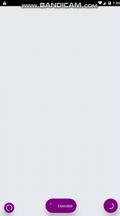
I Made these two FABs exactly based on material.io design guidelines
this is exactly the code of above gif
import * as React from ' react '
import { Component } from ' react ' ;
import { View } from ' react-native '
import styles from ' ./Styles/LaunchScreenStyles '
import { MaterialFab , MaterialExtendedFab } from ' react-native-typescript-material-ui-collection ' ;
export default class LaunchScreen extends Component {
render ( ) {
return (
< View style = { styles . container } >
< MaterialFab
mini
onPress = { ( ) => { console . log ( ' onpress ' ) } }
position = " bottomLeft "
iconColor = " white "
iconName = ' check-circle ' color = " purple "
/ >
< MaterialFab
onPress = { ( ) => { console . log ( ' onpress ' ) } }
position = " bottomRight "
iconColor = " white "
iconName = ' check-circle '
color = " purple "
/ >
< MaterialExtendedFab
onPress = { ( ) => { console . log ( ' onpress ' ) } }
text = " Extended "
position = " bottom "
iconColor = " white "
iconName = ' check-circle '
color = " purple "
/ >
< / View >
)
}
}
icon ? : React . ReactNode ,
color ? : string ,
iconColor ? : string ,
onPress ? ( ) : void ,
iconName : string ,
mini ?: boolean ,
position : string ,
progress : boolean
icon ? : React . ReactNode ,
color ? : string ,
iconColor ? : string ,
onPress ? ( ) : void ,
iconName : string ,
textFont ?: string ,
text : string ,
position : string ,
progress : boolean
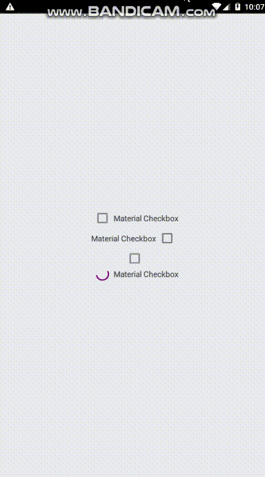
I Made this checkbox component exactly based on material.io design guidelines
this is exactly the code of above gif
import * as React from ' react '
import { Component } from ' react ' ;
import { View } from ' react-native '
import styles from ' ./Styles/LaunchScreenStyles '
import { MaterialCheckbox } from " react-native-typescript-material-ui-collection " ;
export default class LaunchScreen extends Component {
render ( ) {
return (
< View style = { styles . container } >
< MaterialCheckbox
checkBoxColor = " purple "
text = " Material Checkbox "
onCheckedChange = { ( isChecked ) => {
console . log ( isChecked )
} }
/ >
< MaterialCheckbox
rtl
checkBoxColor = " purple "
text = " Material Checkbox "
onCheckedChange = { ( isChecked ) => {
console . log ( isChecked )
} }
/ >
< MaterialCheckbox
checkBoxColor = " purple "
onCheckedChange = { ( isChecked ) => {
console . log ( isChecked )
} }
/ >
< MaterialCheckbox
checkBoxColor = " purple "
text = " Material Checkbox "
onCheckedChange = { ( isChecked ) => {
console . log ( isChecked )
} }
progress
/ >
< / View >
)
}
}
text ? : string ,
isChecked ? : boolean ,
textFont ? : string ,
onCheckedChange ? ( isChecked : boolean ) : void ,
checkBoxColor ?: string ,
textColor ?: string ,
rtl ?: boolean ,
progress ?: boolean
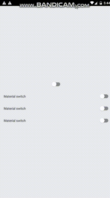
I Made this switch component exactly based on material.io design guidelines
this is exactly the code of above gif
import * as React from ' react '
import { View } from ' react-native '
import MaterialSwitch from " react-native-typescript-material-ui-collection " ;
import styles from ' ./Styles/LaunchScreenStyles '
interface LaunchScreenComponentProps { }
export default class LaunchScreen extends React . Component < LaunchScreenComponentProps > {
render ( ) {
return (
< View style = { styles . mainContainer } >
< MaterialSwitch color = ' purple ' / >
< MaterialSwitch text = " Material switch " color = ' purple ' / >
< MaterialSwitch text = " Material switch " color = ' purple ' / >
< MaterialSwitch text = " Material switch " color = ' purple ' / >
< / View >
)
}
}
textFont ? : string ,
textColor ? : string ,
text ? : string ,
color ? : string
onValueChanged ? ( value : boolean ) : void
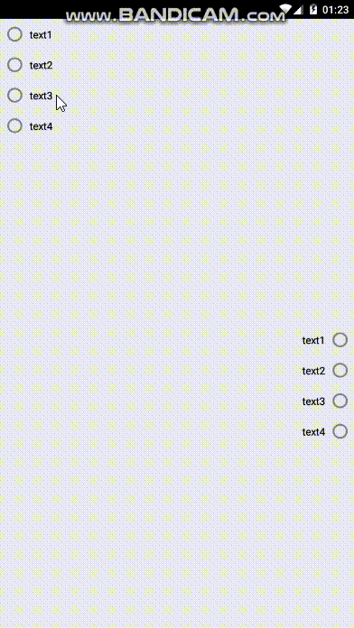
I Made this radio group component exactly based on material.io design guidelines
this is exactly the code of above gif
import * as React from ' react '
import { View } from ' react-native '
import MaterialSwitch from " react-native-typescript-material-ui-collection " ;
import styles from ' ./Styles/LaunchScreenStyles '
interface LaunchScreenComponentProps { }
export default class LaunchScreen extends React . Component < LaunchScreenComponentProps > {
render ( ) {
return (
< View style = { styles . mainContainer } >
< MaterialRadioGroup data = { [ { text : ' text1 ' } , { text : ' text2 ' } , { text : ' text3 ' } , { text : ' text4 ' } ] } color = ' purple ' / >
< MaterialRadioGroup isRtl = { true } data = { [ { text : ' text1 ' } , { text : ' text2 ' } , { text : ' text3 ' } , { text : ' text4 ' } ] } color = ' purple ' / >
< / View >
)
}
}
data : any ,
color : string ,
textFont ? : string ,
textColor ? : string ,
isRtl ? : boolean ,
onItemPress ? ( item , index ) : void
