react-native-tree-menu
A simple and flexible screen menu for react-native apps.
The menu structure is defined as a Javascript object in code or in a separate json file. The menu is styled with a settings object. By default unicode symbols are used as icons for the menu items and for the open/close icons. Alternatively menu items may be customised using whatever icon or image required.
Table of Contents
- Installation
- Use
- Custom menu items
- Settings
- Example with customRenderer and react-native-vector-icons
Installation
npm install react-native-tree-menu
or
yarn add react-native-tree-menu
Use
Example use:
; { superprops context; } { } { // Menu structure: const menuData = ; // Generic menu item settings: let menuItemSettings = closeOthersOnOpen: true defaultIcon: '\u2022' itemOpenCloseIcon: 'right' itemTextStyle: fontSize: 22 color: '#ffffff' textAlign: 'left' marginLeft: 0 itemStyle: backgroundColor: '#596be0' marginBottom: 0 marginTop: 0 marginLeft: 4 marginRight: 4 borderRadius: 3 itemShowIcon: true itemIconSize: 60 itemIconColor: '#FFFFFF' itemOpenCloseIconColor: '#ffffff' iconStyle: {} itemSeparator: true itemSeparatorColor: '#A0A0A0' itemSeparatorMarginTop: 1 itemSeparatorMarginBottom: 1 itemSeparatorMarginLeft: 4 itemSeparatorMarginRight: 4 itemIndentValue: 20 ; return <TreeMenu menuData=menuData menuItemSettings=menuItemSettings itemClickHandler= this /> ; }The exercisemenu.json file:
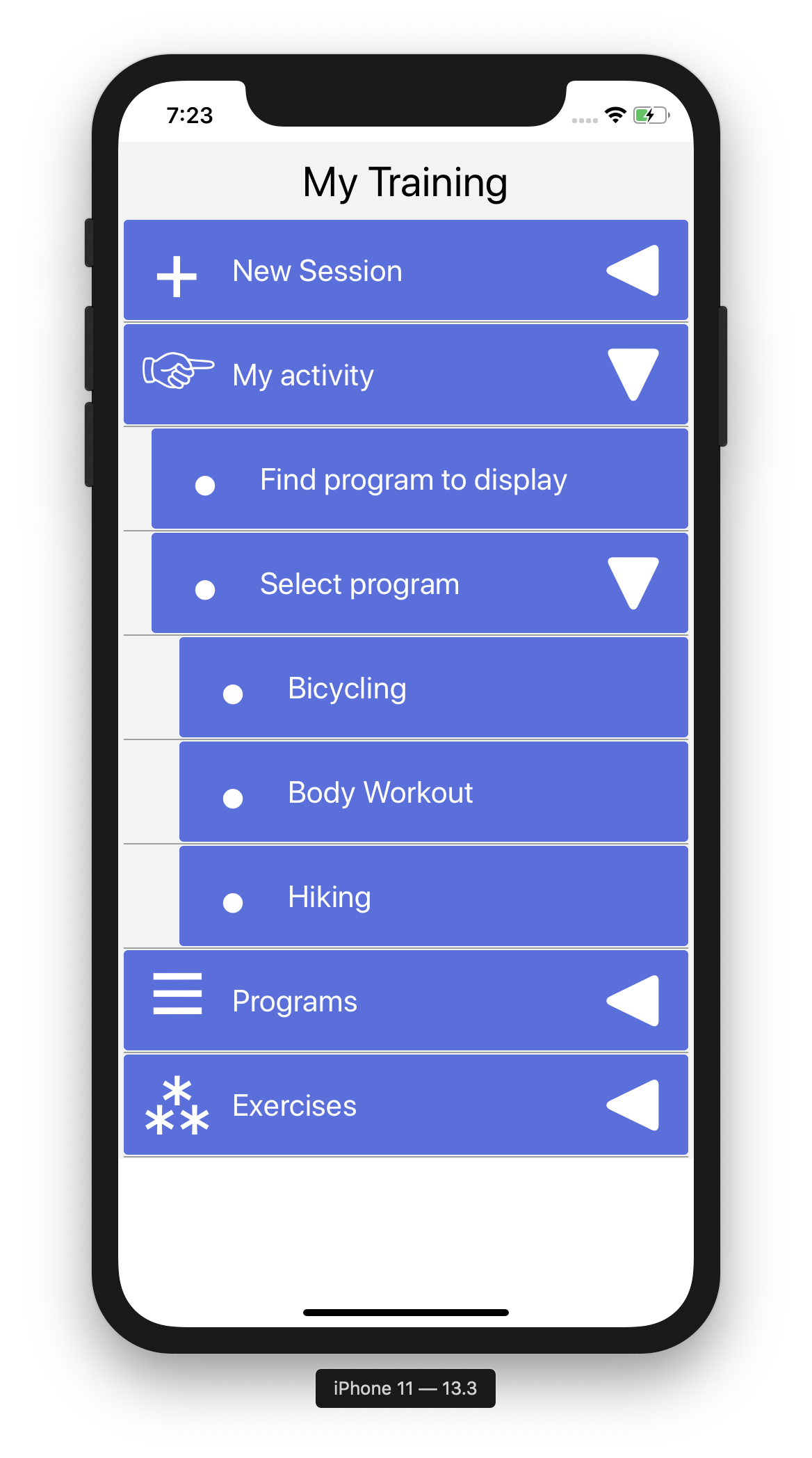
{ "openMenuItemIcon": "\u25C0", "closeMenuItemIcon": "\u25BC", "menu": [ { "id": "id_new_session", "icon": "\u002B", "name": "New Session", "subItems": [ { "id": "id_new_session_find_program", "name": "Find program", "subItems": [] }, { "id": "id_new_session_select_program", "icon": "\u2022", "name": "Select program", "subItems": [ { "id": "id_new_session_select_program1", "icon": "\u2022", "name": "Bicycling", "subItems": [] }, { "id": "id_new_session_select_program2", "icon": "\u2022", "name": "Body workout", "subItems": [] }, { "id": "id_new_session_select_program3", "icon": "\u2022", "name": "Hiking", "subItems": [] } ] } ] }, { "id": "id_activity", "icon": "\u261E", "name": "My activity", "subItems": [ { "id": "id_activity_find_program", "icon": "\u2022", "name": "Find program to display", "subItems": [] }, { "id": "id_activity_select_program", "icon": "\u2022", "name": "Select program", "subItems": [ { "id": "id_activity_select_program1", "icon": "\u2022", "name": "Bicycling", "subItems": [] }, { "id": "id_activity_select_program2", "icon": "\u2022", "name": "Body Workout", "subItems": [] }, { "id": "id_activity_select_program3", "icon": "\u2022", "name": "Hiking", "subItems": [] } ] } ] }, { "id": "id_programs", "icon": "\u2630", "name": "Programs", "subItems": [ { "id": "id_programs_select_program1", "icon": "\u2022", "name": "Bicycling", "subItems": [] }, { "id": "id_programs_select_program2", "icon": "\u2022", "name": "Body workout", "subItems": [] }, { "id": "id_programs_select_program3", "icon": "\u2022", "name": "Hiking", "subItems": [] }, { "id": "id_programs_add", "icon": "\u2022", "name": "Add new program", "subItems": [] } ] }, { "id": "id_exercises", "icon": "\u2042", "name": "Exercises", "subItems": [ { "id": "id_exercises_add", "icon": "\u2022", "name": "Add new exercise", "subItems": [] } ] } ]}The result i shown above.
Custom menu items
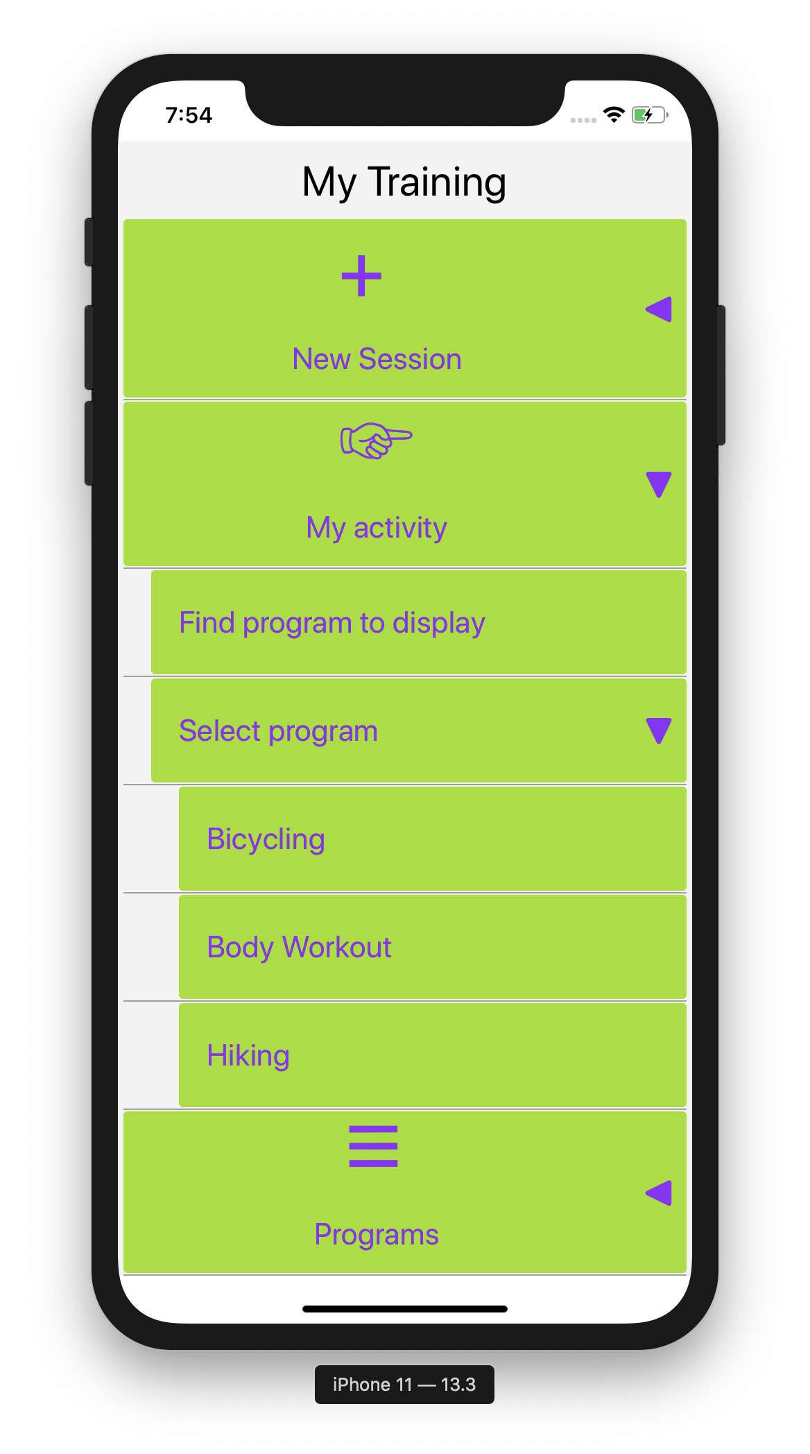
You can customize each item using useCustomItemContentRenderer and renderCustomMenuItem.
<TreeMenu menuData=menuData menuItemSettings=menuItemSettings itemClickHandler= this useCustomItemContentRenderer=true renderCustomMenuItem= this />The renderCustomMenuItem() function will be called for each item for custom rendering.
{ }
Settings
TreeView properties
| Property | Value | Description | Example |
|---|---|---|---|
| menuData | a menu data object | A Javascript object | {menuData} |
| menuItemSettings | a menu settings object | A Javascript object | {menuItemSettings} |
| itemClickHandler | a function | A callback event function | {item => this.onMenuItemClick(item)} |
| useCustomItemContentRenderer | true or false | Use customized menu items or not. Works in conjuction with renderCustomMenuItem below | |
| renderCustomMenuItem | a function | renderCustomMenuItem={menuItemObject => this.renderCustomMenuItem(menuItemObject) } |
Menu data
This is a Javscript object, specified in code or in a separate .json file (as shown above). Notice the unicode symbols used as both menu item icons and open/close menu item icons. Useful unicode symbols could, for instance, be found here Wikibooks or jrgraphix.net or similar.
Required structure (as json):
"openMenuItemIcon": "\u25C0" "closeMenuItemIcon": "\u25BC" "menu": "id": "id_new_session" "icon": "\u2795" "name": "New Session" "subItems": "id": "id_new_session_find_program" "icon": "\u25AA" "name": "Find program" "showDropDownButton": true "subItems": ... etc ... etc ... Menu settings
| Property | Description |
|---|---|
| closeOthersOnOpen | If true, other menu items at the same level are closed when the current is opened. Default is true. |
| defaultIcon | Unicode value. This is used when there is no "icon" specified for the menu items in menuData (json). |
| itemOpenCloseIcon | Where to place the open/close icon. Allowed values: 'left' or 'right'. Default is 'right'. |
| itemTextStyle | Standard react/jsx style object. |
| itemStyle | Standard react/jsx style object. |
| itemShowIcon | Show left menu icon or not. Default is true. |
| itemIconSize | Icon size. Default is 22. |
| itemIconColor | Icon color. Default is '#AAA'. |
| itemOpenCloseIconColor | Color on the open/close icons. Default is '#000'. |
| iconStyle | Standard react/jsx style object. |
| itemSeparator | Show separator line between menu items. Default is true. |
| itemSeparatorColor | Color on the separator line between menu items. Default is '#A0A0A0'. |
| itemSeparatorMarginTop | Separator line top margin. Default is 1. |
| itemSeparatorMarginBottom | Separator line bottom margin. Default is 1. |
| itemSeparatorMarginLeft | Separator line left margin. Default is 4. |
| itemSeparatorMarginRight | Separator line right margin. Default is 4. |
| itemIndentValue | Indent value. Indicates indent value for each submenu level. Default is 20. |
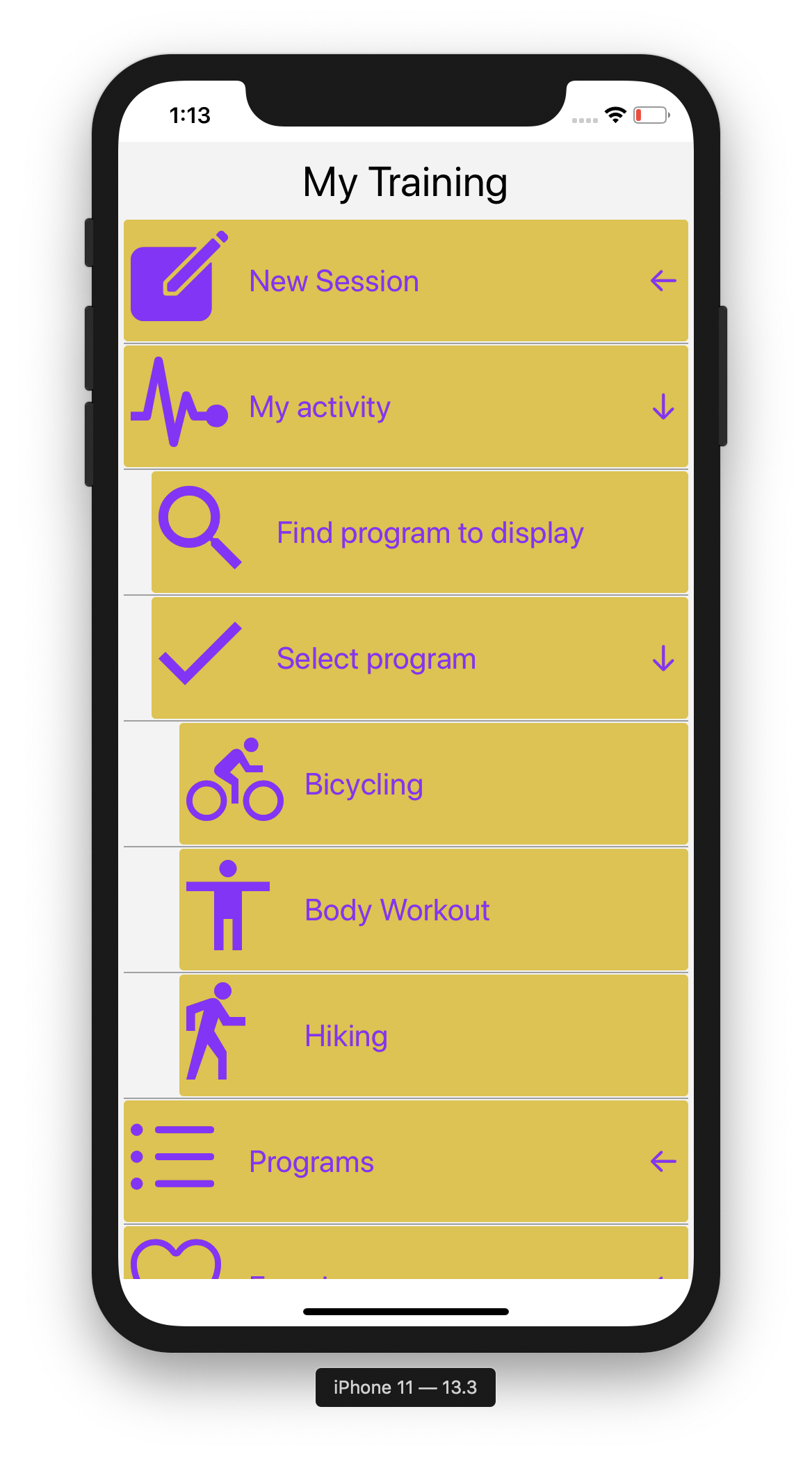
Example with customRenderer and react-native-vector-icons
The menu used in combination with https://www.npmjs.com/package/react-native-vector-icons
Each menu item use different vector icons.
In this example the following menuItemSettings properties are set as follows: itemShowIcon is set to false, itemStyle:backgroundColor and itemOpenCloseIconColor is set to "#e0c437". In addition openMenuItemIcon and closeMenuItemIcon is set to "\u2190" and "\u2193" in the menuData-object (.json file).
{ let viewStyle = flex: 1 flexDirection: 'row' alignItems: 'center'; let iconSize = 80; let iconStyle = marginLeft: 5 marginRight: 5 width: iconSize let color = '#900EFF'; let textStyle = fontSize: 22 color: color; }