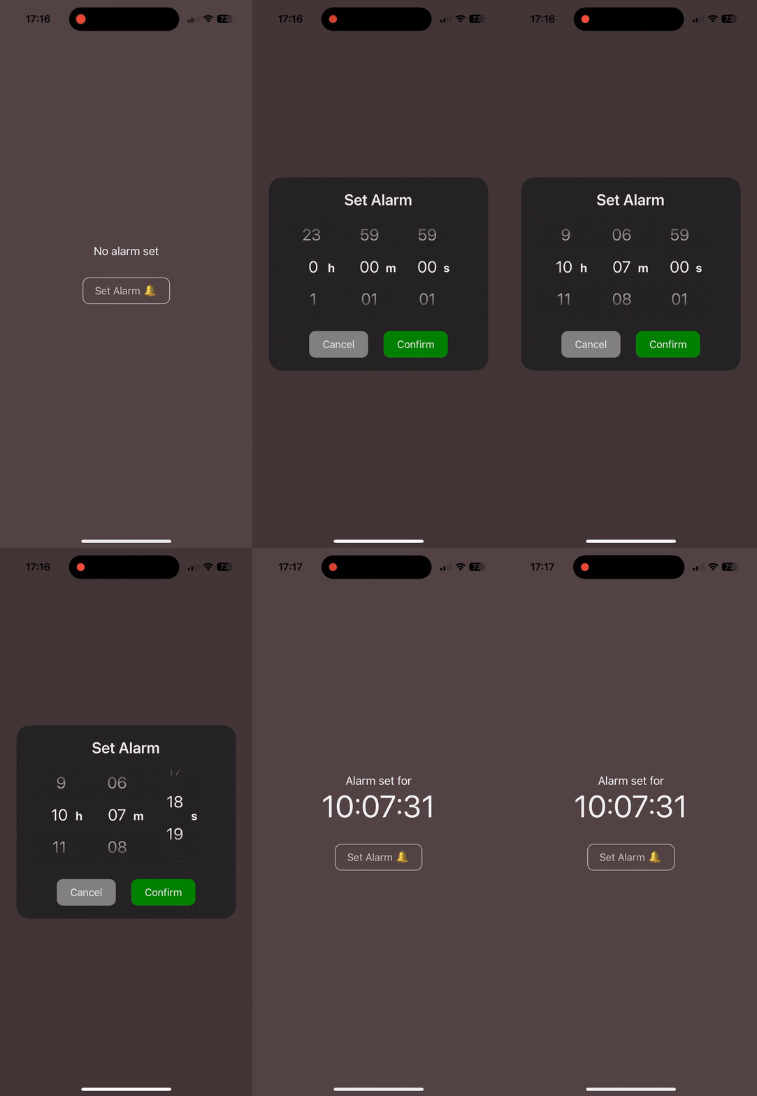
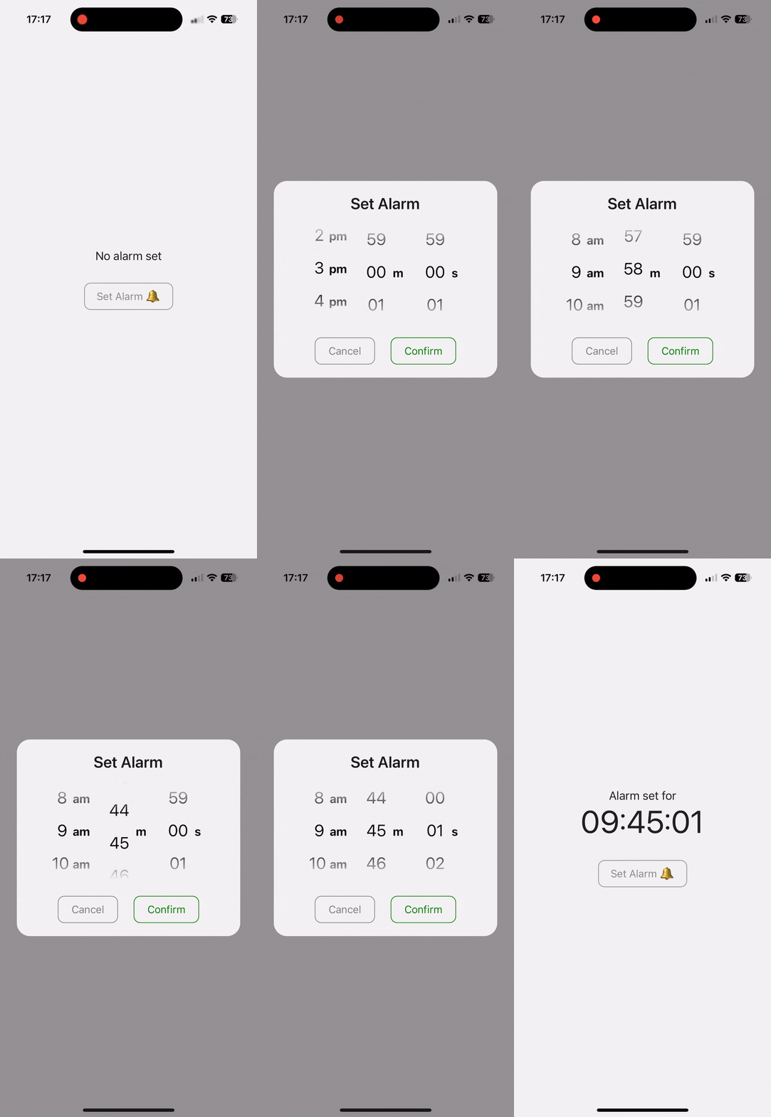
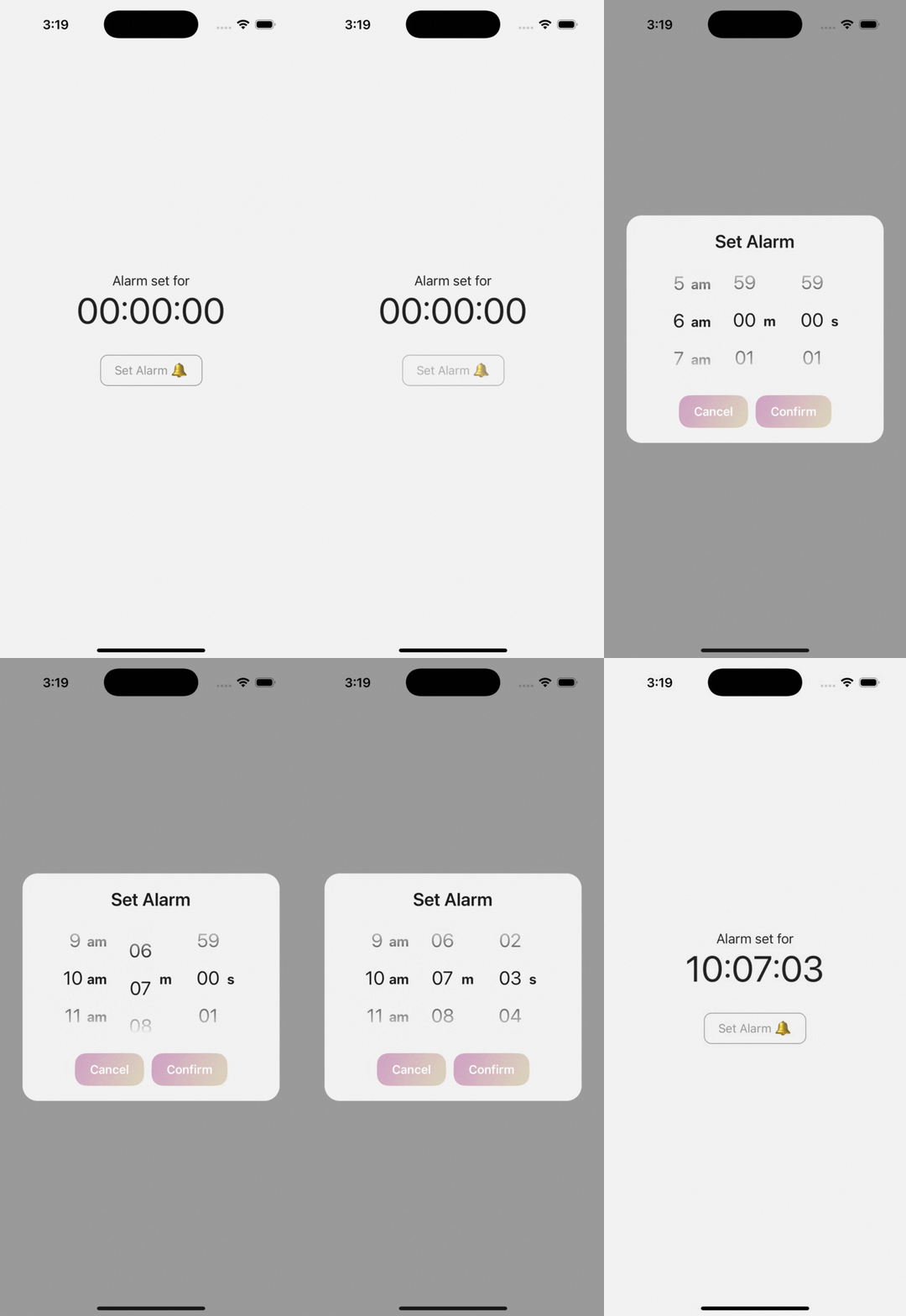
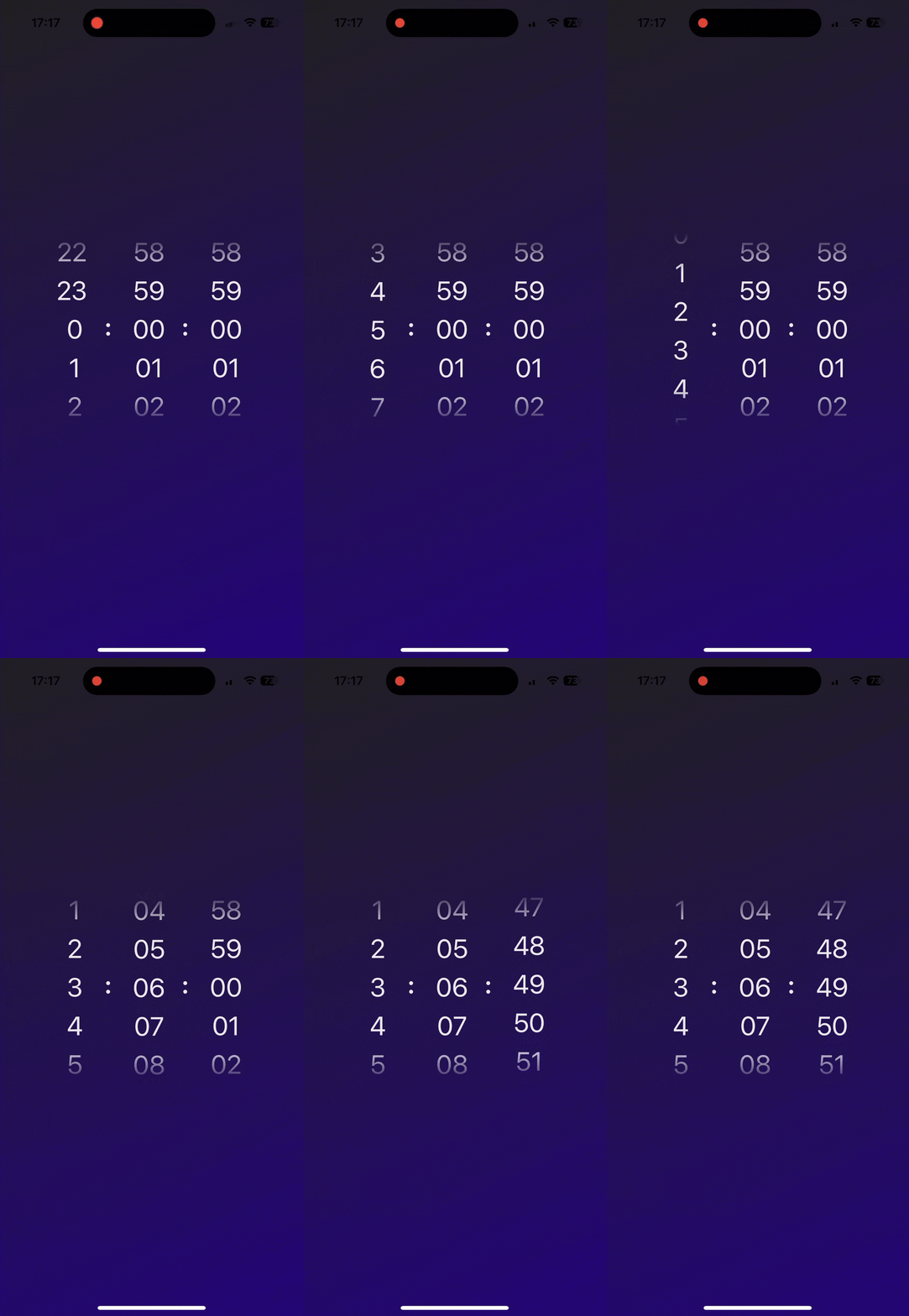
A simple, flexible, performant duration picker component for React Native apps 🔥
Great for timers, alarms and duration inputs.
Works with Expo and bare React Native apps ✅
Includes iOS-style haptic and audio feedback 🍏
- Demos 📱
- Installation 🚀
- Examples 😎
- Props 💅
- Methods 🔄
- Picker Feedback
- Contributing 🧑🤝🧑
- Limitations ⚠
- License 📝
Try it out for yourself on Expo Snack! Make sure to run it on a mobile to see it working properly.
Supports React Native >= 0.59.0 and React >= 16.8.0.
Just run:
npm install react-native-timer-pickeror
yarn add react-native-timer-pickerThis component will work in your React Native Project without any peer dependencies. However, to enable certain additional features (e.g. fade-out) you will need to supply various libraries as props. These are detailed below.
If you want the numbers to fade in/out at the top and bottom of the picker, you will need to install either:
- expo-linear-gradient (if using Expo)
- react-native-linear-gradient (if using in a bare React Native project)
To enable the linear gradient, you need to supply the component as a prop to either TimerPickerModal or TimerPicker.
To make the numbers fade in/out on a transparent background (e.g. if the picker is rendered on top of a gradient or image), you will need to install the @react-native-masked-view/masked-view
component. This is as the standard LinearGradient implementation relies on there being a solid background colour. You then just need to set backgroundColor: "transparent on the TimerPicker styles prop.
import MaskedView from "@react-native-masked-view/masked-view";
To enable the fade-out on a transparent background, you need to supply the imported MaskedView component AND one of the LinearGradient components as props to either TimerPickerModal or TimerPicker. (see this example)
import { TimerPickerModal } from "react-native-timer-picker";
import { LinearGradient } from "expo-linear-gradient"; // or `import LinearGradient from "react-native-linear-gradient"`

....
const [showPicker, setShowPicker] = useState(false);
const [alarmString, setAlarmString] = useState<
        string | null
    >(null);

const formatTime = ({
    hours,
    minutes,
    seconds,
}: {
    hours?: number;
    minutes?: number;
    seconds?: number;
}) => {
    const timeParts = [];

    if (hours !== undefined) {
        timeParts.push(hours.toString().padStart(2, "0"));
    }
    if (minutes !== undefined) {
        timeParts.push(minutes.toString().padStart(2, "0"));
    }
    if (seconds !== undefined) {
        timeParts.push(seconds.toString().padStart(2, "0"));
    }

    return timeParts.join(":");
};

return (
    <View style={{backgroundColor: "#514242", alignItems: "center", justifyContent: "center"}}>
        <Text style={{fontSize: 18, color: "#F1F1F1"}}>
            {alarmStringExample !== null
                ? "Alarm set for"
                : "No alarm set"}
        </Text>
        <TouchableOpacity
            activeOpacity={0.7}
            onPress={() => setShowPicker(true)}>
            <View style={{alignItems: "center"}}>
                {alarmString !== null ? (
                    <Text style={{color: "#F1F1F1", fontSize: 48}}>
                        {alarmString}
                    </Text>
                ) : null}
                <TouchableOpacity
                    activeOpacity={0.7}
                    onPress={() => setShowPicker(true)}>
                    <View style={{marginTop: 30}}>
                        <Text
                            style={{
                                paddingVertical: 10,
                                paddingHorizontal: 18,
                                borderWidth: 1,
                                borderRadius: 10,
                                fontSize: 16,
                                overflow: "hidden",
                                borderColor: "#C2C2C2",
                                color: "#C2C2C2"
                                }}>
                            {"Set Alarm 🔔"}
                        </Text>
                    </View>
                </TouchableOpacity>
            </View>
        </TouchableOpacity>
        <TimerPickerModal
            visible={showPicker}
            setIsVisible={setShowPicker}
            onConfirm={(pickedDuration) => {
                setAlarmString(formatTime(pickedDuration));
                setShowPicker(false);
            }}
            modalTitle="Set Alarm"
            onCancel={() => setShowPicker(false)}
            closeOnOverlayPress
            LinearGradient={LinearGradient}
            styles={{
                theme: "dark",
            }}
            modalProps={{
                overlayOpacity: 0.2,
            }}
        />
    </View>
)import { TimerPickerModal } from "react-native-timer-picker";
import { LinearGradient } from "expo-linear-gradient"; // or `import LinearGradient from "react-native-linear-gradient"`
....
const [showPicker, setShowPicker] = useState(false);
const [alarmString, setAlarmString] = useState<
string | null
>(null);
const formatTime = ({
hours,
minutes,
seconds,
}: {
hours?: number;
minutes?: number;
seconds?: number;
}) => {
const timeParts = [];
if (hours !== undefined) {
timeParts.push(hours.toString().padStart(2, "0"));
}
if (minutes !== undefined) {
timeParts.push(minutes.toString().padStart(2, "0"));
}
if (seconds !== undefined) {
timeParts.push(seconds.toString().padStart(2, "0"));
}
return timeParts.join(":");
};
return (
<View style={{backgroundColor: "#F1F1F1", alignItems: "center", justifyContent: "center"}}>
<Text style={{fontSize: 18, color: "#202020"}}>
{alarmStringExample !== null
? "Alarm set for"
: "No alarm set"}
</Text>
<TouchableOpacity
activeOpacity={0.7}
onPress={() => setShowPicker(true)}>
<View style={{alignItems: "center"}}>
{alarmString !== null ? (
<Text style={{color: "#202020", fontSize: 48}}>
{alarmString}
</Text>
) : null}
<TouchableOpacity
activeOpacity={0.7}
onPress={() => setShowPicker(true)}>
<View style={{marginTop: 30}}>
<Text
style={{paddingVertical: 10,
paddingHorizontal: 18,
borderWidth: 1,
borderRadius: 10,
fontSize: 16,
overflow: "hidden",
borderColor: "#8C8C8C",
color: "#8C8C8C"
}}>
Set Alarm 🔔
</Text>
</View>
</TouchableOpacity>
</View>
</TouchableOpacity>
<TimerPickerModal
visible={showPicker}
setIsVisible={setShowPicker}
onConfirm={(pickedDuration) => {
setAlarmString(formatTime(pickedDuration));
setShowPicker(false);
}}
modalTitle="Set Alarm"
onCancel={() => setShowPicker(false)}
closeOnOverlayPress
use12HourPicker
LinearGradient={LinearGradient}
styles={{
theme: "light",
}}
/>
</View>
)import { TimerPicker } from "react-native-timer-picker";
import MaskedView from "@react-native-masked-view/masked-view"; // for transparent fade-out
import { LinearGradient } from "expo-linear-gradient"; // or `import LinearGradient from "react-native-linear-gradient"`
....
const [showPicker, setShowPicker] = useState(false);
const [alarmString, setAlarmString] = useState<
string | null
>(null);
return (
<LinearGradient
colors={["#202020", "#220578"]}
start={{ x: 0, y: 0 }}
end={{ x: 1, y: 1 }}
style={{alignItems: "center", justifyContent: "center"}}>
<TimerPicker
padWithNItems={2}
hourLabel=":"
minuteLabel=":"
secondLabel=""
LinearGradient={LinearGradient}
MaskedView={MaskedView}
styles={{
theme: "dark",
backgroundColor: "transparent", // transparent fade-out
pickerItem: {
fontSize: 34,
},
pickerLabel: {
fontSize: 32,
marginTop: 0,
},
pickerContainer: {
marginRight: 6,
},
pickerItemContainer: {
width: 100
},
pickerLabelContainer: {
right: -20,
top: 0,
bottom: 6,
width: 40,
alignItems: "center",
},
}}
/>
</LinearGradient>
)import { TimerPicker } from "react-native-timer-picker";
import { LinearGradient } from "expo-linear-gradient"; // or `import LinearGradient from "react-native-linear-gradient"`
....
const [showPicker, setShowPicker] = useState(false);
const [alarmString, setAlarmString] = useState<
string | null
>(null);
return (
<View style={{backgroundColor: "#F1F1F1", alignItems: "center", justifyContent: "center"}}>
<TimerPicker
padWithNItems={3}
hideHours
minuteLabel="min"
secondLabel="sec"
LinearGradient={LinearGradient}
styles={{
theme: "light",
pickerItem: {
fontSize: 34,
},
pickerLabel: {
fontSize: 26,
right: -20,
},
pickerLabelContainer: {
width: 60,
},
pickerItemContainer: {
width: 150,
},
}}
/>
</View>
)| Prop | Description | Type | Default | Required |
|---|---|---|---|---|
| onDurationChange | Callback when the duration changes | (duration: { days: number, hours: number, minutes: number, seconds: number }) => void |
- | false |
| initialValue | Initial value for the picker | { days?: number, hours?: number, minutes?: number, seconds?: number } |
- | false |
| hideDays | Hide the days picker | Boolean | true | false |
| hideHours | Hide the hours picker | Boolean | false | false |
| hideMinutes | Hide the minutes picker | Boolean | false | false |
| hideSeconds | Hide the seconds picker | Boolean | false | false |
| daysPickerIsDisabled | Disable the days picker | Boolean | false | false |
| hoursPickerIsDisabled | Disable the hours picker | Boolean | false | false |
| minutesPickerIsDisabled | Disable the minutes picker | Boolean | false | false |
| secondsPickerIsDisabled | Disable the seconds picker | Boolean | false | false |
| dayLimit | Limit on the days it is possible to select | { max?: Number, min?: Number } |
- | false |
| hourLimit | Limit on the hours it is possible to select | { max?: Number, min?: Number } |
- | false |
| minuteLimit | Limit on the minutes it is possible to select | { max?: Number, min?: Number } |
- | false |
| secondLimit | Limit on the seconds it is possible to select | { max?: Number, min?: Number } |
- | false |
| maximumDays | The highest value on the days picker | Number | 23 | false |
| maximumHours | The highest value on the hours picker | Number | 23 | false |
| maximumMinutes | The highest value on the minutes picker | Number | 59 | false |
| maximumSeconds | The highest value on the seconds picker | Number | 59 | false |
| dayInterval | The interval between values on the days picker | Number | 1 | false |
| hourInterval | The interval between values on the hours picker | Number | 1 | false |
| minuteInterval | The interval between values on the minutes picker | Number | 1 | false |
| secondInterval | The interval between values on the seconds picker | Number | 1 | false |
| dayLabel | Label for the days picker | String | React.ReactElement | d | false |
| hourLabel | Label for the hours picker | String | React.ReactElement | h | false |
| minuteLabel | Label for the minutes picker | String | React.ReactElement | m | false |
| secondLabel | Label for the seconds picker | String | React.ReactElement | s | false |
| padDaysWithZero | Pad single-digit days in the picker with a zero | Boolean | false | false |
| padHoursWithZero | Pad single-digit hours in the picker with a zero | Boolean | false | false |
| padMinutesWithZero | Pad single-digit minutes in the picker with a zero | Boolean | true | false |
| padSecondsWithZero | Pad single-digit seconds in the picker with a zero | Boolean | true | false |
| padWithNItems | Number of items to pad the picker with on either side | Number | 1 | false |
| aggressivelyGetLatestDuration | Set to True to ask DurationScroll to aggressively update the latestDuration ref | Boolean | false | false |
| allowFontScaling | Allow font in the picker to scale with accessibility settings | Boolean | false | false |
| use12HourPicker | Switch the hour picker to 12-hour format with an AM / PM label | Boolean | false | false |
| amLabel | Set the AM label if using the 12-hour picker | String | am | false |
| pmLabel | Set the PM label if using the 12-hour picker | String | pm | false |
| repeatDayNumbersNTimes | Set the number of times the list of days is repeated in the picker | Number | 3 | false |
| repeatHourNumbersNTimes | Set the number of times the list of hours is repeated in the picker | Number | 7 | false |
| repeatMinuteNumbersNTimes | Set the number of times the list of minutes is repeated in the picker | Number | 3 | false |
| repeatSecondNumbersNTimes | Set the number of times the list of seconds is repeated in the picker | Number | 3 | false |
| disableInfiniteScroll | Disable the infinite scroll feature | Boolean | false | false |
| LinearGradient | Linear Gradient Component (required for picker fade-out) | expo-linear-gradient.LinearGradient or react-native-linear-gradient.default | - | false |
| MaskedView | Masked View Component (required for picker fade-out on transparent background) | @react-native-masked-view/masked-view.default | - | false |
| FlatList | FlatList component used internally to implement each picker (day, hour, minutes and seconds). More info below | react-native.FlatList |
FlatList from react-native
|
false |
| pickerFeedback | Callback for providing audio/haptic feedback (fired whenever the picker ticks over a value) | () => void | Promise<void> |
- | false |
| Haptics (DEPRECATED) | Expo Haptics Namespace (please use pickerFeedback instead) | expo-haptics | - | false |
| Audio (DEPRECATED) | Expo AV Audio Class | expo-av.Audio (please use pickerFeedback instead) | - | false |
| clickSoundAsset (DEPRECATED) | Custom sound asset for click sound (please use pickerFeedback instead), was required for offline click sound - download default here | require(.../somefolderpath) or {uri: www.someurl} | - | false |
| pickerContainerProps | Props for the picker container | React.ComponentProps<typeof View> |
- | false |
| pickerGradientOverlayProps | Props for the gradient overlay (supply a different locations array to adjust its position) overlays |
Partial<LinearGradientProps> |
- | false |
| styles | Custom styles for the timer picker | CustomTimerPickerStyles | - | false |
| decelerationRate | Set how quickly the picker decelerates after the user lifts their finger | 'fast', 'normal', or Number | 0.88 | false |
The following custom styles can be supplied to re-style the component in any way. Various styles are applied by default - you can take a look at these here.
| Style Prop | Description | Type |
|---|---|---|
| theme | Theme of the component | "light" | "dark" |
| backgroundColor | Main background color | string |
| text | Base text style | TextStyle |
| pickerContainer | Main container for the picker | ViewStyle & { backgroundColor?: string } |
| pickerLabelContainer | Container for the picker's labels | ViewStyle |
| pickerLabel | Style for the picker's labels | TextStyle |
| pickerAmPmContainer | Style for the picker's labels | ViewStyle |
| pickerAmPmLabel | Style for the picker's labels | TextStyle |
| pickerItemContainer | Container for each number in the picker | ViewStyle & { height?: number } |
| pickerItem | Style for each individual picker number | TextStyle |
| disabledPickerItem | Style for any numbers outside any set limits | TextStyle |
| disabledPickerContainer | Style for disabled pickers | ViewStyle |
| pickerGradientOverlay | Style for the gradient overlay (fade out) | ViewStyle |
| durationScrollFlatList | Style for the Flatlist in each picker | ViewStyle |
| durationScrollFlatListContainer | Style for the View that contains the Flatlist in each picker | ViewStyle |
| durationScrollFlatListContentContainer | Style for the Flatlist's contentContainerStyle prop in each picker |
ViewStyle |
Note the minor limitations to the allowed styles for pickerContainer and pickerItemContainer. These are made because these styles are used for internal calculations and all possible backgroundColor/height types are not supported.
When the disableInfiniteScroll prop is not set, the picker gives the appearance of an infinitely scrolling picker by auto-scrolling forward/back when you near the start/end of the list. When the picker auto-scrolls, a momentary flicker is visible if you are scrolling very slowly.
To mitigate for this, the list of numbers in each picker is repeated a given number of times based on the length of the list (7 times for the hours picker, and 3 times for the days/minutes/seconds picker). These have a performance trade-off: higher values mean the picker has to auto-scroll less to maintain the infinite scroll, but has to render a longer list of numbers. The number of repetitions automatically adjusts if the number of items in the picker changes (e.g. if an interval is included, or the maximum value is modified), balancing the trade-off. You can also manually adjust the number of repetitions in each picker with the repeatHourNumbersNTimes, repeatMinuteNumbersNTimes and repeatSecondNumbersNTimes props.
Note that you can avoid the auto-scroll flickering entirely by disabling infinite scroll. You could then set the above props to high values, so that a user has to scroll far down/up the list to reach the end of the list.
The library offers the ability to provide a custom component for the <FlatList />, instead of the default React Native component. This allows for more flexibility and integration with libraries like react-native-gesture-handler or other components built on top of it, like https://ui.gorhom.dev/components/bottom-sheet.
E.g. if you want to place the timer picker within that bottom-sheet component, the scrolling detection from the bottom-sheet would interfere with the one inside the timer picker, but it can be easily solved by providing the FlatList component from react-native-gesture-handler like this:
import { FlatList } from 'react-native-gesture-handler';
import { TimerPicker } from "react-native-timer-picker";

// ...

<TimerPicker
    {...props}
    FlatList={FlatList}
/>
Please note that this solution does not work for all bottom-sheet components (e.g. @tamagui/sheet) as it depends on the implementation of each component.
Important:
The custom component needs to have the same interface as React Native's <FlatList /> in order for it to work as expected. A complete reference of the current usage can be found here.
The TimerPickerModal component accepts all TimerPicker props, and the below additional props.
| Prop | Description | Type | Default | Required |
|---|---|---|---|---|
| visible | Determines if the modal is visible | Boolean | - | true |
| setIsVisible | Callback to set modal visibility | (isVisible: boolean) => void |
- | true |
| onConfirm | Callback when the user confirms the selected time | ({ hours, minutes, seconds }: { hours: number, minutes: number, seconds: number }) => void |
- | true |
| onCancel | Callback when the user cancels the selection | () => void |
- | false |
| closeOnOverlayPress | Determines if the modal should close on overlay press | Boolean | false | false |
| hideCancelButton | Hide the cancel button within the modal | Boolean | false | false |
| confirmButtonText | Text for the confirm button | String | Confirm | false |
| cancelButtonText | Text for the cancel button | String | Cancel | false |
| modalTitle | Title text for the modal | String | - | false |
| modalProps | Props for the main modal component | React.ComponentProps<typeof Modal> |
- | false |
| containerProps | Props for the main container | React.ComponentProps<typeof View> |
- | false |
| contentContainerProps | Props for the content container | React.ComponentProps<typeof View> |
- | false |
| buttonContainerProps | Props for the button containers | React.ComponentProps<typeof View> |
- | false |
| buttonTouchableOpacityProps | Props for the button touchable opacities | React.ComponentProps<typeof TouchableOpacity> |
- | false |
| modalTitleProps | Props for the modal title text component | React.ComponentProps<typeof Text> |
- | false |
| styles | Custom styles for the timer picker modal | CustomTimerPickerModalStyles | - | false |
The following custom styles can be supplied to re-style the component in any way. You can also supply all of the styles specified in CustomTimerPickerStyles. Various styles are applied by default - you can take a look at these here.
| Style Prop | Description | Type |
|---|---|---|
| container | Main container's style | ViewStyle |
| contentContainer | Style for the content's container | ViewStyle |
| buttonContainer | Style for the container around the buttons | ViewStyle |
| button | General style for both buttons | TextStyle |
| cancelButton | Style for the cancel button | TextStyle |
| confirmButton | Style for the confirm button | TextStyle |
| modalTitle | Style for the title of the modal | TextStyle |
The library exposes a TimerPickerRef type, which can be used to type your ref to the picker:
const timerPickerRef = useRef < TimerPickerRef > null;It has the following available methods:
reset - imperative method to reset the selected duration to their initial values.
timerPickerRef.current.reset(options?: { animated: boolean });setValue - imperative method to set the selected duration to a particular value
timerPickerRef.current.setValue({ hours: number, minutes: number, seconds: number }, options?: { animated: boolean });It also exposes the following ref object:
latestDuration - provides access to the latest duration (even during scrolls). This only works if aggressivelyGetLatestDuration is set to True (as in TimerPickerModal). It is used internally to ensure that the latest duration is returned in TimerPickerModal on pressing the confirm button, even if the inputs are still scrolling.
const latestDuration = timerPickerRef.current?.latestDuration;
const newDuration = {
    hours: latestDuration?.hours?.current,
    minutes: latestDuration?.minutes?.current,
    seconds: latestDuration?.seconds?.current,
};An identical ref is also exposed for the TimerPickerModal component.
You can use the picker feedback callback prop pickerFeedback to provide any form of audio/haptic feedback for the picker. This function is called whenever any of the pickers tick onto a new number.
Note that this prop should be used in lieu of the now deprecated expo-specific audio/haptic feedback props.
There is a challenge here with audio latency as we need to be able to play the click-sound repeatedly and rapidly when a user scrolls fast. Most React Native sound libraries are designed for playing audio tracks and the latency is too high for this application.
Recommended libraries:
- react-native-audio-api: this is a new library but is built by Software Mansion and has strong potential for our application with low-latency audio. It is not currently straightforward to use a local sound asset with this library; please check out the Expo example and Bare React Native example for a guide on how to do that. Note that this library will not work in Expo Go (you must create a development build).
Libraries to avoid:
- react-native-sound: this likely has low enough latency to work but has not been maintained for the 3+ years.
- expo-av: the latency is too high to work well. Expo are developing a new audio module expo-audio that may be better, but at the time of writing (May 2025) it does not have the capability to repeatedly play the same sound.
Recommended libraries:
- expo-haptics: for Expo apps.
- react-native-haptic-feedback: for bare React Native apps.
import { useCallback, useRef } from "react";
import { TimerPicker } from "react-native-timer-picker";

import { AudioContext, type AudioBuffer } from "react-native-audio-api";
import * as Haptics from 'expo-haptics'; // Expo apps
import { trigger } from 'react-native-haptic-feedback'; // Bare RN apps

// see examples/example-expo and examples/example-bare for how to load a local sound
import { getClickSound } from "./utils/getClickSound";

// ...

const audioContextRef = useRef<AudioContext | null>(null);
const audioBufferRef = useRef<AudioBuffer | null>(null);

useEffect(() => {
    const setupAudio = async () => {
        try {
            const context = new AudioContext();
            const arrayBuffer = await getClickSound();
            const buffer = await context.decodeAudioData(arrayBuffer);

            audioContextRef.current = context;
            audioBufferRef.current = buffer;
        } catch (error) {
            console.warn("Audio setup failed:", error);
        }
    };

    setupAudio();

    return () => {
        audioContextRef.current?.close();
    };
}, []);

const pickerFeedback = useCallback(() => {
    try {
        // Audio
        const context = audioContextRef.current;
        const buffer = audioBufferRef.current;

        if (!context || !buffer) {
            console.warn("Audio not initialized");
            return;
        }

        const playerNode = context.createBufferSource();
        playerNode.buffer = buffer;
        playerNode.connect(context.destination);
        playerNode.start(context.currentTime);

        // Haptics (Expo apps)
        Haptics.selectionAsync();
        // Hatpics (Bare RN apps)
        trigger('selection');
    } catch {
        console.warn("Picker feedback failed");
    }
}, [])

<TimerPicker
    {...props}
    pickerFeedback={pickerFeedback}
/>Enable haptic feedback with the expo-haptics module:
import * as Haptics from "expo-haptics";
To enable haptic feedback, you need to supply the imported Haptics namespace as a prop to either TimerPickerModal or TimerPicker.
Enable audio feedback with the expo-av module:
import { Audio } from "expo-av";
To enable audio feedback, you need to supply the imported Audio class as a prop to either TimerPickerModal or TimerPicker.
Please note that the default click sound uses a hosted mp3 file. To make the click sound work offline, you need to supply your own
sound asset through the clickSoundAsset prop. You can download the default click sound here.
Contributions to this project are more than welcome.
N.B. Please submit PRs into develop, not main.
To get this project running locally:
- Clone the Git repo.
- Run
yarn setupfrom the project root (this installs the project dependencies and the examples' additional dependencies)
You can then start either the Expo example or the bare React Native example:
- For Expo, run
yarn startto start the Expo example in Expo Go. For audio feedback, uncomment the relevant lines inexamples/example-expo/App.tsxand create a development build withyarn build:androidoryarn build:ios. - For bare React Native, run
yarn start-bare:androidorstart-bare:iosto start the project on an emulator/device (you have to refresh the app once on startup for it to work).
There are two permenant branches: main and develop. You should never work directly on either of these branches.
- Create a new branch off
developfor your work using the patternfeature/{DESCRIPTION}. - When you think your work is ready for review, submit a PR from your branch back to
develop. - Once the PR is resolved, your work will be merged into
develop, and will be included in the next major/minor release.
- The project is not compatibile with React Native versions prior to
v0.72.0due to this React Native issue. - The audio feedback provided by the
Audioprop withexpo-avsuffers from high latency and doesn't work well when a user scrolls quickly. This has now been deprecated in place of thepickerFeedbackprop. Please tryreact-native-audio-apifor a lower latency audio library.
This project is licensed under the MIT License.


