react-native-tag-group


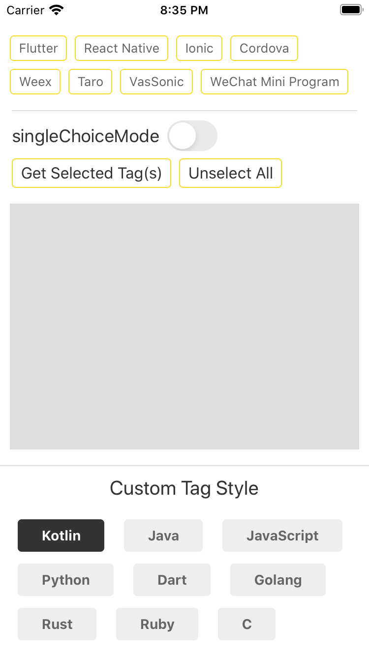
A simple Tag component that supports both single and multiple selection.
Get Started
Installation
npm i react-native-tag-group --saveTagGroup Usage
; // ... { return <TagGroup ref= thistagGroup = ref source='One' 'Two' 'Three' onSelectedTagChange= { this; } /> ;}TagGroup Props
| Props | Type | Description |
|---|---|---|
| style | View style | container's style |
| source | array | source array, usually a string array. |
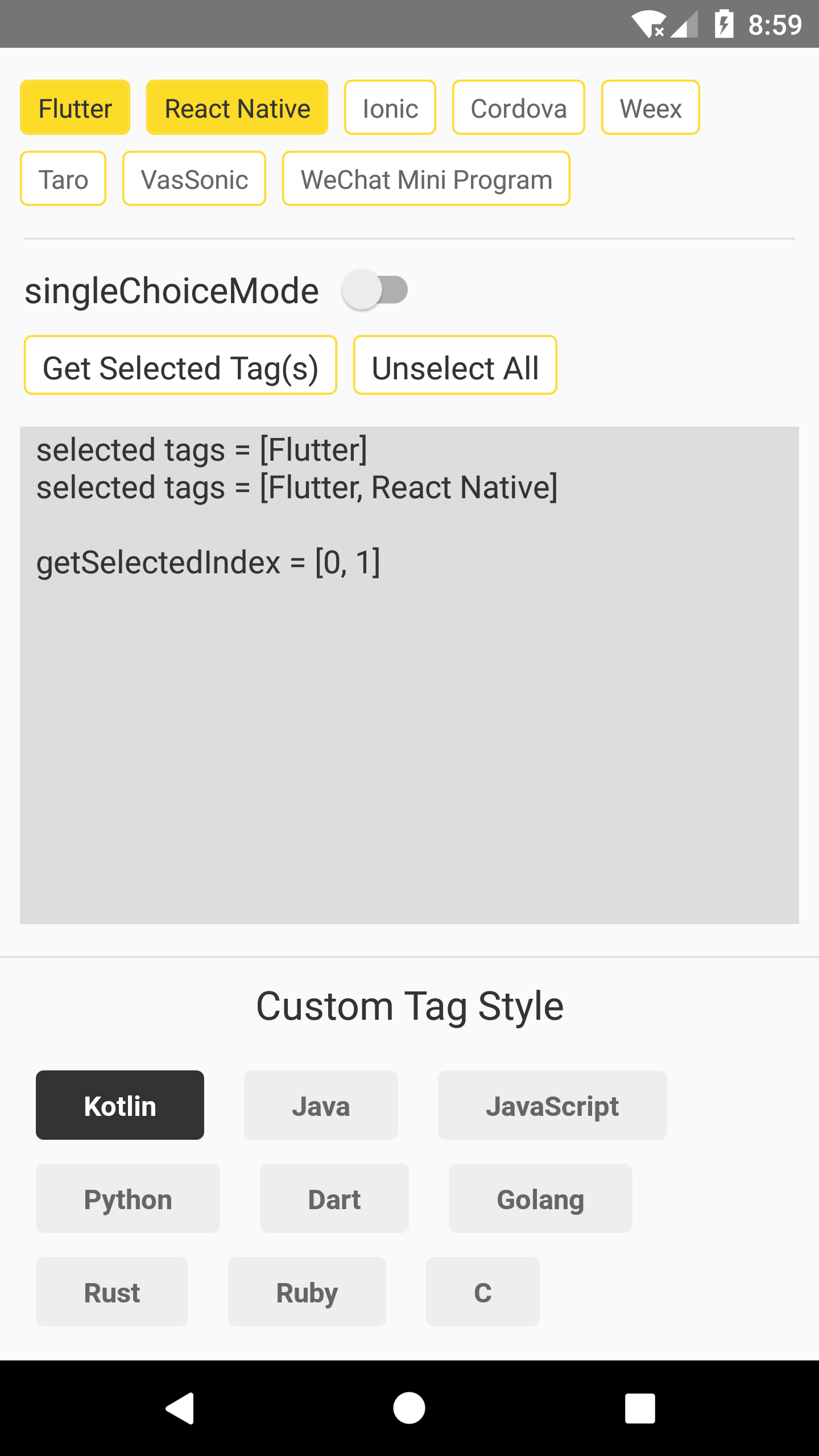
| singleChoiceMode | bool | only allow select one Tag at one time. Default false. |
| onSelectedTagChange | function | callback after Tag(s) pressed, the parameter is a string array[], or (stringValue, selectedIndex) when set singleChoiceMode to true. |
| tintColor | string | set the border color and background color when Tag is selected. |
| tagStyle/activeTagStyle | View style | set the Tag's style before and after selected. |
| textStyle/activeTextStyle | Text style | set the Tag's text style before and after selected. |
| touchableOpacity | bool | use TouchableOpacity instead of TouchableWithoutFeedback. |
Methods
select(index)
Select Tag at the index, this WON'T invoke onSelectedTagChange callback.
unselect(index)
Unselect Tag at the index, this WON'T invoke onSelectedTagChange callback.
getSelectedIndex()
Get the index array of the selected Tag(s), return -1 if no Tag is selected.
Tag Usage
Tag can also be used as a simple button, for example:
; // ... <Tag text='Button Text' tagStyle=stylesbuttonContainer textStyle=stylesbuttonText onPress=thisonTagPress touchableOpacity/> // ... { console}Tag Props
| Props | Type | Description |
|---|---|---|
| tintColor | string | Tag's border color, you can also cusotomize it with tagStyle prop. |
| tagStyle | View style | Tag style. |
| textStyle | Text style | Tag's text style. |
| onPress | function | callback function when Tag is pressed. |
| touchableOpacity | bool | use TouchableOpacity instead of TouchableWithoutFeedback. |
For more information please check the example.