react-native-step-view-navigation
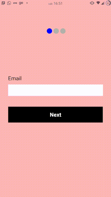
Table of Contents
Install
npm install react-native-step-view-navigationor
yarn add react-native-step-view-navigationUsage
You will add StepViews within StepNavigation and create your screens within StepView.
The StepNavigation Component has a mandatory prop called step. this prop indicates the screen that StepNavigation should be on. to change the screen, just change the value of the prop step to the number of the screen you want to navigate.
Basic Example
;; { const step setStep = return <StepNavigation step=step> <StepView> <View style= backgroundColor: 'pink' flex: 1 justifyContent: 'center' padding: 30 > <Text style=styleslabel>Email</Text> <TextInput style=stylesinput /> <TouchableOpacity style=stylesbtn onPress= > <Text style= color: '#fff' fontWeight: 'bold' fontSize: 20 >Next</Text> </TouchableOpacity> </View> </StepView> <StepView> <View style= backgroundColor: 'gray' flex: 1 justifyContent: 'center' padding: 30 > <Text style=styleslabel>name</Text> <TextInput style=stylesinput /> <TouchableOpacity style=stylesbtn onPress= > <Text style= color: '#fff' fontWeight: 'bold' fontSize: 20 >Next</Text> </TouchableOpacity> </View> </StepView> <StepView> <View style= backgroundColor: 'yellow' flex: 1 justifyContent: 'center' padding: 30 > <Text style=styleslabel>password</Text> <TextInput style=stylesinput /> <TouchableOpacity style=stylesbtn onPress= > <Text style= color: '#fff' fontWeight: 'bold' fontSize: 20 >Next</Text> </TouchableOpacity> </View> </StepView> </StepNavigation> ;} const styles = StyleSheet;Complex Example
;; { return <StepView> <View style= backgroundColor: 'pink' flex: 1 justifyContent: 'center' padding: 30 > <Text style=styleslabel>Step propsme</Text> <TouchableOpacity style=stylesbtn onPress= propsnextpropsme > <Text style= color: '#fff' fontWeight: 'bold' fontSize: 20 >Next</Text> </TouchableOpacity> </View> </StepView> } { const step setStep = const numberOfSteps = 5 let steps = for let index = 0; index < numberOfSteps; index++ steps return <View style= flex: 1 > <View style=alignItems: 'center' paddingTop: 30 backgroundColor: '#aaaaff'> <Text style=styleslabel>Some header</Text> <Text style=styleslabel>Some header</Text> <Text style=styleslabel>Some header</Text> <Text style=styleslabel>Some header</Text> <Text style=styleslabel>Some header</Text> </View> <StepNavigation dotsColor='red' dotsDisabledColor='black' dotsDistance=3 dotsMargin=30 dotsPosition='Bottom' dotsSize=10 transitionDuration=1000 step=step > steps </StepNavigation> </View> ;} const styles = StyleSheet;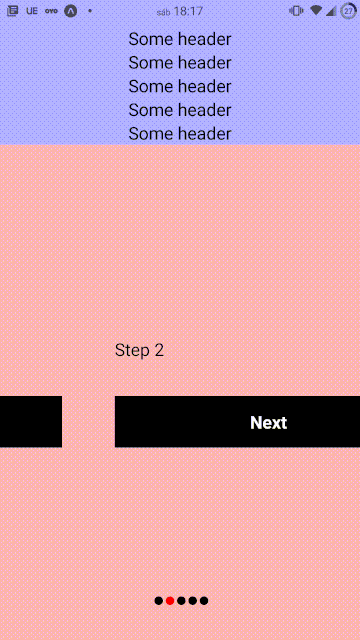
StepNavigation Props
| Props | Type | Default value |
Description |
|---|---|---|---|
| step | number | number of the screen being displayed | |
| dots | boolean | true | step indicator activated |
| dotsPosition | "Top" or "Bottom" | Top | step indicator position |
| dotsMargin | number | 60 | margin top or bottom of the step indicator |
| dotsDistance | number | 5 | distance between dots |
| dotsSize | number | 20 | dots size |
| dotsColor | string | "blue" | dot active color |
| dotsDisabledColor | string | "#aaa" | dots disabeld color |
| transitionDuration | number | 800 | transition duration |
License
ISC