react-native-shadow-cards
Simple and animated radio button component for React Native
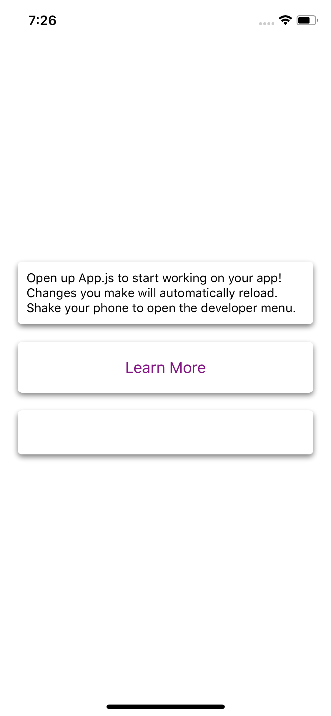
Screenshot
Installation
npm i --save react-native-shadow-cardsUsage
; { return <View style=stylescontainer> <Card style=padding: 10 margin: 10> <Text>Open up Appjs to start working on your app!</Text> <Text>Changes you make will automatically reload</Text> <Text>Shake your phone to open the developer menu</Text> </Card> <Card style=padding: 10 margin: 10> <Button onPress={} title="Learn More" color="#841584" accessibilityLabel="Learn more about this purple button" /> </Card> <Card style=padding: 10 margin: 10 height: 50> </Card> </View> ;}Configuration
Card:
| Property | Type | Default | Description |
|---|---|---|---|
| backgroundColor | string | '#ffffff' | card background color |
| elevation | number | 3 | An attribute to set the elevation of the card, increases 'drop-shadow' of the card |
| cornerRadius | number | 5 | Set the radius of the card |
| opacity | number | 0.5 | Set the opacity of the card |
Contributing
Of course! Welcome :)
You can use following command in example dir: