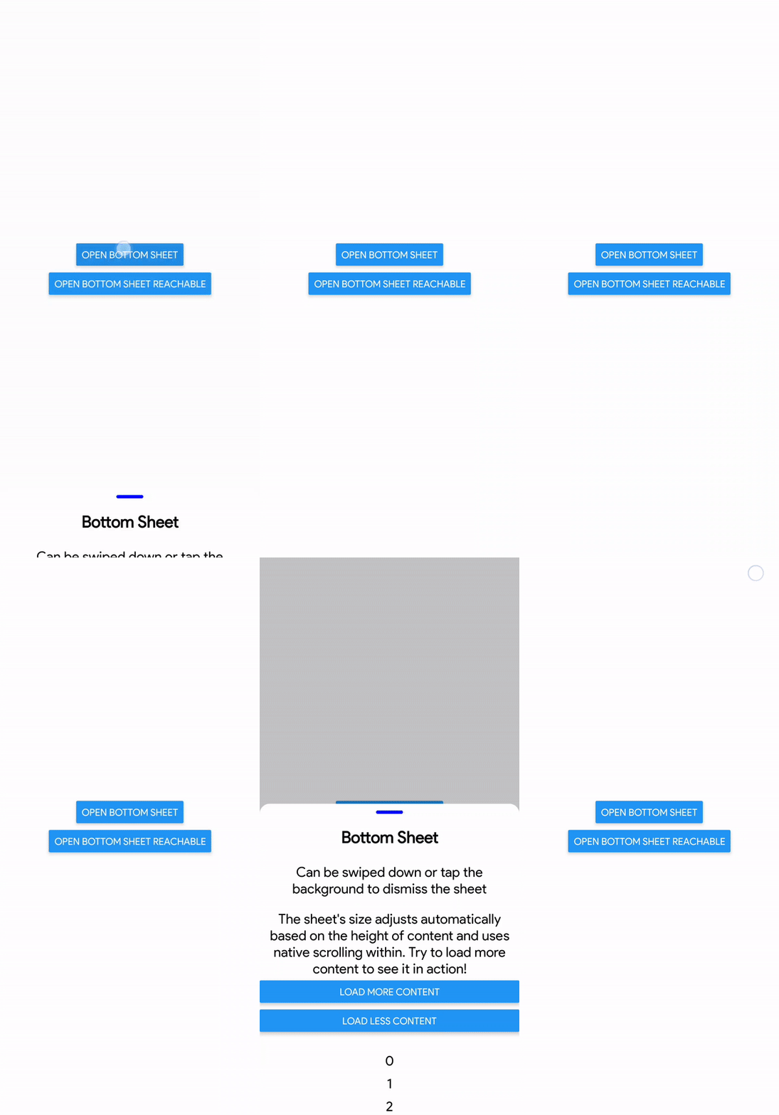
React Native Scrollable Bottom Sheet
A simple bottom sheet popup modal that supports scrollable content for React Native. Fully supports Expo. Uses react-native-reanimated and react-native-gesture-handler.
Features
- Supports scrollable content!
- Lightweight
- Fully customizable
- Fluid and native scrolling
- Smooth swipe to dismiss and swipe to scroll
- Tap background to dismiss
- Auto adjusts size based on content within sheet
- Immediate interactivity with background elements when dismissed
Installation
npm install react-native-scrollable-bottom-sheetExample
import * as React from 'react';

import { StyleSheet, View, Text, Button, type TextStyle } from 'react-native';
import { GestureHandlerRootView } from 'react-native-gesture-handler';
import BottomSheet from 'react-native-scrollable-bottom-sheet';

// Do not forget to wrap your app in GestureHandlerRootView
export default function App() {
  return (
    <GestureHandlerRootView style={{ flex: 1, backgroundColor: 'white' }}>
      <ExampleBottomSheet />
    </GestureHandlerRootView>
  );
}

const ExampleBottomSheet = () => {
  const [visible, setVisible] = React.useState<boolean>(false);

  const onVisibilityChange = (visible: boolean) => {
    setVisible(visible);
  };
  return (
    <View style={styles.container}>
      <Button
        title="Open Bottom Sheet"
        onPress={() => {
          setVisible(true);
        }}
      />
      <BottomSheet onVisibilityChange={onVisibilityChange} visible={visible}>
        <Text style={headerTextStyle}>Bottom Sheet</Text>
        <Text style={headerTextStyle}>
          Your content here! It will automatically scroll when it overflows!
        </Text>
        <View style={{ height: 20 }} />
        <Button
          title="Close Sheet"
          onPress={() => {
            setVisible(false);
          }}
        />
        <View style={{ height: 20 }} />
      </BottomSheet>
    </View>
  );
};

const headerTextStyle: TextStyle = {
  textAlign: 'center',
  fontSize: 24,
  fontWeight: 'bold',
  padding: 20,
};

const styles = StyleSheet.create({
  container: {
    flex: 1,
    alignItems: 'center',
    justifyContent: 'center',
  },
});
Full Example
There is a full example located in ./example/src/App.tsx, also showing off more customization and props.
To run it, clone this repository. Run npm install in the root folder. Within the example folder, run npm install and npx expo start and connect with Expo.
Documentation
The prop interface is documented in src/index.tsx for the interface BottomSheetProps. Also below.
Props
| Prop | Type | Default | Description |
|---|---|---|---|
| visible | boolean (required) | Indicates whether the bottom sheet is currently visible or not. | |
| onVisibilityChange | function (required) | A callback function invoked when the visibility of the bottom sheet changes. | |
| fullScreenPaddingTop | any | 0 | Additional padding from the top of the total height when in fully expanded. Defaults to 0. |
| children | any | The content to be displayed inside the bottom sheet. | |
| swipeDownThreshold | number | 50 | The threshold (in pixels) that triggers the swipe down gesture to close the bottom sheet. Defaults to 50. |
| showScrollbar | boolean | false | Show the scrollbar or not. Defaults to false. |
| animateBackdropOpacityWithDrag | boolean | false | Animate the opacity of the backdrop while dragging down the sheet. Defaults to false. |
| interactiveMaxHeight | number | Dimensions.get('window').height | The interactive height area of the sheet. Recommended to keep this undefined. |
| hideHandle | boolean | false | Hide the handle for the bottom sheet container. |
| handleStyles | any | Styles for the handle element. | |
| hideSheetBackgroundContainer | boolean | false | Hide the background and container for the entire bottom sheet. This also hides the handle. |
| sheetBackgroundContainerStyles | any | Styles for the container of the bottom sheet. | |
| customSheetMass | number | 0.4 | The mass used for the closing/opening animation of the sheet |
| customSheetDamping | number | 100 | The damping used for the closing/opening animation of the sheet |
| useEnteringAndExitingAnimations | boolean | false | Use reanimated entering and exiting animations instead of legacy animated values. This can introduce errors with Tab.Navigator and unmounting if enabled, but disables lazy loading |

